[WIP] The Isle of St Marcus (DEMO added)
-
cloudyssky
- Veteran
- Posts: 258
- Joined: Mon May 17, 2010 2:09 pm
- Completed: Alone
- Projects: Many failed ones
- Location: Massachusetts
- Contact:
Re: [WIP] The Isle of St Marcus
I personally like the new style. Having smaller sprites lets you take in the background setting a little more, and the backgrounds you're providing are amazing. I think it looks better this way.
Projects:
Alone- (Horror/Sci-Fi) Complete! Link
Demokratiya- (Adventure/Action) I'm kind of winging it with this one. Goal is 100,000 words. Yeah, it's gonna take a while.
{Last worked on Sept/28 : Word count (coding and all) ~4500}
Alone- (Horror/Sci-Fi) Complete! Link
Demokratiya- (Adventure/Action) I'm kind of winging it with this one. Goal is 100,000 words. Yeah, it's gonna take a while.
{Last worked on Sept/28 : Word count (coding and all) ~4500}
Re: [WIP] The Isle of St Marcus
Thanks for the feedback, I guess I'll stick with the new way. I can't take any credit for those backgrounds. Those are all from tasogare-tei's set. The bummer is that the bg resolution is 800 x 600 and my game is 1024 x 768 so there's some loss in quality because I have to stretch them. I hope no one will notice, lol.
Update: Added latest map to the main page. The original one can be found here.
Update: Added latest map to the main page. The original one can be found here.
-
HumbertTheHorse
- Regular
- Posts: 135
- Joined: Thu Jul 15, 2010 4:06 pm
- Projects: ... ...
- Location: USA
- Contact:
Re: [WIP] The Isle of St Marcus
Wow, dstarsboy, this looks excellent. The images, script sample, concept - keeping an eye on updates.
Re: [WIP] The Isle of St Marcus
Thanks, Humbert! CGs are actively being worked on and the first 4 days of the 7 day script is finished. Here's some sketches of a few of the CGs that my artist is working on.
On a side note, the programming I'm actually working on is for a free release on the iPhone and iPad, but don't worry, I'm having discussions with a ren'py programmer that I can give my resources to so that they can port the game to the Ren'Py community for free.
On a side note, the programming I'm actually working on is for a free release on the iPhone and iPad, but don't worry, I'm having discussions with a ren'py programmer that I can give my resources to so that they can port the game to the Ren'Py community for free.
- Attachments
-
-
-
Midnighticequeen

- Veteran
- Posts: 292
- Joined: Fri Apr 04, 2008 4:04 pm
- Completed: Bunni and Kitty, Sweethearts, Tiesa's Tales
- Projects: Wish
- Organization: Ice Queen Games
- itch: icequeenstudios
- Contact:
Re: [WIP] The Isle of St Marcus
That's great because I don't own a iPhone or iPad, so it's great to know that I'll be able to play it soonOn a side note, the programming I'm actually working on is for a free release on the iPhone and iPad, but don't worry, I'm having discussions with a ren'py programmer that I can give my resources to so that they can port the game to the Ren'Py community for free.
-
sake-bento
- Eileen-Class Veteran
- Posts: 1909
- Joined: Sat Jan 26, 2008 5:58 pm
- Completed: http://sakevisual.com/games.html
- Projects: Every Sunrise, Shinsei
- Organization: sakevisual
- Tumblr: sakevisual
- Deviantart: sakevisual
- itch: sakevisual
- Contact:
Re: [WIP] The Isle of St Marcus
This is looking really good. I'm looking forward to seeing more~
sakevisual visual novels (and stuff) | sakevisual dev blog
-
jack_norton

- Lemma-Class Veteran
- Posts: 4086
- Joined: Mon Jul 21, 2008 5:41 pm
- Completed: Too many! See my homepage
- Projects: A lot! See www.winterwolves.com
- Tumblr: winterwolvesgames
- Contact:
Re: [WIP] The Isle of St Marcus
It's really nice, I like historical games (what I failed to make with heileen lol). Is amazing how many good free games are being made now, there are at least 2-3 that could be easily sold as commercial products!
Re: [WIP] The Isle of St Marcus
Thanks guys! I'd probably be more apt to make a commercial game every once in a while if my writing skills were even half as good as Jack and Sake's lol.
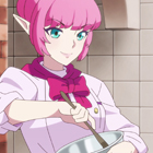
Anyways, I need help! I still cannot figure out how I want to chars to appear on the screen. Can you guys please give me feedback on which style you prefer?
Anyways, I need help! I still cannot figure out how I want to chars to appear on the screen. Can you guys please give me feedback on which style you prefer?
- Attachments
-
- Status quo. Typical VN style, I guess.
-
- I got this idea from Mugen's Heavy Metal Madonna... where he never displays chars on screen, only in the dialog boxes. It works great for him, so I thought I would try it. However, this looks "goofy" if the character is too wide and extends past the right edge of the dialog box... then it looks like he's floating on air a bit.
-
- Kind of like dialog 2 except that it's full body and slightly larger. This by-passes the whole "floating on air" issue with the above.
Re: [WIP] The Isle of St Marcus
Very personal opinion on the question follows :
The Heavy Metal Girl Madonna like one is pretty cool. I think it's one of the best approach when it comes down to reading the character's comments, and seeing his emotions and attitudes at the same time. Unfortunately, it leaves a lot of "empty space" , considering the background image takes up most of the screen, and nothing in particular is happening in it, and that's kind of boring. It's a drawback because what changes the most is the character's stance and emotions, so visually, I'd say it's very efficient, but aesthetically boring.
The last mock-up is kind of a compromise, the sprite being bigger, and I was also surprised at the fact that having the sprite in front of the textbox actually looks good. But it retains, in my eyes, the same problem of having ll that empty space left, what's more, like the previous mock-up, I wonder how you can manage multiple characters on screen with these methods ? Won't you be forced to give up on that option ?
So in the end, the first one would be my favorite, even though it's unoriginal. I would have the textbox a little more opaque though, because it's very tiresome to read when it's so transparent, or have a parameter to control it's opacity.
Also, you could probably lower the sprites as to bring their faces closer to the textbox region, so that their expression and stance changes are perceived easier by the player. It's a hard balance to get, because at the same time they shouldn't look like they are swimming with their heads gasping for air above the textbox. But I have to say, your placement is pretty much near optimal already.
Off course, you also could have both, a "standing" sprite an it's smaller duplicate in the textbox. But my personal taste goes agaisnt that, it feels a bit redundant, and I almost always end up just looking at the smaller sprite.
-
HumbertTheHorse
- Regular
- Posts: 135
- Joined: Thu Jul 15, 2010 4:06 pm
- Projects: ... ...
- Location: USA
- Contact:
Re: [WIP] The Isle of St Marcus
1st one. Character art that good needs to be BIG.
-
Arithra
- Regular
- Posts: 194
- Joined: Wed Jul 28, 2010 2:29 pm
- Completed: Finding a prom date
- Location: Germany
- Contact:
Re: [WIP] The Isle of St Marcus
I think the third one ist the best. Even though humbetthehorse is right. character spirits should be big. but I do't think your would be too small for that.
Please visit my projects Perios- Chained Sorceress
and Final Banquet now with demo!
And my blog for more updates!
and Final Banquet now with demo!
And my blog for more updates!
-
Aleema

- Lemma-Class Veteran
- Posts: 2677
- Joined: Fri May 23, 2008 2:11 pm
- Organization: happyB
- Tumblr: happybackwards
- Contact:
Re: [WIP] The Isle of St Marcus
The embedded sprite makes the window more interesting. But I'd rather you make the dialogue box more independent than to stuff stuff into it. With the characters only in side-view, the room instantly feels empty to me. If you're going to have a LOT of off-screen characters if you do the first option, then side-portraits are a must, I think. If there really is only ever 2-3 characters, and you can show them, then I would go with the first option -- since the character art is so well done, I would prefer bigger, non-cropped versions. Plus, things like the girl's axe are just going to drive you crazy when text starts running under the variable widths of the characters.
If you've already decided and want to do one of the two last options, go with the one that shows the most sprite. So the last one.
If you've already decided and want to do one of the two last options, go with the one that shows the most sprite. So the last one.
-
sake-bento
- Eileen-Class Veteran
- Posts: 1909
- Joined: Sat Jan 26, 2008 5:58 pm
- Completed: http://sakevisual.com/games.html
- Projects: Every Sunrise, Shinsei
- Organization: sakevisual
- Tumblr: sakevisual
- Deviantart: sakevisual
- itch: sakevisual
- Contact:
Re: [WIP] The Isle of St Marcus
The first version feels as if I'm interacting directly with the characters. Holding a conversation with them. The second and third feel like I'm exploring some place, and the characters are behind me, chiming in at certain points when necessary. The first is a lot more personal with the characters, while the other two give me more a sense that I'm in control (it kinda feels like playing an RPG with my party members popping up occasionally to give me useful information). I do like the look of the third one, but unless there's something super important going on in the scenery, or you really do want it to feel detached and impersonal, I'd suggest sticking with the first version.
sakevisual visual novels (and stuff) | sakevisual dev blog
Re: [WIP] The Isle of St Marcus
I like 3. In front of everything.
Re: [WIP] The Isle of St Marcus
Thanks for the input guys. I'll definitely be going with the traditional style of VN. I don't think I really have more than a few chars on screen at a time so that would not be troublesome. I will use the dialog image #2 for "side conversations" with people you are not looking directly at. I'll also darken up the dialog box so it's not as hard to read. Thanks again, everyone.
Who is online
Users browsing this forum: Google [Bot]