
Uploaded with ImageShack.us
Critique! Critique! Critique!... please


I'm using paint tool SAI on all my works btw, i don't use photoshop/gradients/smudge/dodge etc at all.fortaat wrote:10+ points for bunny cloud.
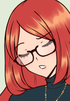
* Stop using gradients so heavily for the skin. Either you paint it with brushes, or go over the final product with brushes. The gradients make the girls look like dolls, and messes basic shading you could have easily done by hand.
This problem was also prevalent in an earlier drawing you posted, as well as your Deviant account, so I say it should be high on the "To Improve" list.
The green skirt is fine, so I don't think you really need me for explanations.
* They don't make any shadows on the bed. They "float".
* The scene has a purple sunset light, which isn't reflected at all on the girls.
* the wall should have more shading, if only to hide the fact you used a pattern. I don't have a problem with the pattern itself, but if you add the smallest hint of shadows it will look better.
* Is the purple smudge under the left girl a different blanket from the yellow one?
* Right girl has an ugly hat. This is unacceptable, since women have all the good hats, like this one.
* The rubies on the right girl's shirt don't look like they're attached to the fabric.
* The throat of the left girl needs another go, highlighting the lights. Right now it looks like a tube, instead of a rounded triangle.
Though I kinda won't consider this one. Sounds like you're trolling rather than giving a critfortaat wrote: * Fair warning, I don't like "cute" faces - the girl on the left has something in her eye, and she says "Baaaaaaaah". The one on the right has a retarded smile, which seems quite detached from what's happening to her friend.

 COMMISSIONS AVAILABLE (check Tumblr sidebar)

I think your art is quite fabulous.Sakurazaki wrote:Geh I've realised that my art quality is pretty poor compared to a lot of people here ;_;
Image for an RP, in a new coloring style.
http://reiwolf23.deviantart.com/#/d2wwgp7
Thank you so much! (sorry I haven't responded till now... I couldn't log in with chrome and I just tried FF O_O)Ren wrote:I'd say the main problem you have is that you don't imagine how the volumes really work and shade accordingly, but instead you work on a preconceived idea of how things should be (as opposed to how they could be).
Also, her left eye seems a bit too big, even considered it's nearer to the viewer, and the mouth a bit out of centre.
I'd advise making a scheme for yourself, once you have the basic idea on paper or on screen, so that you can adjust your sketch accordingly.

Users browsing this forum: No registered users