The Director's Artwork

Use this forum to help develop your game-making skills, and get feedback on writing, art, music, or anything else you've created that isn't attached to a game in progress.
Message
Author
The Director
Regular
Posts: 54
Joined: Mon Oct 04, 2010 8:18 am
Projects: Dynamic Detective Verse 1
Location: Anywhere that has a camera trained on me!
Contact:

The Director's Artwork

#1 Post by The Director »

With most of our character roster completed (we still have a few side characters to work on), I feel I should ask the opinion of some of the fellow artists on this sight for tips on how to improve my artwork.

Note, the avatar I am using I have created myself after I cleaned up the characters as well as the providing the color.

But the artwork that I am showcasing for this example has not been cleaned up yet. Yet, in order to grow as an artist, I need to learn how to take advice from others, so, please, feel free to give me tips.
Image
I do look forward to hearing your comments.

-
The Director
OBJECTION!
Dynamic Detective - An Ace Attorney Parody!
Check us out - We're still looking for help!

http://lemmasoft.renai.us/forums/viewto ... 38&t=11059
http://shroudednotes.blogspot.com/searc ... -results=4

Honey.Yellow
Newbie
Posts: 19
Joined: Thu Oct 14, 2010 1:28 am
Contact:

Re: The Director's Artwork

#2 Post by Honey.Yellow »

Your artwork looks really clean and nice. Her expression is cute, and the situation is comical. I don't think anything looks wrong in this picture, and I really like it! :3

neowired
Regular
Posts: 199
Joined: Mon Dec 01, 2008 2:33 pm
Contact:

Re: The Director's Artwork

#3 Post by neowired »

Well, you were asking and i found a bit of time so here it goes.

First and foremost, circles in perspective, this is one of the complete basics of proper drawing (because a LOT of things have circles or ellipses, it's a basic shape you must learn to draw properly). When you put a circle in perspective, it can't have sharp edges, the edges are round, I'll leave you with this
http://www.ider.herts.ac.uk/school/cour ... ctive.html

other, rhythm or flow or however it's called, when drawing natural things you need to use organic shapes. be it hair, or fumes or fire, it can't be stiff, it has to flow properly

I'm far from the best but I'm leaving you with some guide lines within my ability
Attachments
FuruiFanArt1001.png

fortaat
Regular
Posts: 183
Joined: Tue May 18, 2010 1:16 pm
Contact:

Re: The Director's Artwork

#4 Post by fortaat »

Nice work Neowired.

The Director
Regular
Posts: 54
Joined: Mon Oct 04, 2010 8:18 am
Projects: Dynamic Detective Verse 1
Location: Anywhere that has a camera trained on me!
Contact:

Re: The Director's Artwork

#5 Post by The Director »

I thank you for your support, and yet, you see this alot done in anime/video games/etc., with hair styles.

But I appreciate the support, and fortaat, what exactly are you complimenting?

-
The Director
OBJECTION!
Dynamic Detective - An Ace Attorney Parody!
Check us out - We're still looking for help!

http://lemmasoft.renai.us/forums/viewto ... 38&t=11059
http://shroudednotes.blogspot.com/searc ... -results=4

fortaat
Regular
Posts: 183
Joined: Tue May 18, 2010 1:16 pm
Contact:

Re: The Director's Artwork

#6 Post by fortaat »

He gave you good advice.
I saw many things which were wrong, but couldn't put my finger on the the actual problem ("you need to use organic shapes"), so I couldn't help.

The Director
Regular
Posts: 54
Joined: Mon Oct 04, 2010 8:18 am
Projects: Dynamic Detective Verse 1
Location: Anywhere that has a camera trained on me!
Contact:

Re: The Director's Artwork

#7 Post by The Director »

Yes, but I notice that only the flames and hair were the only points that he really highlighted, and I want to point out that there is no 'wrong' way to do art. While I'll admit my skills are a work in progress, and I do appreciate the advice, I don't want to be told that my art work is wrong...

I don't take offense, but there is no wrong or right way of making artwork. There are only ways of improving yourself as an artist - Besides, like I said before, looking at some hair styles that have been used in game/anime/ and of the like, natural shapes are... Hmm... I can't think of a good word for it.

But still, I welcome the advice as I want to improve myself for the project that I am working on. So, yeah, I'll take it into consideration. But perhaps I should clean this picture up and show my full abililty, since like I said, this is just a rough draft that I drew of this character failing to make warm cereal.

-
The Director
OBJECTION!
Dynamic Detective - An Ace Attorney Parody!
Check us out - We're still looking for help!

http://lemmasoft.renai.us/forums/viewto ... 38&t=11059
http://shroudednotes.blogspot.com/searc ... -results=4

The Director
Regular
Posts: 54
Joined: Mon Oct 04, 2010 8:18 am
Projects: Dynamic Detective Verse 1
Location: Anywhere that has a camera trained on me!
Contact:

Re: The Director's Artwork

#8 Post by The Director »

I don't like double posting, but I feel as though one picture isn't enough to accurately determine one person's art style. So, I give to you another character, unfortunately, time constraints don't allow me to clean up my artwork so please forgive me for that.

Image

Image

This last one was a drawing I cleaned up a year and a half ago, but it has no real bearing in the project I'm a part of.

Image

I do look forward to seeing your advice about these however, and thank you very much for your time.

-
The Director
OBJECTION!
Dynamic Detective - An Ace Attorney Parody!
Check us out - We're still looking for help!

http://lemmasoft.renai.us/forums/viewto ... 38&t=11059
http://shroudednotes.blogspot.com/searc ... -results=4

Jake
Support Hero
Posts: 3826
Joined: Sat Jun 17, 2006 7:28 pm
Contact:

Re: The Director's Artwork

#9 Post by Jake »

The Director wrote: there is no wrong or right way of making artwork. There are only ways of improving yourself as an artist
These two statements contradict each other; if there were really no 'right' or 'wrong' way of making artwork, how would you work out which of your pieces were 'better' or 'worse' in order to tell whether you'd 'improved'?


Here's my piece of advice, as requested in the original post: if you're going to ask for people's critique, then:
- tell them up-front what you're actually aiming for, so people can take it into account and respond accordingly - if you deliberately want to represent fire as a series of short jagged lines even though it looks nothing like fire to the rest of us, then tell us before we critique it and tell us why - like that we can understand what you were aiming for and not waste our time or yours with pointless advice in the wrong direction, and/or potentially suggest alternatives which might give you the same effect while looking less bad to the rest of us.
- don't make excuses for all the things people have said about your art (this includes "there's no right or wrong way to make art") after people have given you advice, because if you try and excuse away everything people say, it just gives the impression that you're not really interested in the critique and you've just wasted their time completely, and that'll make everyone with anything useful to say much more reluctant to try and help you in the future. Explain how stuff happened by all means, but if you discount everything someone said to you they'll wonder why they bothered saying anything at all.


If you don't like someone's critique, or don't agree with it, then you have two options: engage them in conversation to find out why they think what they think and see if either of you can change the other's mind, or just ignore it. People sometimes just give bad critique, as well, despite the fact that there's no right or wrong way to make art.


(As to the curves-versus-straighter-lines, I would suggest that by far the default in manga-inspired art is curves, and for very good reason - the point of the stylisation manga uses is to suggest the feeling of something without drawing it explicitly and realistically, and curves suggest the feeling of hair and fire far more than straigher, more-angular lines do. Manga artists who use straight lines generally do so because they deliberately want a particular effect (often something childish or bizarre/fantastical) or because they're just not so good as those other manga artists who use curves. So if you're really set on not using curves, you should explain to us what exactly you're after so it's easier to tell whether you're close or not.)
Server error: user 'Jake' not found

The Director
Regular
Posts: 54
Joined: Mon Oct 04, 2010 8:18 am
Projects: Dynamic Detective Verse 1
Location: Anywhere that has a camera trained on me!
Contact:

Re: The Director's Artwork

#10 Post by The Director »

Very well, then allow me to say this in the following manner to the last post.

-clears throat- I am quite capable of drawing of drawing in a curved manner, but considering the situations that the character I'm designing for the visual novel, I thought it would be good to have them react in a more cartoonish manner which would lighten the mood for the story. And I know what people are going to say, if its a serious story line, shouldn't you have serious characters.

Indeed, but that falls in line with an old saying 'All work and no play'... And you know the rest.

And I'm not trying to be contradictory, but that's what artwork sometimes is. It all really falls down into personal preferences into the art world.

That being said, what I'm looking for are details that relate more to anatomy, emotions and/or body details that I have included in these examples. Like, are the heads to big or such?

I do apologize if I insulted anyone with my last few posts, or disregarded some sound advice - That was not my intent and I would like to hear more advice concerning this topic.

Thank you for your time,

-
The Director
OBJECTION!
Dynamic Detective - An Ace Attorney Parody!
Check us out - We're still looking for help!

http://lemmasoft.renai.us/forums/viewto ... 38&t=11059
http://shroudednotes.blogspot.com/searc ... -results=4

neowired
Regular
Posts: 199
Joined: Mon Dec 01, 2008 2:33 pm
Contact:

Re: The Director's Artwork

#11 Post by neowired »

http://www.desktopexchange.com/gallery/ ... h_1024.jpg
You're not pulling that off at all, and well, let me stop at this...
Disregarding how Yugi's hair is a lovely humorist topic for certain people

No wait, you are That Artist! I know you. I totally agree! Art is always right, everything for art. YOU ARE AN AWESOME ARTIST DON'T LET ANYONE TELL YOU OTHERWISE. Opinions? what good are those for? they will only limit your artistic creativity, srsl, don't listen to any, they are always wrong. It's just stupid people who think they know better. But we both know you know better, so yeah. I'm sorry for attacking your artistic freedom/style/concept when you obviously only wanted to know if the head is of the right size, that was so insensitive and awful of me. I feel very ashamed now.

Ren

Re: The Director's Artwork

#12 Post by Ren »

The director: did you use reference for the Kanako picture? Some elements, such as the anatomy, style, and confidence in the pose kind of clash with your previous pictures and details in itself.
It would be helpful to know that sort of thing as well, before giving any advice.

From what I see in the other pictures: I'd say you really need to work on the stroke quality and rendering of surfaces, To take an easy example, in the picture of the girl with a top hat you just "filled" the inside of the hat with many kind-of-vertical strokes, without thinking of the idea you should give. The inside of the hat isn't flat, and you shouldn't render it as such.
Pay attention to perspective: in the same hat, you have the rim of it being frontal, while the cylinder is seen from the side.
Lines are important too, when trying to give the idea of a material: try to vary the width and boldness - I for example use thinner lines for hair than I do for skin, which are thinner than the ones I use for heavy fabric - but that is just an example.
Don't get distracted by the fact that you draw in an anime-inspired style - the rendering, anatomy (and its simplification) and perspective are still very important.

I'll also pre-emptively point out that even when talking about sketches, there are some particulars that distinguish a skilled artist from an amateur.

The Director
Regular
Posts: 54
Joined: Mon Oct 04, 2010 8:18 am
Projects: Dynamic Detective Verse 1
Location: Anywhere that has a camera trained on me!
Contact:

Re: The Director's Artwork

#13 Post by The Director »

-raises hands- No, no, it was my fault, I wasn't specific in what I was requesting. Your advice was actually quite sound, and so, I decided to clean up the artwork that I originally posted and took your advice to heart.

I applaud and thank you for your advice, after all, while my artwork has its appeals, I'd like it to be a bit more detailed.

Now this is just cleaned up line art, so, am I on the right path with that organic shapes for fire, hair, smoke etc., But, I am trying.

Image

I also have a talent for drawing faces (some people in my group made references to that one scene in Buso Renkin when I showed them this character's mug shot).

Image

As before, I wish to know if I'm on the right track with that concept you were referring to neowired. And I look forward to tips from everyone else.

Thank you in advance.

And thank you ren for your view points, I will definitely take those points into account. And as for the Kanako picture, I do often look at some poses of characters for practice, but I do completely original work as well. I would also like to point out that this character was created about a year and a half ago, so my art style has changed in that time.

-
The Director
OBJECTION!
Dynamic Detective - An Ace Attorney Parody!
Check us out - We're still looking for help!

http://lemmasoft.renai.us/forums/viewto ... 38&t=11059
http://shroudednotes.blogspot.com/searc ... -results=4

Blue Sky
Regular
Posts: 120
Joined: Tue Jan 12, 2010 7:11 pm
Projects: The Perfect World, Mahou Shoujo Daisuki!
Location: Oregon
Contact:

Re: The Director's Artwork

#14 Post by Blue Sky »

Hmm... you don't need that many lines to represent the fire, instead use a general outline of the shape. Color can be added later to define the flames in more detail, but all of those lines makes things cluttered. Same with the smoke really.

sinto
Regular
Posts: 30
Joined: Tue Jul 27, 2010 12:49 am
Contact:

Re: The Director's Artwork

#15 Post by sinto »

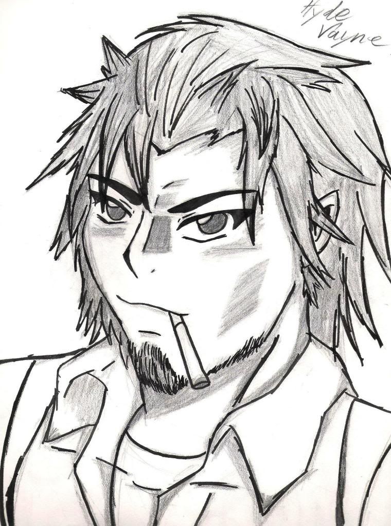
Good day sir! I hope you are open to these general advice I'll give. These are all of the things I've learned from experiences as an artist who has gone through a lot.

First of all, I won't stop you from drawing illustrations using an anime inspired style. That's what you want and I respect that right of yours as an artist.

However as artist, we should ask ourselves this question that involves every artist in whatever field they are into: 'Am I really satisfied with what I can do and what I have done?'

If you are, then the whole world will move ahead of you, they will leave you behind at the spot where and when you told yourself that you are satisfied. If you're not, then you have the advantage of getting ahead of the world, and yourself.

Now I presume that you are not satisfied with your current quality, that is why you made this thread here right?

In your case, as a person who does illustration in anime style let me ask you this: In a modern world where there are so many people drawing in that style, what can you do as an artist to stand out, to contrast yourself from the rest for the whole world to see. I can't give you an answer, that's something that you should find out for yourself. Because, art has no rules. No one can tell you how to do things because every individual has his/her own method of efficiency of doing things. What matters is the result that you are aiming for.

However, art has to start somewhere, wherever it aims to go.

So whatever style one person chooses, it has to have a foundation. Style is an advancement from the foundation; It's a distortion of reality. Without those foundations(Basic anatomy, lighting and shadows, perspective, foreshortening, gesture drawing, basic color theory), the foot base and pillars of our advancement, then you cannot get anywhere.

Understanding how to draw a human face, or better yet, the composition of the human skull, its contours and protruding edges, its effect on how the skin and muscle appear, drastically contributes to how we distort things. Don't just look at a human skull or human face and copy it. You must analyze and understand it. Copying will only give you the ability to project what your eyes saw that moment. As artists we gain knowledge to gain power and understanding.

I hope this was helpful. Thank you for your time :)

Locked

Who is online

Users browsing this forum: No registered users