
My Art
-
CosmicKitty
- Regular
- Posts: 98
- Joined: Wed Sep 14, 2011 12:45 pm
- Projects: Patchwork Battles, Time Stones
- Location: Texas
- Contact:
My Art
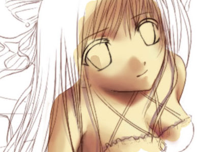
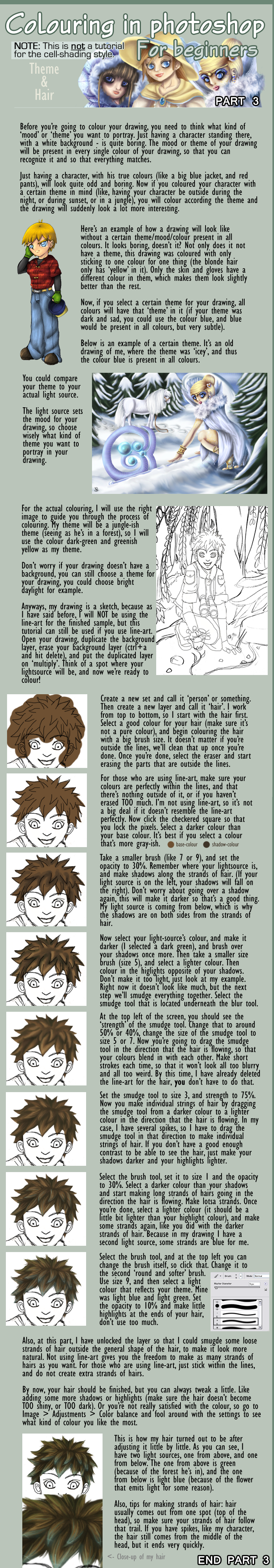
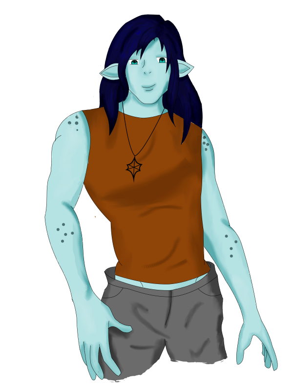
I just finished my first concept portrait of my character and I wanted opinions and suggestions.
Last edited by CosmicKitty on Tue Nov 08, 2011 12:42 am, edited 2 times in total.
-
TakeOverWorld
- Regular
- Posts: 112
- Joined: Fri May 27, 2011 11:00 am
- Location: London, UK
- Contact:
Re: Learning to draw/color
Maybe it's just me, but the colours look a bit... washed out? I'm not sure, it's probably just the pink background.
Erm, anyways, you could probably use more contrast in the colours you use for shading, like use slightly darker colours around the areas with shadows, like the neck.
Erm, anyways, you could probably use more contrast in the colours you use for shading, like use slightly darker colours around the areas with shadows, like the neck.
-
CosmicKitty
- Regular
- Posts: 98
- Joined: Wed Sep 14, 2011 12:45 pm
- Projects: Patchwork Battles, Time Stones
- Location: Texas
- Contact:
Re: Learning to draw/color... opinions needed please
thanks for the input 
I reshaded it a little and took off the pink background, i added it when i was working on the skin and then forgot about it... hopefully it looks a little better? How about the drawing itself?

I reshaded it a little and took off the pink background, i added it when i was working on the skin and then forgot about it... hopefully it looks a little better? How about the drawing itself?
-
NickelBuckle9
- Regular
- Posts: 36
- Joined: Wed Sep 14, 2011 3:47 pm
- Completed: MiniBot
- Projects: Ah! Peku, Pokemon Trainer Game (untitled)
- Location: United States - East Coast
- Contact:
Re: Learning to draw/color... opinions needed please
Looks a lot better without the bright florescent BG, haha. It's really good! If anything, I'd just suggest some more contrast in shading (like, instead of blurring colors well and using a very soft brush, try something a bit harder to get some more defined areas.)
It may just be my own personal preference, but instead of soft shading like this:
http://www.dragoart.com/tuts/pics/9/131 ... tep-12.jpg
I prefer some harder shading as such:
http://www.designyourway.net/teme/ramyskin.jpg
As for the drawing, it looks good! Anatomy works pretty well, and it looks clean. Just remember to color the whites of the eyes
-
TakeOverWorld
- Regular
- Posts: 112
- Joined: Fri May 27, 2011 11:00 am
- Location: London, UK
- Contact:
Re: Learning to draw/color... opinions needed please
It does look better The drawing itself is quite good, though one thing is her neck is too thin.
-
CosmicKitty
- Regular
- Posts: 98
- Joined: Wed Sep 14, 2011 12:45 pm
- Projects: Patchwork Battles, Time Stones
- Location: Texas
- Contact:
Re: Learning to draw/color... opinions needed please
I've worked a little more on the complete character... I'd love some more opinions...

This was the original picture that I never shaded because I went in a different direction with the clothing

This was the original picture that I never shaded because I went in a different direction with the clothing
-
Marcelo_Orlando
- Veteran
- Posts: 264
- Joined: Tue Nov 04, 2008 1:23 pm
- Completed: Case of the missing bracelet, Case of the mysterious stalker
- Projects: Horror/fantasy
- Organization: Kaboyashi Square
- Location: US
- Contact:
Re: Learning to draw/color... opinions needed please
First off, let me say rar! To your awesomeness, and I like your style. The coloring is good just needs less saturation and maybe make the colors harder. Your character art looks more sharp anime than the cute bunny types so I think darker colors would look better.


Re: Learning to draw/color... opinions needed please
Well for one her eyes have no whites, except only in the top left corner of her left eye. There's also almost no shading on the skin, which is weird because you've done a lot of shading in the hair. You should spend the same amount of dedication on the skin as well.
The shading of the hair could really be improved on. Right now, it's blobs of light colours and dark colours, that you tried to smudge into a shape. Hair is made up out of strands, and by making blobs of colour like that, it stops looking like hair. Only certain art styles can get away with using 1 colour for shadows, but at least they indicate that there are strands in the hair. If you're going to smudge the hair, why not smudge some strands of hair in it? Here's an example of smudged hair, it's an old picture of mine, but I still really like her pigtails, all smudged. Here's another one with smudged hair. See how giving it definitive edges it looks more like hair?
I have a very old tutorial on how to make hair with the smudge tool (it's for Photoshop, I hope I'm correct in thinking that's what you were using), maybe it'll help

A GxB game about designing your own clothes.
-
CosmicKitty
- Regular
- Posts: 98
- Joined: Wed Sep 14, 2011 12:45 pm
- Projects: Patchwork Battles, Time Stones
- Location: Texas
- Contact:
Re: Learning to draw/color... opinions needed please
Yeah, I've had problems making the hair look better since I don't use a tablet... I've done a newer character that I've tried to make strands of hair on, but his hair is very dark so I don't know how well you can tell
Re: Learning to draw/color... opinions needed please
No, you can't really see. Don't be afraid to add highlights in the hair to create more contrast. Things can still look dark without actually using dark colours.
A GxB game about designing your own clothes.
-
CosmicKitty
- Regular
- Posts: 98
- Joined: Wed Sep 14, 2011 12:45 pm
- Projects: Patchwork Battles, Time Stones
- Location: Texas
- Contact:
Re: Learning to draw/color... opinions needed please
I finally finished this one
Completed Games:
Holiday Hijinks: House on Haunted Hill
http://lemmasoft.renai.us/forums/viewto ... 11&t=17849
The beauty of life is, while we cannot undo what is done,
we can see it, understand it, learn from it and change.
So that every new moment is spent not in regret, guilt, fear or anger,
but in wisdom, understanding and love.
Jennifer Edwards
Re: Learning to draw/color... opinions needed please
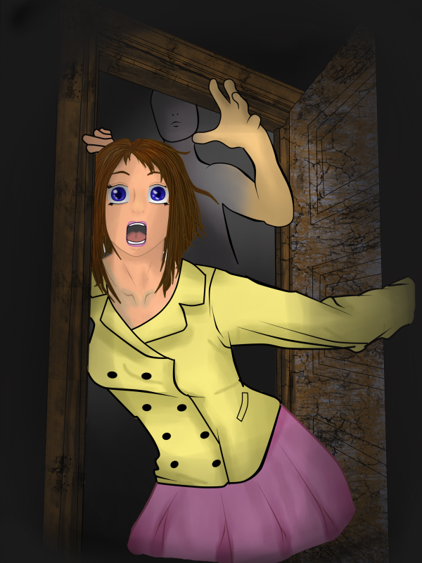
Hi, your colors looks a bit dull, maybe you could use lighter, brighter shades? But maybe thats your *style* ;w; (And the faces are abit awkward but idkwhy)
Re: Learning to draw/color... opinions needed please
The thing I think hits me most with your pictures is that (to me) the stray lines of shading in the fold of the clothes doesn't look so good, it maybe to your advantage to makes "less detailed" shading without these lines and focus on more "block shading" at the moment because they look a little out of place. (What I mean in block shading does not have to mean "cel shading" but just focus on major areas of shading and light)
For the hair in the "screaming picture" the same thing can go that it might be best to do a solider colouring instead of "strand by strand" hair colour since it looks a bit strange when the rest of the style is not so detailed. Hair without exact strands does not have to look bad at all and you can look at some different artists to see how you can get the hair to look nice. But, it's your style and this is just my comment
She looks cute all in all as a character though.
Edit: Drew a little on your picture as an attachment: it's not meant to be corrections or anything like that! but just some thoughts or ideas, maybe you find something helpful or maybe it doesn't help, it's just my two cents
What I mainly thought was it usually looks a bit more deep in colour if you don't use only flat "greyish" colours for shading. So I used some slightly red tones for the shading changes. Of course using different colours and shading can give different athmospheres. I changed some other things here and there but it's all just random thoughts.
- Attachments
-
-
CosmicKitty
- Regular
- Posts: 98
- Joined: Wed Sep 14, 2011 12:45 pm
- Projects: Patchwork Battles, Time Stones
- Location: Texas
- Contact:
Re: Learning to draw/color... opinions needed please
Thanks for the input I've been planning on going back and recoloring that character, it was the first one I did and I think her skin looks way too white and I think I want to redo the skirt and fix the folds in the jacket. I really like the color scheme you added to her though, it looks much more vibrant. I'm still working to come up with a style I really like, If I block color the hair (like the full body of the girl) I get told I should make individual strands, if I do I get told I shouldn't, I use colored lineart and people say you're supposed to use black.... but it all helps me grow I think it's safe to say that my work has drastically improved in the last few months... for example
The first image I did about a month ago, the second was my fix for it a few days ago:
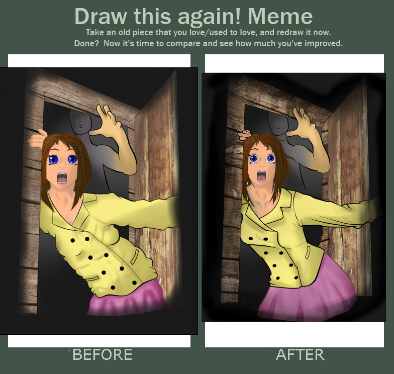
so if you have anything else at all you see wrong with my work, please point it out
The first image I did about a month ago, the second was my fix for it a few days ago:
so if you have anything else at all you see wrong with my work, please point it out
Completed Games:
Holiday Hijinks: House on Haunted Hill
http://lemmasoft.renai.us/forums/viewto ... 11&t=17849
The beauty of life is, while we cannot undo what is done,
we can see it, understand it, learn from it and change.
So that every new moment is spent not in regret, guilt, fear or anger,
but in wisdom, understanding and love.
Jennifer Edwards
Holiday Hijinks: House on Haunted Hill
http://lemmasoft.renai.us/forums/viewto ... 11&t=17849
The beauty of life is, while we cannot undo what is done,
we can see it, understand it, learn from it and change.
So that every new moment is spent not in regret, guilt, fear or anger,
but in wisdom, understanding and love.
Jennifer Edwards
Re: Learning to draw/color... opinions needed please
I'm glad that you found something you liked about itbuprettyinpink wrote:Thanks for the input
(Remember that it's not really like "if you see something that's WRONG...", I mean actually you can't really say that something is "right" or "wrong" with art
Well about block colour vs hair strands, what I saw here in the thread was: "Only certain art styles can get away with using 1 colour for shadows, but at least they indicate that there are strands in the hair. "
It doesn't mean that you really need to do many individual strands, but that in many styles you have to be careful that the hair doesn't end up looking like a helmet instead of hair. There's many different ways to do it and I think usually what ends up being a solution when you want to use strands, is to draw thicker strands (more like "many lumps of hair" than "many strands"). But you can also make block colours and just show a hint of strands in some places to emphasize that it's not a helmet. It might help to study a few different styles
I don't know why it would be said that "you should use black lineart", it's very common to use coloured lineart and definitely not something bad. You have to make sure you don't make it look too bland or too unclear but that's true for every single thing in drawing, "watch out so that it doesn't look too strange"
Who is online
Users browsing this forum: No registered users