Help! Lacking something!

Questions, skill improvement, and respectful critique involving art assets.
Message
Author
Green Skies
Regular
Posts: 53
Joined: Wed Jun 16, 2010 1:47 am
Projects: Shoot The Moon (GXB Otome)
Organization: Green Skies
Contact:

Help! Lacking something!

#1 Post by Green Skies »

Image

Here is an example of a sprite
I know one of his hands is pulling a disappearing act and his collarbones are in the wrong place...that sort of critique i'm not looking for yet

What I want to know is why it looks so unprofessional...like the atmosphere?
I mean Starry Sky by bumblebee and such may not have perfect anatomy but somehow come off as very very finished and professional

Is it detail? Lineart? Brushes? Photoshop?
I'm sure if I corrected my errors it would look better, but it would still lack in that area that I can't quite pinpoint...any ideas?

Thank you!


Personally I think it is detail...if my lineart was more detailed (and well-done) then it should look more finished and sell-able yes?
It is not that I want to sell our game, I just want it to look well-made.
Last edited by Green Skies on Mon Dec 19, 2011 4:39 pm, edited 1 time in total.
Current Project: Shoot the Moon // Devblog

User avatar
Auro-Cyanide
ssǝʇunoƆ ʇɹ∀
Posts: 3059
Joined: Sun Jul 25, 2010 9:02 am
Completed: http://auro-cyanide.tumblr.com/visualnovels
Projects: Athena
Organization: Cyanide Tea
Tumblr: auro-cyanide
Deviantart: Auro-Cyanide
Location: Melbourne, Australia
Contact:

Re: Help! Lacking something!

#2 Post by Auro-Cyanide »

I think it's a combination of lineart, shading and detail. It might be nice if you coloured your lineart since it isn't really characteristic enough to stand strong on its own. Your shading is pretty good, but maybe more contrast would be good. So having darker and lighter areas. Introducing other colours can help too. There is purple in the white shirt, why not add a bit to the other clothes and skin. Finally, I think your work could benefit from some detail. Starry Sky's characters are quite detailed and it makes them look more finished. The hair especially could do with some stray strands and sharper highlights.

It looks pretty really nice though, good work!
Last edited by Auro-Cyanide on Mon Dec 19, 2011 3:28 am, edited 1 time in total.

User avatar
Tag-
Miko-Class Veteran
Posts: 508
Joined: Tue Jul 05, 2011 7:50 am
Projects: Circo della Sera
Contact:

Re: Help! Lacking something!

#3 Post by Tag- »

First of all, your drawing looks great :D

Most commercial sprites have super smooth lineart, and while photoshop is good for this, I tend to find that SAI yields better results in lineart. Still, this is not a necessity in my opinion.
What you could do to increase the atmosphere of professionalism is definitely colour the lineart, it makes your lines look smooth and 'airy'. A bit more contrast detail in the shading would also do you well.

A comparison of the lineart would be:
valorytest3.png
Something like this.


Hope this helped~ :D
PM me if needed

Green Skies
Regular
Posts: 53
Joined: Wed Jun 16, 2010 1:47 am
Projects: Shoot The Moon (GXB Otome)
Organization: Green Skies
Contact:

Re: Help! Lacking something!

#4 Post by Green Skies »

Auro-Cyanide wrote:Finally, I think your work could benefit from some detail. Starry Sky's characters are quite detailed and it makes them look more finished. The hair especially could do with some stray strands and sharper highlights.

I completely agree too. Thank you! Detail detail detail...it will be the death of me.
His character is so...monochromatic, I'll try to throw some reflected light on him. I just wish he was more colorful to begin with!

Tag- wrote: What you could do to increase the atmosphere of professionalism is definitely colour the lineart, it makes your lines look smooth and 'airy'. A bit more contrast detail in the shading would also do you well.

Both of you mentioned contrast. I'll try! I guess I am a little scared of extremes!

Thank you both for the quick feedback, and thank you for being so nice and cordial!
Current Project: Shoot the Moon // Devblog

User avatar
LateWhiteRabbit
Eileen-Class Veteran
Posts: 1867
Joined: Sat Jan 19, 2008 2:47 pm
Projects: The Space Between
Contact:

Re: Help! Lacking something!

#5 Post by LateWhiteRabbit »

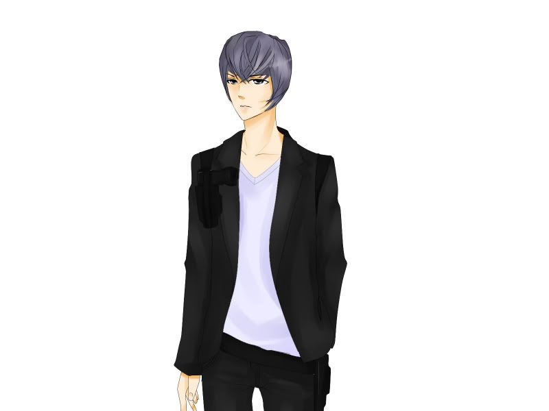
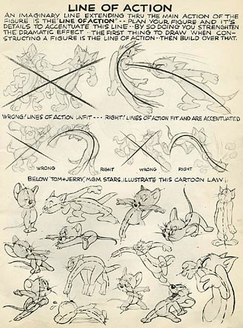
Well, first you need to find the "line of action" for each figure you draw. Otherwise you're drawing will look stiff, like yours does.

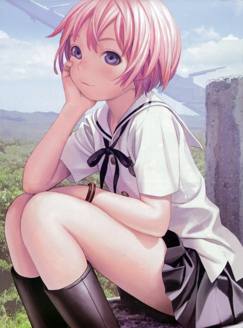
Second, your figure looks very uncomfortable and unnatural, like he doesn't know what to do with that free hand - likely because YOU didn't know what to do with that free hand. No one stands with their hands limply at their sides. Every pose your character assumes should tell you something about their personality. Look at each of the two photos. Photo One. Photo Two. Every person is standing in a static or casual pose, but each of their choices on how to stand tells you a lot about their personality and how they are feeling.

Third, your line work is very weak. All your lines have the same width and emphasis, with no variation. Lines need to be thicker where there is shadow, or where the object is closer to the viewer. Lines should be thinner on brightly lit areas or where the object is farther from the viewer. Long lines should be thicker in the middle and taper towards the ends as a general rule. There are more considerations than this, but if you don't having varying line weights your image comes up looking lifeless.

Fourth, the clothes on your figure look very ill-fitting. This makes it look as if you have a poor grasp of the underlying anatomy. A lot of that ill-fitting look in this image is caused by your excess of detail on your wrinkles. You've added a lot of wrinkles and folds without properly following where wrinkles and folds would actually form and behave on this figure in this pose. Study real fabrics and clothing, use reference, and understand why wrinkles or folds happen - either because the clothing is being pulled, pinched, draping, or folding.

The accessories like the gun holder and gun aren't drawn correctly on the figure either, so they feel like they are floating on top. Again part of this is simply research and reference. For one, holsters are worn under suit jackets, never over, the straps must be closer in to the neck to provide support (you have the straps resting on what would just be padding in a real suit) and the gun is hanging much too high. The point of a holster is easy and quick access. This seems like nitpicking I know, but professional artists look this stuff up and use reference. With Google Image search we artists have no excuse not to use reference these days. And that is another big tip - use reference. Don't slavishly copy, but ALL professional artists use reference. We have filing cabinets full of the stuff, and often take pictures ourselves. This article on IO9 gives a good overview of how a professional artist tackles a piece and how they use reference.

Fifth, the hair. Again, this is a case of studying actual hair and how it clumps and behaves, and not trying to fit in every line or hair. The hair in this case is also clinging quite stubbornly to the shape of the head, causing tangential lines (where two lines flow directly into each other like they are the same line) where the hair meets the cheeks. Your coloring also doesn't make sense for how you have drawn the bangs on the forehead - we should be seeing skin the way it is now. In general, drawing and coloring it should take as long as the figure did by itself - if you are doing it well.

Finally, coloring. Auro-Cyanide was right to congratulate you on using purple in shading the white shirt - much better than gray! But you used gray to shade the suit. Gray or black should almost never be used for shading. In fact, you should probably avoid black as much as possible anyway. You need to study colors and color mixing, and really learn to see various colors. Look at the image below:
Image
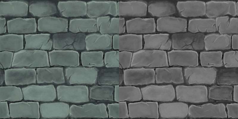
It is a stone wall, and most people think of stone as being gray, but notice how poor and anemic the stone wall on the right looks when painting with nothing but grays. Now look at the stone wall on the left painted in blues and greens. It still READS as gray to an observer (especially if the actual gray wall isn't beside it - go on cover up the right side with your hand) but it looks MUCH more rich.

Another example, this time by the great Jo Chen.
Image
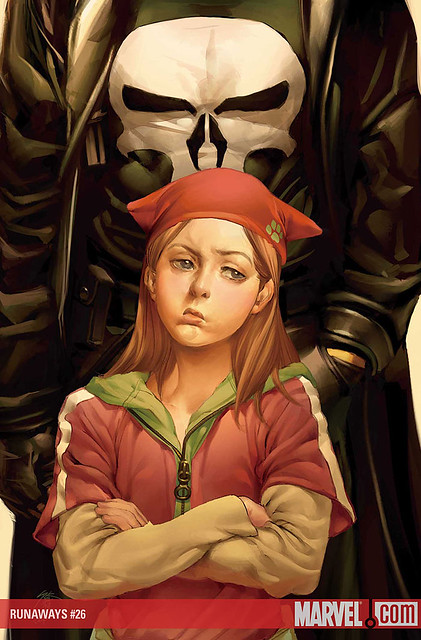
We all know that the Punisher's outfit is black, right? But Chen didn't use any black to paint this picture. Punisher's coat and shirt and gloves are painted with browns, greens, yellows, and dark reds. Notice also how the coat reads as leather due to the way it folds and the highlights on it. Notice too that none of those highlights on the jacket or even the skull on his shirt are painted with a pure white, only creamy light yellows.

Your skin needs other colors than shades of peach and white as well. Skin is made up of a lot of different colors - blues, reds, yellows, golds. Skin is paler and has more blue the thinner it is or the closer blood vessels are to the surface, and areas like the nose, ears, and fingertips that are exposed to the most sun or changes in temperature are usually more red. The take away here is to avoid white in skin, and use multiple colors.

And yes, use contrast in your coloring. Colors without strong contrast look weak and flat.

I won't touch the anatomy as you've asked me not to and I know you're aware of it.

I hope all this helped, and if you need any clarification I'll be glad to try and answer any further questions.
Last edited by LateWhiteRabbit on Mon Dec 19, 2011 4:16 am, edited 2 times in total.

Pugfarts
Regular
Posts: 97
Joined: Thu Dec 01, 2011 2:05 am
Projects: I Will Hold Your Hand
Contact:

Re: Help! Lacking something!

#6 Post by Pugfarts »

dammit. someone sticky this for White's post.

User avatar
Auro-Cyanide
ssǝʇunoƆ ʇɹ∀
Posts: 3059
Joined: Sun Jul 25, 2010 9:02 am
Completed: http://auro-cyanide.tumblr.com/visualnovels
Projects: Athena
Organization: Cyanide Tea
Tumblr: auro-cyanide
Deviantart: Auro-Cyanide
Location: Melbourne, Australia
Contact:

Re: Help! Lacking something!

#7 Post by Auro-Cyanide »

Yes, excellent post LateWhiteRabbit!

*sigh* Stuff like clothing and colour theory can be difficult to learn (I've been at it for years ;_;) but every little bit goes a long way to add that little something to your work :) I know the first time I realised how much olive green was in some skin tones I was surprised out how much difference it made.

User avatar
15385bic
Miko-Class Veteran
Posts: 771
Joined: Tue Jun 28, 2011 7:39 am
Location: Australia
Contact:

Re: Help! Lacking something!

#8 Post by 15385bic »

sadly i have the same problem as you >3>
I think its the colouring as well - kinda flat
(i should read everyone else's suggestions too *_*)

User avatar
Celianna
Veteran
Posts: 224
Joined: Fri Aug 12, 2011 1:03 am
Contact:

Re: Help! Lacking something!

#9 Post by Celianna »

Oh my god ... I just noticed there's a gun on his shoulder. Wow, did not notice that at all until I dragged it into Photoshop and zoomed in on it.

To make something appear black, you don't necessarily have to use black, much like what LateWhiteRabbit was talking about. Black is the absorption of all colours, so you can pretty much use any colour other than pure black to colour black. The more popular colours to use instead of pure black is a dark blue, or a brownish grey.

To show you an example, I made his coat a blue-ish purple, while also making it brighter so you could see the gun as well.

Image

If you don't put the sprite on something that uses pure black, you could easily see this as 'black' and not 'blue-ish purple'.

There's actually a TV Tropes article on this.
Image
A GxB game about designing your own clothes.

User avatar
LateWhiteRabbit
Eileen-Class Veteran
Posts: 1867
Joined: Sat Jan 19, 2008 2:47 pm
Projects: The Space Between
Contact:

Re: Help! Lacking something!

#10 Post by LateWhiteRabbit »

Celianna wrote: If you don't put the sprite on something that uses pure black, you could easily see this as 'black' and not 'blue-ish purple'.

There's actually a TV Tropes article on this.
That's brings up something I meant to say but forgot. (Oh, my God, he's still talking?! :lol: )

You should do all your coloring on a neutral colored background, like a midtone gray or a sepia brown, so you can more closely tell the true hue values of the colors you are working with. Pure white or pure black cause colors to look brighter or darker than they actually are.

User avatar
Auro-Cyanide
ssǝʇunoƆ ʇɹ∀
Posts: 3059
Joined: Sun Jul 25, 2010 9:02 am
Completed: http://auro-cyanide.tumblr.com/visualnovels
Projects: Athena
Organization: Cyanide Tea
Tumblr: auro-cyanide
Deviantart: Auro-Cyanide
Location: Melbourne, Australia
Contact:

Re: Help! Lacking something!

#11 Post by Auro-Cyanide »

LateWhiteRabbit wrote:
Celianna wrote: If you don't put the sprite on something that uses pure black, you could easily see this as 'black' and not 'blue-ish purple'.

There's actually a TV Tropes article on this.
That's brings up something I meant to say but forgot. (Oh, my God, he's still talking?! :lol: )

You should do all your coloring on a neutral colored background, like a midtone gray or a sepia brown, so you can more closely tell the true hue values of the colors you are working with. Pure white or pure black cause colors to look brighter or darker than they actually are.
This is true, I almost always use a 50% grey so its very netural in terms of tone and isn't going to corrupt how I see the colours. The only reason I would use something else is if I was using a colour that had a similar tonal value to the gry (in which it could get a little confusing) or if I WANTED the colour to corrupt the others because it can lead to interesting colour choices that you might not have come up with normally :)
Last edited by Auro-Cyanide on Mon Dec 19, 2011 6:41 am, edited 1 time in total.

Green Skies
Regular
Posts: 53
Joined: Wed Jun 16, 2010 1:47 am
Projects: Shoot The Moon (GXB Otome)
Organization: Green Skies
Contact:

Re: Help! Lacking something!

#12 Post by Green Skies »

Haha! Thanks everyone!
He does look awkward, but I think that a tiny bit of that is because he's missing the hand that is supposed to be in his pocket.
LateWhiteRabbit wrote:. Otherwise you're drawing will look stiff, like yours does.
Boy that was quite a post! Thank you! everything makes sense. But I do have one small comment: I love realism, and respect it it all its glory, but anime (I think anyway) doesn't have to follow the rules of realism as much.
But again with the bumblebee reference.. http://tokyojuliet.files.wordpress.com/ ... /98430.jpg
( I completely understand the whole "reference concept" though! )

I will (of course) try my best to improve my technical skill, and sincerely appreciate your critique, but I also think there is something beyond that. A certain few of my favorite anime artists draw many anatomy errors, misplaced clothing folds, no reflected color ect and yet still have a professional and polished look. That is what I wanted to try to pick apart with the help of all of you.
But I completely agree with you with all the points you brought up on this sprite! I really need to work on the fundamentals!

Celianna wrote:
Oh my god ... I just noticed there's a gun on his shoulder. Wow, did not notice that at all until I dragged it into Photoshop and zoomed in on it.
:oops: hahaha how embarrassing! And wow! So shiny!
Thank you I understand better.

Again thank you! All your critique is sincerely appreciated :)
Last edited by Green Skies on Mon Dec 19, 2011 6:25 am, edited 2 times in total.
Current Project: Shoot the Moon // Devblog

Green Skies
Regular
Posts: 53
Joined: Wed Jun 16, 2010 1:47 am
Projects: Shoot The Moon (GXB Otome)
Organization: Green Skies
Contact:

Re: Help! Lacking something!

#13 Post by Green Skies »

Auro-Cyanide wrote:
This is true, I almost always use a 50% grey so it very netural in terms of tone and isn't going to curropt how I see the colours.
Wow. That will help me so much! I somehow always end up using a neon like background and get a massive headache. Silly me!
Current Project: Shoot the Moon // Devblog

User avatar
LateWhiteRabbit
Eileen-Class Veteran
Posts: 1867
Joined: Sat Jan 19, 2008 2:47 pm
Projects: The Space Between
Contact:

Re: Help! Lacking something!

#14 Post by LateWhiteRabbit »

Green Skies wrote:But I do have one small comment: I love realism, and respect it it all its glory, but anime (I think anyway) doesn't have to follow the rules of realism as much.
But again with the bumblebee reference.. http://tokyojuliet.files.wordpress.com/ ... /98430.jpg
( I completely understand the whole "reference concept" though! )
Well, in regards to realism and anime,
Range Murata and
Satoshi Kon say "hi". It is very possible to do realistic anime, and I think it looks the best, but there IS much more stylized anime. The key here, is whether that anime is purposefully stylized because the artist was going for a certain effect, or if it is just a case of bad anatomy. As many teachers and professors of the world have said, you must learn the rules before you can effectively break them. If you don't know how to draw a realistic jacket, your stylized jacket will never look very good.

That is why anime art is despised at art schools and scorned in much of art world - because anime artists will insist that the anatomy isn't bad or wrong, but stylized. If you only draw anime and not realistic anatomy, you are just relying on "artistic short hand", like a child who draws a bowl for a mouth, or circles for eyes. If you look at the artbooks of the most famous manga and anime artists, you will see they do a lot of life drawings and anatomy studies. Even Osamu Tzeku drew realistic sketches.

Anime is a simplified drawing form, but you must know WHERE to simplify and how for it to look good and work.
Green Skies wrote: A certain few of my favorite anime artists draw many anatomy errors, misplaced clothing folds, no reflected color ect and yet still have a professional and polished look. That is what I wanted to try to pick apart with the help of all of you.
Ah, that is because of the coloring. Good coloring can vastly elevate inferior drawings, and bad coloring can bring good drawings crashing to earth. It is the shiny coat of paint that can hide a lot of flaws. And line weights.

Just ask American comic artist Rob Liefeld. That guy sucks, but his art has been looking better and better for 20 years. No, he hasn't stopped sucking or improved, the methods of coloring comics have just gotten better! Example of what better coloring can do for art.

EDIT: Another example of art being made to look more professional by using different coloring.
Last edited by LateWhiteRabbit on Mon Dec 19, 2011 7:07 am, edited 1 time in total.

User avatar
Auro-Cyanide
ssǝʇunoƆ ʇɹ∀
Posts: 3059
Joined: Sun Jul 25, 2010 9:02 am
Completed: http://auro-cyanide.tumblr.com/visualnovels
Projects: Athena
Organization: Cyanide Tea
Tumblr: auro-cyanide
Deviantart: Auro-Cyanide
Location: Melbourne, Australia
Contact:

Re: Help! Lacking something!

#15 Post by Auro-Cyanide »

This a bit of an elaboration on what I was talking about, especially the difference hair can make and a little purple in the skins shadows :3
Help 17.jpg
While it is true the is some manipulation that goes on when it comes to stylisation, reality is king. The more you draw from realism, the stronger your work will be and the more in control you will be. Everything starts with reality at some point, so it is the best place to look when you get lost :)

That said, there are some exceptions. For instance, in reality light is very, very rarely white. It usually has a colour, plus you have atmospheric lighting, bouncing light and coloured shadows. However, when dealing with sprites it's best to have fairly neutral lighting because you will be placing them in many different conditions. A sprite with warm light will look out of place in a cool environment and even tinting might not fix that. But it's always good to know the rules so you know when you are making an informed decision to discard them :)

Post Reply

Who is online

Users browsing this forum: No registered users