So um, the title says it all.
How do you decide what fonts to use in your VN?
Forum rules
Ren'Py specific questions should be posted in the Ren'Py Questions and Annoucements forum, not here.
Ren'Py specific questions should be posted in the Ren'Py Questions and Annoucements forum, not here.
-
OtomeWeekend

- Eileen-Class Veteran
- Posts: 1087
- Joined: Tue Apr 19, 2011 1:29 am
- Location: Somewhere seaside
- Contact:
How do you decide what fonts to use in your VN?
Sorry, I don't know if I'm in the wrong section, to admins; feel free to move this on its right section 
So um, the title says it all.
So um, the title says it all.
"The weak can never forgive. Forgiveness is the attribute of the strong." ---Mahatma Gandhi
I no longer use this account. Please refer to my new account, enta if you want to contact me. Thank you.
I no longer use this account. Please refer to my new account, enta if you want to contact me. Thank you.

Re: How do you decide what fonts to use in your VN?
Pretty easy. First I decide what general setting/time period the work is in (Sci-fi/Western/Victorian)
I then look through the categories of www.1001freefonts.com
I download and try several within Ren'Py. Sometimes the fanciest font can be the worst choice (If I'm going to be sitting down for 10 hours reading 150,000 words I definitely would want something that doesn't cause eye strain). As a general rule, if a work is short, then up the spice with fancy things. But a longer work should work like cruise control (That's why I always use instant-on text cps for longer works).

Re: How do you decide what fonts to use in your VN?
I totally disagree with that 100%. Do not EVER use fancy fonts, a work should be readable, it shouldn't be cluttered with pretty little fonts where you can't even tell the difference between a B and a D. You should always use a Sans Serif fonts whenever possible, use serif fonts if you absolutely want to have a 'fancy' font - I suggest Times New Roman and that's it.DaFool wrote:As a general rule, if a work is short, then up the spice with fancy things.
Illegible fonts, aka 'fancy' fonts are a death sentence. You want the player to be able to read your story, and that is the highest priority: readability.

A GxB game about designing your own clothes.
-
PyTom

- Ren'Py Creator
- Posts: 16093
- Joined: Mon Feb 02, 2004 10:58 am
- Completed: Moonlight Walks
- Projects: Ren'Py
- IRC Nick: renpytom
- Github: renpytom
- itch: renpytom
- Location: Kings Park, NY
- Contact:
Re: How do you decide what fonts to use in your VN?
I think this is in the right section.
I also think it's usually a bad idea to "spice up" the main text with a fancy font - where fancy font is pretty much any font that was designed more for style than for readability.
There are two places where I think fancy fonts are "ok". The first is in the user interface - the main menu, game menu, and so on. That's because the user spends a lot less time in these places - and so, if it takes twice as long to parse out a button's name, who cares? It doesn't add a continual burden to the user.
The other is character names, as long as they're color-coded or side-imaged or something. The idea is that in these cases, you don't have to read things twice - once you learn the names, the color code will suffice.
To be fair, fancy fonts aren't always bad. I was able to lock onto the font in ADRIFT - with its fancy As - fairly quickly. But the fancy font in The Thirteenth year was problematic throughout the game.
Supporting creators since 2004
(When was the last time you backed up your game?)
"Do good work." - Virgil Ivan "Gus" Grissom(When was the last time you backed up your game?)
Software > Drama • https://www.patreon.com/renpytom
Re: How do you decide what fonts to use in your VN?
Interesting reaction since I have always considered myself a proponent of readability. I think people have different tolerance levels for what they consider too fancy.
The fonts I tend to choose tend to be similar to standard fonts (the fanciest ones actually crash Ren'Py with C++ runtimes and render.py flipping out, literally... they're that fancy) Without the various truetype fonts out there, it's a very limited set of choices.
But I have since discovered how to use drop_shadow so that should help improve readability in my future projects.
-
PyTom
- Ren'Py Creator
- Posts: 16093
- Joined: Mon Feb 02, 2004 10:58 am
- Completed: Moonlight Walks
- Projects: Ren'Py
- IRC Nick: renpytom
- Github: renpytom
- itch: renpytom
- Location: Kings Park, NY
- Contact:
Re: How do you decide what fonts to use in your VN?
Do you have any examples of those crashes? It seems possible if the font data is corrupt, but I'd still like to catch and fix it.
Supporting creators since 2004
(When was the last time you backed up your game?)
"Do good work." - Virgil Ivan "Gus" Grissom(When was the last time you backed up your game?)
Software > Drama • https://www.patreon.com/renpytom
Re: How do you decide what fonts to use in your VN?
http://www.1001freefonts.com/BlavickeCapitals.php (LOL seriously not going use this except for wtf moments).
Might be able to render 10 lines before the game craps out.
Might be able to render 10 lines before the game craps out.
Re: How do you decide what fonts to use in your VN?
Unless your font size is very small I don't see any reason why you shouldn't use serif fonts.Celianna wrote:You should always use a Sans Serif fonts whenever possible, use serif fonts if you absolutely want to have a 'fancy' font - I suggest Times New Roman and that's it.
-
Desu_Cake

- Veteran
- Posts: 300
- Joined: Mon Aug 15, 2011 2:03 pm
- Projects: Secret, Secret and Secret
- Location: Ireland
- Contact:
Re: How do you decide what fonts to use in your VN?
Sans serif looks better on a screen, serif looks better on paper. Unless you want a specific effect, you shouldn't use serif fonts for something to be viewed on-screen.AxemRed wrote:Unless your font size is very small I don't see any reason why you shouldn't use serif fonts.Celianna wrote:You should always use a Sans Serif fonts whenever possible, use serif fonts if you absolutely want to have a 'fancy' font - I suggest Times New Roman and that's it.
Also, yes, simpler is better. Readers tend to ignore the font unless it sticks out like a sore thumb or is too fancy. IMO the reader shouldn't care about the font. Default fonts tend to look, well, default, but fancy onestend to attract too much attention to themselves, which takes away attention from more important things, such as what they are actually saying.
-
LateWhiteRabbit

- Eileen-Class Veteran
- Posts: 1867
- Joined: Sat Jan 19, 2008 2:47 pm
- Projects: The Space Between
- Contact:
Re: How do you decide what fonts to use in your VN?
Celianna is right.Celianna wrote:I totally disagree with that 100%. Do not EVER use fancy fonts, a work should be readable, it shouldn't be cluttered with pretty little fonts where you can't even tell the difference between a B and a D. You should always use a Sans Serif fonts whenever possible, use serif fonts if you absolutely want to have a 'fancy' font - I suggest Times New Roman and that's it.DaFool wrote:As a general rule, if a work is short, then up the spice with fancy things.
Illegible fonts, aka 'fancy' fonts are a death sentence. You want the player to be able to read your story, and that is the highest priority: readability.
Really, font choice is a part of graphic design, and there are numerous considerations to keep in mind when selecting a font.
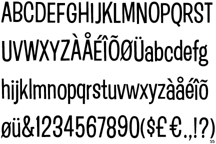
1. Readability is key. This is why any dialogue, story, or blocks of text should be written in a simple Sans Serif font. Serif fonts only work well in print for this purpose, but will create a cluttered and hard to read effect when used on a screen in long sentences or paragraphs.
2. Fonts have different categories, types, and uses. Here is a link to a PDF file that goes into the different types and uses of fonts. Put even more basically, there are fonts meant only for titles, banners, or headlines, and others meant for decoration. Only certain kinds of fonts are meant to be used for reading - so choose wisely.
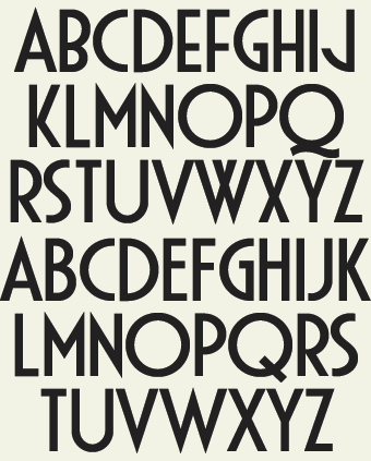
3. Fonts have a style. That is, each font has a feeling it evokes or a frame of mind it puts the viewer in. This is often caused by association of that font with a particular time or place. Fonts that were in widespread use or popularity during a particular decade can be used to evoke the feeling of that time period -
1920s-Early 1930s
1950s

1960s
1970s

1980s

4. If you use two different fonts, they should be very different - otherwise people will think you have made a mistake. Make sure all the fonts you use go together thematically, but make sure they cannot be confused for the same font.
5. There are certain fonts to avoid altogether if you don't want graphic designers screaming at the sky or feeling nauseous when they look at you work. Don't use Comic Sans, as it is over-used, poorly made, and never ever looks professional. In general, you should avoid fonts that are shipped with every Microsoft computer, as they are likely to be over-used and the reader is probably already tired of seeing them.
6. There are many good sites to get fonts off of - Dafont.com is one I use all the time. Regardless of where you get your fonts, ensure that the license allows for what you are using it for. Many are free and clear in the public domain, some may only be free for personal use. You will probably have to pay for the very best fonts.
To finish, fonts are part of the aesthetic of your game or work. They must be easily readable, match the tone and feeling of the work, and compliment the rest of the design. There are whole books written on the subject of picking and creating appropriate fonts. Good font selection can really elevate a game in an almost imperceptible way, while bad font choices can hurt your game's design and cause it to feel cheap or mismatched.
Re: How do you decide what fonts to use in your VN?
Thanks for the reference material, LateWhiteRabbit.
However, I still think outright banning serif fonts for the screen is severely limiting. Most of my future projects are set in steampunk or Victorian setting, and that's a setting with lots of serif usage. (Of course I'm not going to use cursive, that's just insane) Limiting serif font usage to only menu interfaces will make the main text feel out of place, since sans serif fonts tend to be modern fonts. They also tend to make the game look like a webgame using the default browser fonts.
However, I still think outright banning serif fonts for the screen is severely limiting. Most of my future projects are set in steampunk or Victorian setting, and that's a setting with lots of serif usage. (Of course I'm not going to use cursive, that's just insane) Limiting serif font usage to only menu interfaces will make the main text feel out of place, since sans serif fonts tend to be modern fonts. They also tend to make the game look like a webgame using the default browser fonts.
-
LateWhiteRabbit
- Eileen-Class Veteran
- Posts: 1867
- Joined: Sat Jan 19, 2008 2:47 pm
- Projects: The Space Between
- Contact:
Re: How do you decide what fonts to use in your VN?
The important thing to remember is that there are a large selection of different types of Serif and Sans Serif fonts.DaFool wrote:Thanks for the reference material, LateWhiteRabbit.
However, I still think outright banning serif fonts for the screen is severely limiting. Most of my future projects are set in steampunk or Victorian setting, and that's a setting with lots of serif usage. (Of course I'm not going to use cursive, that's just insane) Limiting serif font usage to only menu interfaces will make the main text feel out of place, since sans serif fonts tend to be modern fonts. They also tend to make the game look like a webgame using the default browser fonts.
Good San Serif fonts don't have to look like default browser fonts, and Serif fonts don't have to be unreadable on screen. Sans Serif fonts have been in use for nearly 300 years, so they could certainly fit in with a Steampunk setting if chosen wisely.
But again, rather than hard and fast rules, you just have to ensure that your selection of font:
1. Is easily readable at a glance
2. Is thematically and aesthetically appropriate
A Serif font may be appropriate for your game, and could be easily used as long as it fits the two criteria above. Just do research on the period and look you want, and remember certain things like Times New Roman wasn't invented until the 1930s, and so would be an inappropriate choice of a Serif font for a Steampunk game set in Victorian times.
Looking at advertisements and pictures from the time your story is set in can provide a road map and examples of what to try and use. Victorian newspaper ads for example. When you see a font you like in an old image, you can identify the font or one close to it by using a site like WhatTheFont!
-
PyTom
- Ren'Py Creator
- Posts: 16093
- Joined: Mon Feb 02, 2004 10:58 am
- Completed: Moonlight Walks
- Projects: Ren'Py
- IRC Nick: renpytom
- Github: renpytom
- itch: renpytom
- Location: Kings Park, NY
- Contact:
Re: How do you decide what fonts to use in your VN?
I'll note that serif fonts are significantly less bad in VNs then in the body text of a web browser. That's because we use fairly large font sizes in our games - IIRC, Ren'Py's default is 22 pixels, compared to the 16 of a web browser - and most web text is as small as 12-14.
Supporting creators since 2004
(When was the last time you backed up your game?)
"Do good work." - Virgil Ivan "Gus" Grissom(When was the last time you backed up your game?)
Software > Drama • https://www.patreon.com/renpytom
Re: How do you decide what fonts to use in your VN?
This I agree with. When the fonts are being designed with, such as creating a logo, buttons, interface etc. then using something fancy is fine. Once the player learns what it is, they'll remember it for next time. But something that is meant to be read, especially for a long period of time, should always be simple and clean - a sans serif type of font.PyTom wrote:I think this is in the right section.
I also think it's usually a bad idea to "spice up" the main text with a fancy font - where fancy font is pretty much any font that was designed more for style than for readability.
There are two places where I think fancy fonts are "ok". The first is in the user interface - the main menu, game menu, and so on. That's because the user spends a lot less time in these places - and so, if it takes twice as long to parse out a button's name, who cares? It doesn't add a continual burden to the user.
I don't mind reading serif fonts on the computer, in fact I prefer this in my MS Word document, but it also depends on the contrast. Put a dark font on a black background and I'm ready to kill someone, regardless of the type of font used.
A GxB game about designing your own clothes.
-
OtomeWeekend
- Eileen-Class Veteran
- Posts: 1087
- Joined: Tue Apr 19, 2011 1:29 am
- Location: Somewhere seaside
- Contact:
Re: How do you decide what fonts to use in your VN?
Thanks for the references and replies(and it seemed like this thread could help in improving ren'py too xD)
I like Comic sans(because it's pop and cute for some reason). So since it's not difficult to read, I might stick up to it? :v
I like Comic sans(because it's pop and cute for some reason). So since it's not difficult to read, I might stick up to it? :v
"The weak can never forgive. Forgiveness is the attribute of the strong." ---Mahatma Gandhi
I no longer use this account. Please refer to my new account, enta if you want to contact me. Thank you.
I no longer use this account. Please refer to my new account, enta if you want to contact me. Thank you.
Who is online
Users browsing this forum: No registered users