Looking for critique and feedback - Kazegen
Looking for critique and feedback - Kazegen
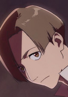
Just looking for a critique and some feedback. I've been going over various artists that I like and seeing what works and what doesn't, and this is what has come out of it. Hair... is difficult.
-
Tetiel
- Regular
- Posts: 194
- Joined: Tue May 17, 2011 3:52 am
- Projects: Anton's Vacation EP 1 and 2 + Rising Angels (CGs/Character Selection), Katajion Kinetic Monthly (character sprites)
- Location: Windsor, Ontario, Canada
- Contact:
Re: Looking for critique and feedback - Kazegen
Hair is indeed very difficult! I imagine you're mostly asking after coloring techniques. It looks to me that you're using three colors, a base, shadow, and highlight (do I detect color dodge?). For the areas around the neck and near the ears, you may want to also use a darker color because around that area, barely any light is allowed through. The highlights also look a bit unnatural since it looks like well... a ring around the head. The highlights would be gradual and would have very sharp jags since the actual hair would not be even. Also, be very careful to follow the light source which is coming from the top left according to how you did the eyes, but the hair looks like it's being shined upon from the top right.
Are you using a tablet or a mouse?
Are you using a tablet or a mouse?
-
Thyroid
- Newbie
- Posts: 12
- Joined: Sun Dec 04, 2011 8:41 pm
- Projects: Project White
- Organization: Divulge
- Contact:
Re: Looking for critique and feedback - Kazegen
I suggest moving the eyebrows up higher and maybe widening them if needed. The low placement on the face and similarity to the skin shading color makes them look like eyelids.
Re: Looking for critique and feedback - Kazegen
I'm going to agree with what the others said. I think the eyebrows should be raised a bit since right now it doesn't really look like he has eyebrows. Maybe widen them a bit too. Also the highlight looks out of place. I've seen a lot of different styles of highlights and a majority of what I've seen doesn't necessarily have to follow the rule of where the light is hitting. I've seen a lot of art where people just go crazy with the highlights (uh, sometimes myself included...) It really depends on what looks good to you. The highlight you have here seems to jagged and has a constant width which really makes it look boring. Maybe try smudging it here and there?
Also, I think the eyes are a little too far apart. Eyes should be at least one eye width apart and it looks like the space between the two is more than that. For the hair, you actually didn't do a bad job! The reason why it looks awkward is because the hair line is way too high. Lower the hair line, extend the bangs and it should look better. I hope this helped! C:
Also, I think the eyes are a little too far apart. Eyes should be at least one eye width apart and it looks like the space between the two is more than that. For the hair, you actually didn't do a bad job! The reason why it looks awkward is because the hair line is way too high. Lower the hair line, extend the bangs and it should look better. I hope this helped! C:
Re: Looking for critique and feedback - Kazegen
Actually, the position of the eyes are okay.. some styles are like that(I draw it like that sometimes, nothing wrong actually.) . The length of the eyebrows is okay too but I think you need to position it a little higher.(Not every chr have the same length for the eyebrows, do they?) For the hair, I think its a little too stiff, usually soft looking hair looks better (atleast I think so).
I don't mean to offend anyone ;A; Pls don't get mad at me lol.
I don't mean to offend anyone ;A; Pls don't get mad at me lol.
Re: Looking for critique and feedback - Kazegen
Yeah I think I'll take back my comment about the eyes. I was just looking at some of my own stuff and I don't even seem to be following my own advice o_o. Just play around with both and see what works better I guess!MonoPiero wrote:Actually, the position of the eyes are okay.. some styles are like that(I draw it like that sometimes, nothing wrong actually.) .
Re: Looking for critique and feedback - Kazegen
Re: Looking for critique and feedback - Kazegen
Yup, just bumping because.
Re: Looking for critique and feedback - Kazegen
No offence ok..? The colors and shading are a bit dull :/.. And if you want to highlight the hair, I don't recommend white (Its ok with low opacity though.) Eyes are drawn a bit weirdly.Kazegen wrote: Hey all, thanks for the critique and feedback. I just wanted to post a new piece, which I made after looking at your comments. I think I improved a lot, but hair still escapes me. More feedback and critique on the new piece will be very appreciated.
-
peong-keu
- Regular
- Posts: 38
- Joined: Sat Dec 04, 2010 7:58 pm
- Completed: My Magical Cosplay Cafe • Novus Magus Amorous
- Tumblr: saeun
- Deviantart: saeun
- Contact:
Re: Looking for critique and feedback - Kazegen
The tie isnt clearly attached in any way, if it were a clip on it should be hooked off the top between the collar folds, and if its tied on it should have something holding it around her neck under the collar (stemming from the sides of the folded square of the tie)
"weird" might be going too far, but the eyes should be closer to the same size even if shes leaning away a little, and the lines are a little messy
The hair is drawn especially well though, a very cute style, though the right half around the bangs has kind of a bald spot
The ribbons look great, and I like the style of cheek blush
-
EriksBlue
- Regular
- Posts: 36
- Joined: Tue Jul 19, 2011 3:56 pm
- Projects: Torn Apart
- Location: California
- Contact:
Re: Looking for critique and feedback - Kazegen
For your first drawing your characters eyes are too far apart. On the second picture the characters eyes are to large and she needs wider shoulders.

Who is online
Users browsing this forum: No registered users