What do you think of my *new*(AGAIN?) coloring style?

Questions, skill improvement, and respectful critique involving art assets.
Post Reply
Message
Author
User avatar
OtomeWeekend
Eileen-Class Veteran
Posts: 1087
Joined: Tue Apr 19, 2011 1:29 am
Location: Somewhere seaside
Contact:

What do you think of my *new*(AGAIN?) coloring style?

#1 Post by OtomeWeekend »

So here I am again changing my coloring style again!


My guardian devil: It's because of puberty, I promise! Hehehe...
My guardian angel: Hey, stop making up lies and excuses!
Me: I think I'm gonna side on mr. guardian devil here.....*dies*


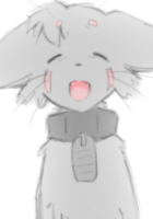
Um, here's an art example on question(a bit sketchy):
characters1.png
Any opinions?
"The weak can never forgive. Forgiveness is the attribute of the strong." ---Mahatma Gandhi

I no longer use this account. Please refer to my new account, enta if you want to contact me. Thank you.

User avatar
myapple
Regular
Posts: 151
Joined: Sat Jun 30, 2012 12:34 pm
Projects: RoG2.0, Stirling
Organization: red inc.
Location: Tokyo
Contact:

Re: What do you think of my *new*(AGAIN?) coloring style?

#2 Post by myapple »

I think it's quite soft and pretty~
However, the colour bleeds and overlapping aren't really my thing ^^; (it makes it seem more like a coloured sketch than an actual finished drawing)

User avatar
OtomeWeekend
Eileen-Class Veteran
Posts: 1087
Joined: Tue Apr 19, 2011 1:29 am
Location: Somewhere seaside
Contact:

Re: What do you think of my *new*(AGAIN?) coloring style?

#3 Post by OtomeWeekend »

myapple wrote:I think it's quite soft and pretty~
However, the colour bleeds and overlapping aren't really my thing ^^; (it makes it seem more like a coloured sketch than an actual finished drawing)
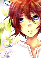
Actually, because it's is INDEED a sketch (^^;;) Shouldn't have said "a bit sketchy" xD
I was only going to ask people about opinions that's why I thought the sketchy one should be fine OTL
"The weak can never forgive. Forgiveness is the attribute of the strong." ---Mahatma Gandhi

I no longer use this account. Please refer to my new account, enta if you want to contact me. Thank you.

User avatar
Alera
Miko-Class Veteran
Posts: 651
Joined: Sun Mar 21, 2010 3:20 am
Completed: Tortichki // Zayay // Hero's Spirit
Deviantart: psyalera
itch: psyalera
Location: UK
Contact:

Re: What do you think of my *new*(AGAIN?) coloring style?

#4 Post by Alera »

It looks nice~ Though I think if you use some more contrasting colours for your shadows it will add more depth to the picture. What I mean is that you shouldn't be afraid to use darker colours for the shadows sometimes, don't be afraid to play around some more with your colour choices too, try mixing green with some purple in the shading for example!
Image
Games:
❤️ Zayay [Otome?][BxPlayer][NaNo 2013]
❤️ Tortichki [Drag&Drop mini game]

Other games I've worked on:
My Heart's Flame Emissary of Starlight Freedom From Silence Sickness
And many more unannounced/secret projects. (. .)

User avatar
chocojax
Miko-Class Veteran
Posts: 705
Joined: Sun Oct 25, 2009 11:27 am
Projects: Umbra, Familiarity, Maleficent Justice
Tumblr: chocojax
Location: California
Contact:

Re: What do you think of my *new*(AGAIN?) coloring style?

#5 Post by chocojax »

I was about to write what Alera wrote, haha.

I really like bold, bright colors since they draw my attention+are more appealing to look at. Here's something that I got from toying around with the hues and stuff.

Though, if you're just going for soft, nice colors, you should take the original and make it slightly more saturated.
Attachments
thin.png

User avatar
OtomeWeekend
Eileen-Class Veteran
Posts: 1087
Joined: Tue Apr 19, 2011 1:29 am
Location: Somewhere seaside
Contact:

Re: What do you think of my *new*(AGAIN?) coloring style?

#6 Post by OtomeWeekend »

↑I just remembered that it's opacity was set in 68% and that's why it looks like that. :)

Aherm, this is the real thing(not the sketch anymore xD)
finished!
finished!
I added some useless details just to add some atmosphere on it :P

*I hadn't put any saturation on it, btw.
"The weak can never forgive. Forgiveness is the attribute of the strong." ---Mahatma Gandhi

I no longer use this account. Please refer to my new account, enta if you want to contact me. Thank you.

User avatar
FatUnicornGames
Miko-Class Veteran
Posts: 576
Joined: Sun Mar 25, 2012 7:54 pm
Projects: Club Shuffle
Contact:

Re: What do you think of my *new*(AGAIN?) coloring style?

#7 Post by FatUnicornGames »

I hate to say, but I think I like Choco's version right now. The drawing is so lovely and I feel like I can't see the line work in the original version as well. In the new version it is almost impossible to see the line work clearly.
Image
Developer Blog for Club Shuffle - Follow and Share?
-Also! You can call me Crystal if you want.-

User avatar
Sapphi
Eileen-Class Veteran
Posts: 1685
Joined: Fri Jun 05, 2009 3:31 am
Completed: Boku no Taisetsu na Yumeko
Projects: Twelve, PAW ★ PRINTS
Organization: Kitsch-soft
Location: Illinois, USA
Contact:

Re: What do you think of my *new*(AGAIN?) coloring style?

#8 Post by Sapphi »

OtomeWeekend wrote: Aherm, this is the real thing(not the sketch anymore xD)
I like the muted colors, but I'd like to see darker shadows. The shading under the necks and hair is very underwhelming. Also, I'm not sure how I feel about the color of the lines. They look good on the middle character, but out of place on the other two. The cool blue hair looks strange with the warm color of the lines. It's producing a bit of uncomfortable dissonance.

A minor complaint - what's with the shiny necks and jaws? The T-zone of the face can be shiny, and a little shininess on the cheeks is natural too, but a shiny neck just makes a person look sweaty. I'm feeling a little overheated just looking at that poor guy on the right, wearing all that fur but looking so flushed. :lol:

Oh, speaking of looking flushed... if the middle character is supposed to be blushing, the blush color should be carried over the tops of his cheeks keeping the structure of them in mind. Those big circles are making the face look sunken right now. (Strangely, the upped-saturation version chocojax posted doesn't have this problem.)
"It is [the writer's] privilege to help man endure by lifting his heart,
by reminding him of the courage and honor and hope and pride
and compassion and pity and sacrifice which have been the glory of his past."
— William Faulkner
▬▬▬▬▬▬▬▬▬▬..+X+..▬▬▬▬▬▬▬▬▬▬
Image

TrickWithAKnife
Eileen-Class Veteran
Posts: 1261
Joined: Fri Mar 16, 2012 11:38 am
Projects: Rika
Organization: Solo (for now)
IRC Nick: Trick
Location: Tokyo, Japan
Contact:

Re: What do you think of my *new*(AGAIN?) coloring style?

#9 Post by TrickWithAKnife »

It's not really about your colouring style, but for that particular picture I'm not so fond of the background colour. It's too similar to the skin colour of the characters. Same thing with the text and speech bubbles. There is not enough contrast, so it doesn't stand out so much.
Everything else looks great to me, but I'm no artist.
"We must teach them through the tools with which they are comfortable."
The #renpy IRC channel is a great place to chat with other devs. Due to the nature of IRC and timezone differences, people probably won't reply right away.

If you'd like to view or use any code from my VN PM me. All code is freely available without restriction, but also without warranty or (much) support.

H.S.
Newbie
Posts: 8
Joined: Fri Aug 10, 2012 4:55 am
Location: Russia
Contact:

Re: What do you think of my *new*(AGAIN?) coloring style?

#10 Post by H.S. »

Good palette and beauty coloring, but shades and lights too pale, IMHO :wink:

Post Reply

Who is online

Users browsing this forum: No registered users