hey, searched the forums/stickies but couldn't find anything detailed on graphic design tutorials/resources.
- any tutorials/sites teaching graphic design concepts beyond color theory?
like a college course or text, but free, and with lots of examples to illustrate the concepts?
- or websites with lots of design ideas for inspiration/free resources?
i don't want to reinvent the wheel. and this is an area that i really want to improve in.
tnx.
need help. any GRAPHIC DESIGN TUTORIALS/RESOURCES?
-
unknown5

- Veteran
- Posts: 311
- Joined: Tue Apr 20, 2010 1:41 pm
- Completed: (see sig)
- Projects: slit-mouth girl, purifier, etc.
- Contact:
need help. any GRAPHIC DESIGN TUTORIALS/RESOURCES?
information wants to be free, yo.
-
dramspringfeald
- Miko-Class Veteran
- Posts: 825
- Joined: Tue May 03, 2011 2:45 pm
- Projects: The Echo, CBlue, Safety_Dance
- Location: ABQ-USA
- Contact:
Re: need help. any GRAPHIC DESIGN TUTORIALS/RESOURCES?
need help. and COOKING TUTORIALS/RESOURCES?
- any tutorials/sites teaching Cooking concepts beyond ramen?
like a college course or text, but free, and with lots of examples to illustrate the concepts?
- or websites with lots of cooking ideas for inspiration/free resources?
i don't want to reinvent the wheel. and this is an area that i really want to improve in.
===
Could you be more specific? GD is an entire filed of study. What kind of subject do you want to take up?
> CGI
> Modeling
> CGI Animation
> Flash
> Webside design
> Concepts design
> Theory
> Building design
> Comic books
> Drawing With a computer
> Drawing without a Computer
> how to use a pencil?
> Weapons designs
> How to draw my little pony
> Modern arts
the list goes on.
Don't be a Poser! Learn to Draw
Learn to Draw with Stan Lee
Learn to Draw with Mark Crilley
If you want you can brows my art. My art can be found at...FA // IB // DA Neglected for a few years so I'm just now updating it
Learn to break a bone to break a bone,
Learn to build a house to build a house,
Learn to make a Game to make a Game.
-
unknown5
- Veteran
- Posts: 311
- Joined: Tue Apr 20, 2010 1:41 pm
- Completed: (see sig)
- Projects: slit-mouth girl, purifier, etc.
- Contact:
Re: need help. any GRAPHIC DESIGN TUTORIALS/RESOURCES?
wah, that's a lot. 
ok, the way i was thinking was take away the sprites, cg, bg.
what's left?
the artistic elements like titles, menus, logos, typography, etc.
the whole look, feel, layout, color scheme, presentation, packaging, etc. of the game.
that's kinda what i had in mind.
it really seems to make a difference in the professional polish/look of the whole thing.
tnx.
information wants to be free, yo.
-
Googaboga

- Eileen-Class Veteran
- Posts: 1395
- Joined: Wed Dec 12, 2012 1:37 pm
- Completed: https://gbpatch.itch.io/
- Projects: Floret Bond, XOXO Blood Droplets, Our Life
- Organization: GB Patch Games
- Tumblr: gb-patch
- itch: gbpatch
- Contact:
Re: need help. any GRAPHIC DESIGN TUTORIALS/RESOURCES?
So you are looking for help with GUI (graphical user interface)? There is a topic on this site all about GUI. If you read through that you can find lots of helpful links and advice:
http://lemmasoft.renai.us/forums/viewto ... 46&t=15069
http://lemmasoft.renai.us/forums/viewto ... 46&t=15069
In-Progress:
Floret Bond, XOXO Blood Droplets, Our Life
Released:
A Foretold Affair, My Magical Divorce Bureau, XOXO Droplets, Lake of Voices
Floret Bond, XOXO Blood Droplets, Our Life
Released:
A Foretold Affair, My Magical Divorce Bureau, XOXO Droplets, Lake of Voices
-
unknown5
- Veteran
- Posts: 311
- Joined: Tue Apr 20, 2010 1:41 pm
- Completed: (see sig)
- Projects: slit-mouth girl, purifier, etc.
- Contact:
Re: need help. any GRAPHIC DESIGN TUTORIALS/RESOURCES?
yup, already went thru that thread. =)Googaboga wrote:So you are looking for help with GUI (graphical user interface)? There is a topic on this site all about GUI. If you read through that you can find lots of helpful links and advice:
http://lemmasoft.renai.us/forums/viewto ... 46&t=15069
but looking for more detailed instruction on concepts, principles, things to keep in mind when creating a design - like use of space, balance, shapes, colors, readability, avoiding clutter, aesthetics, basic types of designs, patterns, examples, why is design X better than design Y, what is good about design A, what is bad about design B, how can design C be improved, how does design D attract the eye, what about design E is distracting, etc.
i want to train myself to be able to 'see' and 'think' like a graphic designer sees and thinks. when i see a good design, i want to be able to take it apart and understand what elements and artistic ingenuity make that design work and be effective.
the difference is huge between someone with training and a hobbyist like myself. it's like wrapping a gift professionally or stuffing it in a greasy brown paper bag (me). heh.
i just want to improve enough so that it looks okay and doesn't detract from the overall work, and hopefully, even adds to the quality.
edit: kinda like these, i suppose, but in more detail? haven't had a chance to go thru all of them yet ...
http://justcreative.com/2008/06/13/how- ... he-basics/
http://psd.tutsplus.com/articles/web/50 ... gn-theory/
information wants to be free, yo.
-
Auro-Cyanide

- ssǝʇunoƆ ʇɹ∀
- Posts: 3059
- Joined: Sun Jul 25, 2010 9:02 am
- Completed: http://auro-cyanide.tumblr.com/visualnovels
- Projects: Athena
- Organization: Cyanide Tea
- Tumblr: auro-cyanide
- Deviantart: Auro-Cyanide
- Location: Melbourne, Australia
- Contact:
Re: need help. any GRAPHIC DESIGN TUTORIALS/RESOURCES?
I've been meaning to write a Graphic Design Guide for a while but I haven't gotten around to it yet >_> I have a Bachelor of Arts majoring in Graphic Design and currently work as a corporate Graphic Designer in a large business, I figure I might be able to actually articulate some of what I know. I think.
Anyway, it seems you have some idea of the elements and principles of graphic design like colour, balance, typography etc. That's what we learn in our first year. The other two years are spent trying to actually figure out how they relate to what we see around us, and boy that took a long time.
It's really hard to say how to make good design. The majority of the time it feels really instinctual. You play by a lot of the rules simply out of design sensibility. So there isn't a paint by numbers guide on how to do it well and a lot of it is experimentation to see what looks good.
The best advice I can give you right now is to do a whole heap of research, find as many different samples as you can. Then mimic them with different material. Mimicking can force you to actually think about what each part is doing and why and how you need to apply it to your new information. Analyse the emotions and genres behind different pieces as you go so you can start understanding why one thing reads as something and another reads as something else.
Graphic Design is like art, it takes time to develop the skills and the taste to do it well. So as long as you start and make sure you are thinking carefully about it, you should make progress
This is one of my favourite inspiration sites, but it is mostly traditional design: http://www.mr-cup.com/blog.html
As for GUI, try looking up either web design interfaces or heads up displays for games. Those two tend to give you better results then looking up GUI.
-
unknown5
- Veteran
- Posts: 311
- Joined: Tue Apr 20, 2010 1:41 pm
- Completed: (see sig)
- Projects: slit-mouth girl, purifier, etc.
- Contact:
Re: need help. any GRAPHIC DESIGN TUTORIALS/RESOURCES?
thanks for the link! i was hoping you'd post. 
whenever i try a design that is complex or has too many elements, it looks like an awful, cluttered mess, so i end up being forced to go with something simple.
and i'm stuck at simple and can't move from it. (not that simple is a bad thing, but it just sucks being stuck there, lol)
i really admire how some people can create complex, sophisticated designs that are beautiful to look at while conveying information so clearly and/or balancing diverse elements.
it's an amazing skill and talent.
information wants to be free, yo.
-
Auro-Cyanide
- ssǝʇunoƆ ʇɹ∀
- Posts: 3059
- Joined: Sun Jul 25, 2010 9:02 am
- Completed: http://auro-cyanide.tumblr.com/visualnovels
- Projects: Athena
- Organization: Cyanide Tea
- Tumblr: auro-cyanide
- Deviantart: Auro-Cyanide
- Location: Melbourne, Australia
- Contact:
Re: need help. any GRAPHIC DESIGN TUTORIALS/RESOURCES?
Do you have an example of something you think is getting too cluttered? It will be easier to give you some pointers if I can see what you are up to Though don't undervalue simplicity. Designers love it because it serves out ultimate goal, to communicate. Everything should be in the interest of communicating correctly to the receiver and so nothing should be there that isn't doing something towards that goal. Often these 'extra bits' would simply confuse or convolute the message. That said, getting simply but clear designs can be hard when you have a billion things going on (like annual reports >_>).
-
unknown5
- Veteran
- Posts: 311
- Joined: Tue Apr 20, 2010 1:41 pm
- Completed: (see sig)
- Projects: slit-mouth girl, purifier, etc.
- Contact:
Re: need help. any GRAPHIC DESIGN TUTORIALS/RESOURCES?
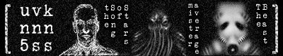
urgh, i don't want to post this since this is really, really, REALLY bad and embarrassing, but what the heck.
the important thing is to improve, right? or to embarrass oneself horribly while trying.
okay, so i'm kinda trying to cram a lot of things in all at once, and it's making a cluttered mess. =(
- certain ideas: puzzles, recombination, interlocking, fit, key, morbid/macabre things, a bit of sci-fi, hidden meanings, etc.
- when u hover over the keys, the letters rearrange properly
- i need to come up with better anagrams. 'tarts' and 'bint'??? oTL
- yeah, MiStEr average -> Star Eve Mirage (also the letters float around and become distorted)
- the fuzzy letters in the background also change and move. unfortunately, it looked like the flashing neon lights of a cheap motel.
w00t! it might work well for a serial killer ripper character, i suppose. but unfortunately, this is not that.
- the fuzzy letters are the combination of the title screens i use for each section of the story - school, home, girl, etc.
- another complication. it looks TOO MUCH like a puzzle/mystery screen. problem is that it's a kinetic horror novel without puzzles. and i'm sure someone looking at the menu will think there are puzzles inside. oTL AAAAAARGH.
- minor thing. i kinda wish one key could be aligned vertically up and another down because the 'skull' also looks like a pelvic bone. but that's kinda like complaining about burnt toast while the house is burning down.
- also the spiral tower thingy in the bell curve is kinda like an image that i use later.
so, it's a mess ... QQ.
anyhoo, i was thinking of pretty much nuking the whole damn thing and salvaging what i could, lol. i.e. go simple ... again. oTL
(probably keep the keys. ditch the fuzzy letters. keep the title and bell curve, but center it. put some sort of border design around the whole thing for a gothic fence kinda look. dunno. might be kinda boring tho.)
edit: oh yeah, lambda is backwards, but so much to fix, it didn't even register.
the important thing is to improve, right? or to embarrass oneself horribly while trying.
okay, so i'm kinda trying to cram a lot of things in all at once, and it's making a cluttered mess. =(
- when u hover over the keys, the letters rearrange properly
- i need to come up with better anagrams. 'tarts' and 'bint'??? oTL
- yeah, MiStEr average -> Star Eve Mirage (also the letters float around and become distorted)
- the fuzzy letters in the background also change and move. unfortunately, it looked like the flashing neon lights of a cheap motel.
w00t! it might work well for a serial killer ripper character, i suppose. but unfortunately, this is not that.
- the fuzzy letters are the combination of the title screens i use for each section of the story - school, home, girl, etc.
- another complication. it looks TOO MUCH like a puzzle/mystery screen. problem is that it's a kinetic horror novel without puzzles. and i'm sure someone looking at the menu will think there are puzzles inside. oTL AAAAAARGH.
- minor thing. i kinda wish one key could be aligned vertically up and another down because the 'skull' also looks like a pelvic bone. but that's kinda like complaining about burnt toast while the house is burning down.
- also the spiral tower thingy in the bell curve is kinda like an image that i use later.
so, it's a mess ... QQ.
anyhoo, i was thinking of pretty much nuking the whole damn thing and salvaging what i could, lol. i.e. go simple ... again. oTL
(probably keep the keys. ditch the fuzzy letters. keep the title and bell curve, but center it. put some sort of border design around the whole thing for a gothic fence kinda look. dunno. might be kinda boring tho.)
edit: oh yeah, lambda is backwards, but so much to fix, it didn't even register.
information wants to be free, yo.
-
MaiMai

- Yandere
- Posts: 1757
- Joined: Sat Mar 21, 2009 6:04 pm
- Completed: [Phase Shift]
- Projects: [ None ]
- Organization: Paper Stars
- Tumblr: maiscribbles
- Deviantart: maiscribble
- Location: USA, Southern California
- Contact:
Re: need help. any GRAPHIC DESIGN TUTORIALS/RESOURCES?
I notice that you have a lot of blur/fuzz effects that applies to your drawings and now that it's with the typography... I can honestly say ditch it. You'll want clarity instead of fuzz.
 COMMISSIONS AVAILABLE (check Tumblr sidebar)
-
unknown5
- Veteran
- Posts: 311
- Joined: Tue Apr 20, 2010 1:41 pm
- Completed: (see sig)
- Projects: slit-mouth girl, purifier, etc.
- Contact:
Re: need help. any GRAPHIC DESIGN TUTORIALS/RESOURCES?
the text in the back is intentionally blurred heavily to make it almost unreadable except for flickers of clarity using animation. but the idea didn't work out like i had visualized inside my head (the cheap motel effect). meh. looks horrible, so i was just going to simplify and ditch it. sometimes ideas work out. other times. urgh. this happens, heh.MaiMai wrote:I notice that you have a lot of blur/fuzz effects that applies to your drawings and now that it's with the typography... I can honestly say ditch it. You'll want clarity instead of fuzz.
edit: at least now i know how to animate the neon lights for a cheap motel scene.
information wants to be free, yo.
-
Auro-Cyanide
- ssǝʇunoƆ ʇɹ∀
- Posts: 3059
- Joined: Sun Jul 25, 2010 9:02 am
- Completed: http://auro-cyanide.tumblr.com/visualnovels
- Projects: Athena
- Organization: Cyanide Tea
- Tumblr: auro-cyanide
- Deviantart: Auro-Cyanide
- Location: Melbourne, Australia
- Contact:
Re: need help. any GRAPHIC DESIGN TUTORIALS/RESOURCES?
Haha, I wouldn't worry about it. You should see some of my older things. Plus, this will make it MUCH easier to actually explain to you what you need to do.
Disclaimer: I'm a graphic designer, not a web designer. While principles are shared, I do lack specific on-screen knowledge as I specialise in print. Also, I'm still learning about GUI myself.
First up, I don't think it's a matter of how many things you have that is making it look cluttered, but more how many different things that are going on. The key to GUI is usability. Right now your design is rather confusing to look out and it's a bit hard for players to immediately tell what they are meant to do. Everything isn't working together to form one message, and so it comes across as bits and pieces. This will immediately make it a weak design. The other things letting you down is a confusing tone of voice and image quality.
First thing you need to do is pin down your tone of voice. Pick 2-3 words that you want your design to immediately invoke in your audiences mind. You say you want it to be morbid, secretive and dark, but then you have used a rounded san serif which is seen as friendly, happy and informal. Visuals all read a certain way, so when you are picking out your pieces take a moment to think about how something reads. Does it seem friendly or cold? Formal or informal? Is there a cultural message? Picking out typefaces especially can be a pain, but if you pick out our tone of voice and theme you can usually search with those in mind.
Second you need to think about you GUI as a whole. GUIs are a bit like a brand. It's something that has to be consistently used throughout the game, you have to follow your own rules (and know when to break them) and make sure everything 'belongs'. This is a tough task. It's hard to create a flexible design that can be used over multiple functions. I generally start with the in game menu for this reason. The in game menus are the GUI that the player will see the most and has to be very functional. Start with your text box, option menu, choices and quit menu first and work out your problems and designs there. Use thumbnail sketches as well if you need to nut out your composition idea. I also often start with a logo since that is what I am used to and a logo often forces you to solidify you idea into a simple design.
Right now it feels like you are wanting to say too much at once, and so it's getting a bit missed up. Instead, pick ONE element to be the consistent element through your design. It could be the code, it could be the graph, it could be the pattern, it could be the key, but it can only be one. This element will be the primary element that you can use multiple times. Make sure you create it properly. Right now your keys aren't very well formed or clear and so it's hard to figure out what they are. If it helps, try using a vector program like Inkscape to create your one element well.
As you work, you need to create 'RULES'. This is one of the basics of graphic design since it gives us structure and usually results in much better design. The rules consist of things like grids that everything line up to, making sure all your typography follows conventions (eg, headings in bold, body in light, notes in italic), imagery matches (using the same colours consistently, same opacities consistently etc). These rules act as guides only, since you do break them when you need to, but you only break them when you have a good reason. You should always be able to back up your choices with rationale as to WHY you just did what you did and why you think it's a good solution. Basically if you think carefully about what you are doing and matching it to what you have previously done (or editing what you have previously done to match what you are doing now) you'll find you will start following patterns and these will help you solve problems that you come across. Don't know where to stick a menu? What did you do previously? Can you apply the same rules? Can you adjust the rules while still keeping the meaning?
Based specifically on your current design a couple things for you to think about:
-Why are your menu elements separated into 3 groups? Do these groups have meaning? If not, maybe consider keeping them together as one element.
-Is there another way you can display the decoding element? How many ways could you do it? Is there a way that could specifically relate to your game?
-Do you think it's a good idea that all the menu items are unreadable at the beginning? Maybe the title would be enough. Maybe there is something else you could do with them.
-Does it have to be in black and white? Could colour help you convey a message?
-How is your main menu going to influence/be a part of the rest of your design?
-Maybe you can try dividing your canvas and giving different elements to different parts?
-Your title should be the dominate element (whether it's bigger, brighter or bolder) followed by the menu. Nothing else should get in the way of you communicating that clearly to the viewer.
-Do you think it's a good idea to repeat the same visual element, like the keys, in such a way? Does it look interesting or does their similarity distract?
-Rethink you typeface choice. Something more straight/sharp would be better.
Phew, hopefully that will be of some help? I tried to explain as clearly as I could, but I often have trouble with this type of thing orz Please feel free to ask any questions ^_^
-
arachni42

- Veteran
- Posts: 341
- Joined: Mon Feb 25, 2013 6:33 pm
- Organization: no, I'm pretty messy
- Location: New York
- Contact:
Re: need help. any GRAPHIC DESIGN TUTORIALS/RESOURCES?
Don't be embarrassed; it definitely takes practice. I agree that it's not the number of things you have that makes it look crammed, but the usage of space and lack of readability. I think Auro-Cyanide did a good job of summing up principles and goals. You want the visual message to look unified.unknown5 wrote:the text in the back is intentionally blurred heavily to make it almost unreadable except for flickers of clarity using animation. but the idea didn't work out like i had visualized inside my head (the cheap motel effect). meh. looks horrible, so i was just going to simplify and ditch it. sometimes ideas work out. other times. urgh. this happens, heh.
Some other thoughts:
But unified doesn't mean uniform. The blur is not working for a couple reasons. For one, since nothing is clear, it all just looks hard to read. I think the blurring should be used more discriminately and it's important that the title be clearer. Second, the blur effect is very... even. Try mixing it up a bit. For example, instead of something like this:
- blur1.jpg (4.93 KiB) Viewed 2917 times
- blur2.jpg (5.43 KiB) Viewed 2917 times
(Re-reading I guess it's supposed to be Star Eve Mirage, right? Sorry bout that; it was just a thing I did quickly to show what I meant about blur, so ignore the actual content!
You should consider more than grayscale, even if it's a monochrome tint. There are more ways to make the background text recede into the background than blur -- right now you've got white on black, but if you used two colors with less contrast between them, they would work together more as a background. Also note that sometimes some texture in the background helps. (Note that the text over the keys looks busy because, in part, of that lack of contrast.)
You said there's an effect you're aiming for, and it's probably not just "inside your head." I bet you've seen elements of it before in other graphic design! I definitely suggest looking for some references! Look for specific references from things that gave you the same feeling that you want to convey. If you're thinking gothic fence, find some pictures and ask yourself what makes it them look gothic fence-ish? Find things that don't look gothic and figure out what makes them not look gothic. If you're thinking of skulls, look at how they are used in other media and your impressions of what looks good and doesn't.
In general, every time you watch a movie, or see a logo, or play a game, pay attention to the graphic design elements. Ask yourself: what thy are trying to say, and how are they doing it? Even if you don't know the answer, you'll start to see patterns and come up with answers of your own. Look at the colors, the fonts, the layouts, the animations. Note the year that it came out. Things that visually said "sci-fi" in the 70s look different than things that visually say "sci-fi" now... although some designers now will specifically choose elements that say "sci-fi in the 70s." (Check out the Fallout series for a message that conveys both future and past.)
Good luck!

-
unknown5
- Veteran
- Posts: 311
- Joined: Tue Apr 20, 2010 1:41 pm
- Completed: (see sig)
- Projects: slit-mouth girl, purifier, etc.
- Contact:
Re: need help. any GRAPHIC DESIGN TUTORIALS/RESOURCES?
wow, guys! thanks for taking the time and trouble to give such detailed advice.
it takes a lot of thought and takes away from your free time, so i really, really appreciate it! =D
a lot of stuff to digest, so i'm gonna go through it all slowly and try my best applying the principles and advice and see what happens. should be interesting! i'm sure i'll make mistakes, but i just want to get better.
thanks! =D =D =D
information wants to be free, yo.
-
unknown5
- Veteran
- Posts: 311
- Joined: Tue Apr 20, 2010 1:41 pm
- Completed: (see sig)
- Projects: slit-mouth girl, purifier, etc.
- Contact:
Re: need help. any GRAPHIC DESIGN TUTORIALS/RESOURCES?
thank you for your great advice. it made me rethink completely what i was trying to achieve and the message i was trying to convey. i never considered that a visual design could have a 'tone of voice'. and the mentioning of the retro layouts reminded me of what i wanted to do previously with my other lovecraft kn.
i wanted to create a link between the past and present, and perhaps future, by connecting the old pulp horror novels with visual novels. so i'm gonna go with a pulp horror-inspired design. before there wasn't a purpose or message to my design, but now i have one that is clear. and this is also something that i can use for future stories to create a consistent visual theme across multiple works.
hopefully, i won't screw this one up, lol.
edit: i dun wanna turn this into a personal critique thread, so i'll just toss the rough design for the new menu over in the personal arts section. thanks again.
information wants to be free, yo.
Who is online
Users browsing this forum: No registered users