
owo
Just a little tweak and you got that already! And, yeah, it's always been my biggest weakness: editing. I should really learn how to edit them properly. Mind if I post this picture once I'm finished with it? I'll show you what I learned from you ^^ And, do you think it's okay to post another picture if I find something wrong again?
All in all, this really helps! You're a great and kind person for taking your precious time to help the community. Salute!
Melody's Art Tutoring/Critiques [Open]
-
MelodyKnighton

- Regular
- Posts: 72
- Joined: Sun May 04, 2014 4:53 pm
- Projects: too many
- Organization: Los Muertos Studios
- Tumblr: MelodyKnighton
- Contact:
Re: Melody's Art Tutoring/Critiques [Open]
Aw that's sweet of you to say. I just really like teaching and it's a good warm up, so win/win. Glad to hear it's been helping people. And yes, of course show me your future work. I'd love to see how everyone is improving! : )
Re: Melody's Art Tutoring/Critiques [Open]
Hoho, you deserve the praise! I'm teaching some of my underclass men for my part time job, but I never really liked it, so I think you're awesome in so many ways.
Anyway, without any shame, here you go:
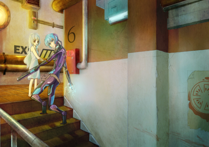
I was playing with editing; color burn, contrast, etc. And a bit too much textures XP
I'm not too sure about the colour and lighting though. I think there's not much depth in it, and a bit too saturated? I'm not satisfied with the two boxes near the window, but... meh, I'm too lazy to fix it. (And don't mind the messy sketch ^^) What's your opinion?
Anyway, without any shame, here you go:
I was playing with editing; color burn, contrast, etc. And a bit too much textures XP
I'm not too sure about the colour and lighting though. I think there's not much depth in it, and a bit too saturated? I'm not satisfied with the two boxes near the window, but... meh, I'm too lazy to fix it. (And don't mind the messy sketch ^^) What's your opinion?
-
MelodyKnighton
- Regular
- Posts: 72
- Joined: Sun May 04, 2014 4:53 pm
- Projects: too many
- Organization: Los Muertos Studios
- Tumblr: MelodyKnighton
- Contact:
Re: Melody's Art Tutoring/Critiques [Open]
Oh yeah, that looks really nice Disciple! You pick up on things really fast. : )
I like it how it is, but I made a couple subtle changes to just show you a quick trick that I use in editing. Your picture is perfectly fine without it, but it might help for future work.
I tend to be a bit heavy handed with contrast and saturation in my images, so to tone it down and even things out a bit, I copy the merged layer and apply a photoshop action to it. The one I use is one of a million you can find all over the web that fakes the 'retro' 'hipster' 'vintage' photo look. So I apply it to the photo, merge it down so I have two layers (the original image and the 'filtered' image). then I lower the opacity of the filtered one to 22%. The result is a softer image with pretty and vibrant colors like you see in most professional VN's, but subtle enough that it won't change your art.
I used that on your image and ended up with this. Your characters seem to be blending into the scene a little more naturally now, but other than that the change is minimal and purely aesthetic. Hope it helps. Really great job!
-
kisa

- Veteran
- Posts: 384
- Joined: Sat Aug 27, 2011 7:08 pm
- Completed: Brother Rose, Dogs Alone
- Projects: So many projects, I can't name them.
- Deviantart: tsubasafan135
- Skype: Discord: Kisaofbishies#6680
- itch: kisa
- Contact:
Re: Melody's Art Tutoring/Critiques [Open]
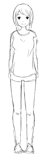
How's the anatomy on this one?
(This character has much more natural proportions ^u^')
(This character has much more natural proportions ^u^')
- Attachments
-
I'm offering commissions!
viewtopic.php?f=62&t=41656
viewtopic.php?f=62&t=41656
Re: Melody's Art Tutoring/Critiques [Open]
Oh, that really makes the character blended in more. owo
Thanks, Melody! This really helps! I'll be sure to practice more and more ^v^
Thanks, Melody! This really helps! I'll be sure to practice more and more ^v^

Re: Melody's Art Tutoring/Critiques [Open]
I feel like a lots off with the anatomy but can't seem to spot the mistakes. I'm much more comfortable with drawing more dynamic poses (lots of Vipplu), but when I draw static poses, it looks pretty bad..

Re: Melody's Art Tutoring/Critiques [Open]
You seem busy ><
But still, I really need you !
I've been asked to draw a kind of mascot for a forum, but I've never draw on a tablet (This is my first drawing)
About the drawing:
I don't know about the tool I should use, and how to make the lines look cleaner so that it would be easier to put colour later.
About colouring:
Heeeh... I think it was a complete slaughter...
It's reaaallly awful though I tried to check a tuto (Coloring each layer alone, then passing them into "product" and then erasing what's superfluous.
Here they are:
- Attachments
-
[The extension exe has been deactivated and can no longer be displayed.]
Re: Melody's Art Tutoring/Critiques [Open]
-EDITED-
Sorry for the double post...
Sorry for the double post...
-
MelodyKnighton
- Regular
- Posts: 72
- Joined: Sun May 04, 2014 4:53 pm
- Projects: too many
- Organization: Los Muertos Studios
- Tumblr: MelodyKnighton
- Contact:
Re: Melody's Art Tutoring/Critiques [Open]
always room for more. Sorry for the delay to those waiting to hear back, I get swamped with freelance work towards the end of the month every month so it might take a little while but I'll get to you as soon as I can. : )
-
anothernoona
- Newbie
- Posts: 15
- Joined: Fri Jul 26, 2013 11:57 pm
- Projects: Hetalia VN
- Contact:
Re: Melody's Art Tutoring/Critiques [Open]
I want feedback on one of the sprites I did for my newest project. I didn't lined it yet cause I'm scared there's major errors in it :/
Thank you for your help
Thank you for your help
- Attachments
-
- DONT MIND THE STUPID TEXT PLEASE
-
Rinima

- Eileen-Class Veteran
- Posts: 1078
- Joined: Wed Jul 17, 2013 3:31 pm
- Projects: WtRF
- Organization: Harmonic Dreams
- IRC Nick: Rinima or Charlie
- Deviantart: Emlindes
- Location: England
- Contact:
Re: Melody's Art Tutoring/Critiques [Open]
Totally off topic and I could get my arse kicked for this but is that Spain out of Hetalia?anothernoona wrote:I want feedback on one of the sprites I did for my newest project. I didn't lined it yet cause I'm scared there's major errors in it :/
Thank you for your help
Are you making a Hetalia vn?
Cause if so, please direct me to your WIP if you have one and I will love you forever.
Like, seriously love you.
Pronouns: They/them or He/him
-
kelsaki
- Regular
- Posts: 71
- Joined: Sun Jan 05, 2014 11:40 pm
- Projects: Maiden Iron
- Location: AL
- Contact:
Re: Melody's Art Tutoring/Critiques [Open]
@melodyknighton
- This thread is a great idea and help to everyone! Thank you for offering your time and expertise in helping answer all these questions If you can find the time (and if not it's entirely fine ) I would love a few notes about character development. This is mostly relating to how you use style to create characters yet make their personality show yet they still look like they belong in the same world.
Things I have tried to help me become better:
-Height Chart:
- I have also looked at so many expression sheets that I have a folder dedicated just to that research.
Examples of a few characters I have tried to create:
- This thread is a great idea and help to everyone! Thank you for offering your time and expertise in helping answer all these questions
Things I have tried to help me become better:
-Height Chart:
- I have also looked at so many expression sheets that I have a folder dedicated just to that research.
Examples of a few characters I have tried to create:
- This is the oldest of the designs.
Maiden Iron info --->http://lemmasoft.renai.us/forums/viewto ... 16&t=24812
Request/Critique Thread --->http://lemmasoft.renai.us/forums/viewto ... 54&t=24973

Re: Melody's Art Tutoring/Critiques [Open]
Hello! I would really appreciate it if you could give me critiques about my art in general (especially when it comes to coloring) whenever you have the time ^w^
Heres just some drawings I did for fun that were on my computer


Thank you very much!
Heres just some drawings I did for fun that were on my computer
Thank you very much!

Re: Melody's Art Tutoring/Critiques [Open]
Hey there!
I really need help with shading ;;; I don't feel comfortable with the way I shade my stuff. I think its too simple and it doesn't really suits my outlines.

Here's a example of one of my sprites. Do you have a idea what I can change to make it look more professional? ;;;
I really need help with shading ;;; I don't feel comfortable with the way I shade my stuff. I think its too simple and it doesn't really suits my outlines.
Here's a example of one of my sprites. Do you have a idea what I can change to make it look more professional? ;;;

Who is online
Users browsing this forum: No registered users