
I didn't know how to delete the previous topic so I am making another one, I hope it's alright
I made this topic to get some opinions about my art ^^' I want to be able to do drawings that interesting to be put in a vn, but the problem that I have right now is that I find my art plain boring.. so I am trying to get better here by practicing it and stuff
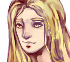
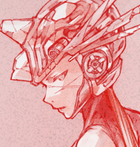
This is something I did recently, I tried to do a new coloring style which I found more fun, faster and less painful.... somewhat lol but I am satisfied enough with it~
My art journey~
My art journey~
Last edited by King-sama on Fri Mar 17, 2017 9:09 pm, edited 6 times in total.
-
chocojax

- Miko-Class Veteran
- Posts: 705
- Joined: Sun Oct 25, 2009 11:27 am
- Projects: Umbra, Familiarity, Maleficent Justice
- Tumblr: chocojax
- Location: California
- Contact:
Re: My art journey~
The coloring looks nice, yo! The colors (mainly the skin) look like they don't really have much of an effect on the other parts, so maybe you could try to mess around with that more.
If you haven't already, you could go out and imitate and experiment with other artists' styles. It's pretty fun, and it helps a lot with the view of "my art looks boring!"
If you haven't already, you could go out and imitate and experiment with other artists' styles. It's pretty fun, and it helps a lot with the view of "my art looks boring!"
Re: My art journey~
Ohh great idea Choco! but I am sorta still afraid of doing this actually ^^' is a chicken do you have any examples of your own work that you still keeping somewhere maybe it will be a great cure and insperation for me QuQchocojax wrote:If you haven't already, you could go out and imitate and experiment with other artists' styles. It's pretty fun, and it helps a lot with the view of "my art looks boring!"
chocojax wrote:The coloring looks nice, yo! The colors (mainly the skin) look like they don't really have much of an effect on the other parts, so maybe you could try to mess around with that more.
Thank you very much! XD errr.....I am not sure I get what you meant with the colors doesn't have an effect on the other parts......can you do a color over or give an example if that was ok I WILL THANK YOU FOREVER!!
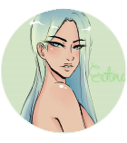
Anyways, here is another something I did recently, still practicing coloring, colors, values and simple perspective o.o still not really glad with the eyes coloring TT.TT
Last edited by King-sama on Fri Apr 24, 2015 2:11 pm, edited 1 time in total.
-
Sapphi
- Eileen-Class Veteran
- Posts: 1685
- Joined: Fri Jun 05, 2009 3:31 am
- Completed: Boku no Taisetsu na Yumeko
- Projects: Twelve, PAW ★ PRINTS
- Organization: Kitsch-soft
- Location: Illinois, USA
- Contact:
Re: My art journey~
The coloring is beautiful, especially the hair. But I think you should either make the large light shines in the eyes brighter (more opaque). Right now I'm getting a bug eye vibe, or an "is this a corpse?" vibe. Either way I feel like the technique makes their eyes look glazed over which makes them look the opposite of lively and happy. If you are going for creepy, you're bang on. If not I would change it. 
"It is [the writer's] privilege to help man endure by lifting his heart,
by reminding him of the courage and honor and hope and pride
and compassion and pity and sacrifice which have been the glory of his past."
— William Faulkner
▬▬▬▬▬▬▬▬▬▬..+X+..▬▬▬▬▬▬▬▬▬▬

by reminding him of the courage and honor and hope and pride
and compassion and pity and sacrifice which have been the glory of his past."
— William Faulkner
▬▬▬▬▬▬▬▬▬▬..+X+..▬▬▬▬▬▬▬▬▬▬
-
Morhighan
- Miko-Class Veteran
- Posts: 975
- Joined: Sun Jun 27, 2010 12:54 pm
- Completed: AIdol, When Our Journey Ends, Forgotten Not Lost
- Organization: MysteryCorgi
- Tumblr: MysteryCorgi
- Deviantart: MysteryCorgi
- Soundcloud: MysteryCorgi
- itch: MysteryCorgi
- Location: USA
- Contact:
Re: My art journey~
Wow, I love how vivid your colors are! o:
Keep up the great work!
Keep up the great work!
-
Glitterbark
- Regular
- Posts: 70
- Joined: Mon Jun 10, 2013 7:27 pm
- Projects: Best Wishes
- Tumblr: glitterbarkgaming
- itch: glitterbark
- Contact:
Re: My art journey~
Oh goodness, these are beautiful! I especially love the shading on the hair and the super bright colors. Your art is not boring; it has so much "pop!" to it! I just want to pet all that lovely fluffy hair...
WIP: 
-
Erotome
- Regular
- Posts: 33
- Joined: Fri May 16, 2014 4:24 pm
- Projects: Paws & Effect, RE4: Otome Edition
- Organization: Shimmersoft
- Tumblr: erotomesoft
- Deviantart: Erotome
- Contact:
Re: My art journey~
Your art isn't boring - The style is adorable and the colouring is just spot-on (never been able to do chibi or colour so envious here); they all like like cute little dolls.
-
revengineer
- Newbie
- Posts: 22
- Joined: Sun Jun 01, 2014 8:38 pm
- Contact:
Re: My art journey~
Totally adorable for sure! I get tired with my own style, we all do - but this is something that is VERY marketable for a VN or any kind of game art. Please keep making more!
My Portfolio http://idrawcyberpunkthings.tumblr.com/
Re: My art journey~
Sapphi wrote:The coloring is beautiful, especially the hair. But I think you should either make the large light shines in the eyes brighter (more opaque). Right now I'm getting a bug eye vibe, or an "is this a corpse?" vibe. Either way I feel like the technique makes their eyes look glazed over which makes them look the opposite of lively and happy. If you are going for creepy, you're bang on. If not I would change it.
Oh i get what you mean XD; i have a better eye coloring style now than this corpse one lol thank you for telling me your opinion honestly~ X] creepy stuff is always awesome too~~
Morhighan wrote:Wow, I love how vivid your colors are! o:
Keep up the great work!
Hehe thanks~ Lol
Haha pet hair?! Lol i appreciate your words you are very nice ^u^* i tryed to color like the pros that are everywhere~ lolFoxTrotMuffin wrote:Oh goodness, these are beautiful! I especially love the shading on the hair and the super bright colors. Your art is not boring; it has so much "pop!" to it! I just want to pet all that lovely fluffy hair...
You gotta try chibis~ i would like to see them when you do!Erotome wrote:Your art isn't boring - The style is adorable and the colouring is just spot-on (never been able to do chibi or colour so envious here); they all like like cute little dolls.
Awwwww thaaaaaank you! Q0Q i will keep making more but after i am finished with some very delayed artworks and other things ^^'revengineer wrote:Totally adorable for sure! I get tired with my own style, we all do - but this is something that is VERY marketable for a VN or any kind of game art. Please keep making more!
Re: My art journey~
Thanks for the encouragement 8']paullarry wrote:You are going good in your art journey. Keep moving forward...
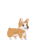
Latest arts o.o
I don't know if I am actually getting better or not....
Last edited by King-sama on Fri Apr 24, 2015 2:11 pm, edited 2 times in total.
Re: My art journey~
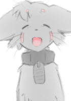
Latest art ^^ tried to practice one head chibus. How to improve in drawing them?
Last edited by King-sama on Fri Apr 24, 2015 2:12 pm, edited 1 time in total.
-
DarkSin
- Regular
- Posts: 110
- Joined: Mon Apr 01, 2013 1:57 pm
- Completed: Rituals in the Dark (GxG), Sweetest Monster (BxG), My Magical Divorce Bureau!!
- Projects: Innate Imperfections (GxG)
- Organization: SinSystem
- itch: darksin
- Contact:
Re: My art journey~
Your art is very good. I love your sketching, your use of colours... everything
There is considerable improvement in your chibis. As for how you could improve them... you could maybe make the shines in their eyes brighter and making their faces more round? It could be chalked down to stylistic choice, though. It's not really that important.
There is considerable improvement in your chibis. As for how you could improve them... you could maybe make the shines in their eyes brighter and making their faces more round? It could be chalked down to stylistic choice, though. It's not really that important.

-
Ernestalice15

- Regular
- Posts: 61
- Joined: Mon Jan 26, 2015 12:36 am
- Projects: One Last Crane, Demoness, The Golden Catalyst
- Organization: Animon Works
- IRC Nick: Nomina
- Tumblr: ernestalice15
- Deviantart: Ernestalice15
- Location: Indonesia
- Contact:
Re: My art journey~
Who said that your art is boring? It's really really good, much much better than mine. And you're improving. I wonder about the male, though. Because it's only one, I can't really tell if it's as good as the others or not, but as I can see, the body seems to be proportionally weird at the chest to the bottom part. But that's just detail and it's not really that weird. Keep it up
Re: My art journey~
Thanks for the critique guys! ^^
I did some sky sketches......hopefully I will improve in it OTL
what do you think?
what do you think?
-
shwippie
- Regular
- Posts: 129
- Joined: Wed Dec 22, 2010 4:12 pm
- Completed: Double Romance
- Projects: Rolland's Candy Shop. Mitzi's Fable
- Tumblr: shwippie
- Deviantart: shwippie
- Contact:
Re: My art journey~
What beautiful skies! You could try making some edges softer for variation. Also in the sunset image, bringing some of the purple in the sky into the clouds. It's kind of difficult to explain in words, but this photo is an example of the soft vs. crisp and the distribution of colors: http://1.bp.blogspot.com/-EoX0QQA6xeE/U ... et_sky.jpg . I don't know if those things would clash with your style. Your skies have a refreshing look, and I really like the atmospheric perspective!


Who is online
Users browsing this forum: No registered users