BLENDER: Lighting, Materials, and Rendering
DISCLAIMER: I am not a professional 3d artist. My 3d knowledge was acquired from various tutorials and head-banging experiments. Some things I do might make seasoned 3d artists roll their eyes along the z-axis and vomit n-gons...
Lighting Setup
You may have the best models and textures, but lighting ultimately makes or breaks a scene. Here's my lighting setup. Quite a lot of lamps but that's because the lighting provided by the Sun and Environment lighting wasn't enough to light up the scene so I added a few more.
ISO layout of the scene, I like doing this for my renders ^^:

Lamp positions:


As annotated, the Pink lights are helper point lamps made to brighten the scene up (especially the bookshelf), this could also be substituted with an area lamp that blankets all the objects in the scene. They all have the same settings - low energy, diffuse only, no shadow, and high distance to reach all the objects.
The Green Light is an isolated area lamp affecting only the room walls just to brighten it up a bit.
The Blue Light is a default point lamp with high distance to reach every object. This is used to re-create shadows that were blended by the Environment lighting, as well as brightening everything a bit.
Material Settings
All of my materials are default Lambert with varying specular settings and some having mirror settings on. The floor is obviously textured with a simple wooden plank texture. I run my textures through the 'Cutout' filter in photoshop to simplify them, because I noticed in a lot of anime, textures tend to be pretty simple and the cutout filter does that quite effectively. The wardrobe texture is a procedural cloud texture. I played around different X/Y/Z size combinations to get the vertical lines effect then applied it as a Normal map.
A word of caution, don't use pure white or black material colors because once they are combined with Environment Lighting, Light/Shadows, and Ambient Occlusion, they easily become pure Black or White - you don't want that, because it will mess with your values and no amount of Color Balancing or Hue/Sat will change pure black or white colors.
Freestyle Settings - Thickness = 2, that's it! I rendered it separately with transparency so I can easily overlay it over the render.
I think that covers all of the Blender specific parts except Modeling because that deserves another thread but I just kept my models simple, staying low-poly whenever I can and getting the basic form first before adding the nuts-and-bolts. Now it's time to hit the Render button!
Click for full-view:

Not bad! Note that I made the Sky transparent so I can easily paint behind the windows.
Photoshop Post-Processing Part 1
Values
All right, first things first, let's check the values! Just add a new layer > bucket fill with white or black > set layer mode to Saturation. I was aiming for a well-lit room for this scene, so the image should have evenly distributed values - there shouldn't be very dark or very bright spots (of course except parts where it makes sense; inside the wardrobe, dark plastic etc). Why? Because if there was an object that has a very dark value in say the right edge of the scene, the eye would most likely focus on that one. I don't like that for this particular scene. I want to control where the eye looks at (the center part, we'll get to that in the last step.)

Line
Now let's overlay the line render. Once again, don't use black color for the line color - it's too heavy and harsh! Use a color that blends well with the render. What I did was to take the dominant color of the whole image and use a dark version of it, in this case I used a deep brown-red. I lowered the opacity to about 40-50% and set it to multiply to blend it into the scene.

I wanted to give the lighting a 'Magic Hour' feel so I gave it a magenta-ish color and upped the highlights with yellow.
Click for Full-View:

Now that we have the values and base colors in place, it's time to paint it over on SAI.
SAI Paint Over
You can do this in Photoshop or any painting software really, but I prefer painting in SAI. This is also my favorite part (getting a decent raw render is a clooose second). Things I did in this step:
- add textures
- refine materials
- soften a few hard edges
- reinforce speculars/highlights
- add detail
Here's a couple of close-ups:

And here's the full paint-over. Click for Full-View:

Photoshop Post-Processing Part 2
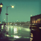
And now back to photoshop for the final step. The background at this point is Okay-looking, maybe just brighten the light by a notch. But I wanted to lead the eye towards the center so that the viewer has something to focus on at first glance. This is where adding the bright lights come in.
Add another layer, set it to screen and use a soft round brush to paint the light streaks. Try to use whatever the sky color is or any dominant color, in this case, Yellow, Orange and Magenta. Use as many layers as you want to achieve the lighting you're aiming for. Overlay, Color Dodge, Linear Light etc are your friends here.
Click for Full-View:

And there you go! That's basically my process for making backgrounds with a lot of man-made objects. I have a different approach for nature backgrounds and the like, but that's for another time. If you've come this far, thanks but oh, there's one last thing!
Click for Full-View: