It has a very nightly feel to it, yet everything is clearly visible.
A Dark Game ... Help Requested
-
Guest
-
BlackSpider
- Regular
- Posts: 133
- Joined: Fri Aug 22, 2003 1:08 pm
- Location: Wroclaw, Poland
- Contact:
-
Yang Sei Fu
- Regular
- Posts: 114
- Joined: Wed Jul 16, 2003 12:50 am
- Location: Toronto, Canada
- Contact:


-
PyTom

- Ren'Py Creator
- Posts: 16096
- Joined: Mon Feb 02, 2004 10:58 am
- Completed: Moonlight Walks
- Projects: Ren'Py
- IRC Nick: renpytom
- Github: renpytom
- itch: renpytom
- Location: Kings Park, NY
- Contact:
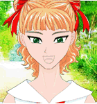
Yang Sei Fu --- I think you're right, it does need more texture and shades. In my defense, those were my first and second digital paintings, and it's been over a decade since I took a formal art class, and those were high-school ones that weren't very good. I'm a programmer by training, not a creative type, so making a game is really pushing me out of my element. But it's a lot of fun, and it's always good to do things that you don't know how to do.
I'm considering repainting those backgrounds, but I'll need to be sure I can do a competent job before I try. And I still want to release the game fairly soon.
Do you know where I can get the picture from AIR that you mentioned? Update: Right above. Thanks!
Eclipse --- I have no problem seeing your background, since white and black are almost certainly very different on people's monitors. (To the reader: If you cannot distinguish white and black on your monitor, please check the position of the "Power" button. )
)
The flatness and black and white may make it only suited for very flat, uncolored, characters. While I don't know this for sure, it may make sense to experiement with some solid filled areas to give it a little depth, like screentone is used for in Manga. But I'm just a programmer out of his depth, so take what I say with a grain of salt.
I'm considering repainting those backgrounds, but I'll need to be sure I can do a competent job before I try. And I still want to release the game fairly soon.
Do you know where I can get the picture from AIR that you mentioned? Update: Right above. Thanks!
Eclipse --- I have no problem seeing your background, since white and black are almost certainly very different on people's monitors. (To the reader: If you cannot distinguish white and black on your monitor, please check the position of the "Power" button.
The flatness and black and white may make it only suited for very flat, uncolored, characters. While I don't know this for sure, it may make sense to experiement with some solid filled areas to give it a little depth, like screentone is used for in Manga. But I'm just a programmer out of his depth, so take what I say with a grain of salt.
Supporting creators since 2004
(When was the last time you backed up your game?)
"Do good work." - Virgil Ivan "Gus" Grissom(When was the last time you backed up your game?)
Software > Drama • https://www.patreon.com/renpytom
-
Yang Sei Fu
- Regular
- Posts: 114
- Joined: Wed Jul 16, 2003 12:50 am
- Location: Toronto, Canada
- Contact:

-
PyTom
- Ren'Py Creator
- Posts: 16096
- Joined: Mon Feb 02, 2004 10:58 am
- Completed: Moonlight Walks
- Projects: Ren'Py
- IRC Nick: renpytom
- Github: renpytom
- itch: renpytom
- Location: Kings Park, NY
- Contact:
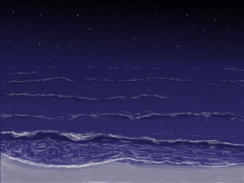
http://www.bishoujo.us/moonlight/pics/newbeach.jpg
Is a newly drawn picture that includes waves and water texture, which I agree makes the picture look a bit more realistic. It also has larger, hand-drawn stars, which show up much better on the darket monitors, IMO.
What do people think of this one.
Oh, and happy new year.
Is a newly drawn picture that includes waves and water texture, which I agree makes the picture look a bit more realistic. It also has larger, hand-drawn stars, which show up much better on the darket monitors, IMO.
What do people think of this one.
Oh, and happy new year.
Supporting creators since 2004
(When was the last time you backed up your game?)
"Do good work." - Virgil Ivan "Gus" Grissom(When was the last time you backed up your game?)
Software > Drama • https://www.patreon.com/renpytom
-
Yang Sei Fu
- Regular
- Posts: 114
- Joined: Wed Jul 16, 2003 12:50 am
- Location: Toronto, Canada
- Contact:

The last picture with the hand-drawn stars is excellent.
ALTHOUGH: Personally, I have absolutely no problems with dark BGs or games. I am used to corecting my gamma settings for many games, so I wouldn't worry too much. Even plain black/white is fine (eclipse's picture), because although this can really sting your eyes, there's still the contrast adjustment button.
ALTHOUGH: Personally, I have absolutely no problems with dark BGs or games. I am used to corecting my gamma settings for many games, so I wouldn't worry too much. Even plain black/white is fine (eclipse's picture), because although this can really sting your eyes, there's still the contrast adjustment button.
-
BlackSpider
- Regular
- Posts: 133
- Joined: Fri Aug 22, 2003 1:08 pm
- Location: Wroclaw, Poland
- Contact:
-
Yang Sei Fu
- Regular
- Posts: 114
- Joined: Wed Jul 16, 2003 12:50 am
- Location: Toronto, Canada
- Contact:
Who is online
Users browsing this forum: No registered users