Character Critique Needed!
- Yangyang Mobile
- Regular
- Posts: 46
- Joined: Wed Sep 02, 2015 2:41 am
- Completed: The Letter, The Diary
- Projects: Love Esquire
- Organization: Yangyang Mobile
- Tumblr: yangyangmobile
- Deviantart: yangyangmobile
- itch: yangyangmobile
- Contact:
Character Critique Needed!
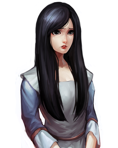
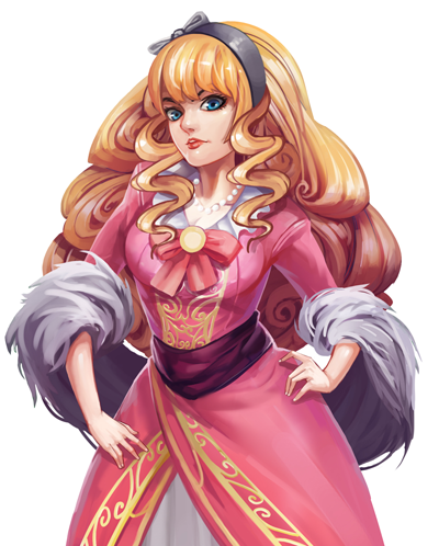
Hello, gang! Our team is currently developing a horror visual novel called "The Letter". For the past days we've been trying to pin down the art style for our characters, and decided to take inspiration from sakimichan and Zeronis. This is what we've come up so far:
What do you think? I'm a bit worried that the audience might not like it because it's far away from the typical, pure anime-style art. Will you buy a game with this kind of art style? :/ All opinions are appreciated! Thanks in advance! ^u^
- LateWhiteRabbit
- Eileen-Class Veteran
- Posts: 1867
- Joined: Sat Jan 19, 2008 2:47 pm
- Projects: The Space Between
- Contact:
Re: Character Critique Needed!
I like it. I'm a great lover of noses existing on characters.Yangyang Mobile wrote: What do you think? I'm a bit worried that the audience might not like it because it's far away from the typical, pure anime-style art. Will you buy a game with this kind of art style? :/ All opinions are appreciated! Thanks in advance! ^u^
-
- Lemma-Class Veteran
- Posts: 2299
- Joined: Mon Feb 06, 2012 9:50 pm
- Completed: Icebound, Selenon Rising Ep. 1-2
- Projects: Selenon Rising Ep. 3-4
- Organization: Fastermind Games
- Deviantart: sundownkid
- Location: NYC
- Contact:
Re: Character Critique Needed!
I think it looks fantastic. I actually like that kind of pseudo realistic art even better than anime style art. In fact, I'd get it for my own games if it didn't cost so much
Re: Character Critique Needed!
I love it! Maybe it's because I'm an American, but I've never really preferred the anime art style.
- Ulalaria
- Regular
- Posts: 150
- Joined: Thu May 29, 2014 11:45 pm
- Completed: Faust: Scene II, Queen At Arms, Rosewater
- Projects: The Owl-Woman Oracle
- Tumblr: meagantrott
- Contact:
Re: Character Critique Needed!
I like this art style a lot, but I'm also American, and I'm not really sure where your expected market is. For what it's worth, Moacube's Cinders has seen a good amount of success without having a typical anime art style, and I think the horror aspect of your game might be more impactful with these character designs you currently have that are less simplified and closer to realism than it would be with more stylized anime characters.
- Fox Lee
- Veteran
- Posts: 213
- Joined: Sat Oct 18, 2008 1:46 am
- Completed: Where Ages Go [NaNo2015]
- Projects: Swan x Swan [YuriJam/NaNo16], ♥ON, Guilded Age
- Organization: Invincible Ink
- Deviantart: foxlee
- itch: foxlee
- Location: Australia
- Contact:
Re: Character Critique Needed!
I don't think you will have too much of a problem, not having anime-type art. If you were doing an otome or school dating sim, maybe - but it seems to me like lots of the more respected OELVN games have something other than a straight-up anime aesthetic. Plus, there's an audience out there who just plain hate anime aesthetics, but could enjoy VNs. Any anime die-hards you lose, you might make up for by being attractive to that crowd.
I think they're beautifully done, though there is one thing that bothers me. They both seem to have the same adorable, tiny-pursed-painted-lips-with-front-teeth-showing mouth ^^; It's a very minor nitpick, just it's weirding me out a bit <XD
As for whether I would buy it, I do prefer more anime-ish art myself, but if a game excited me I wouldn't let a more western aesthetic keep me away. However, I don't enjoy horror as a genre, so I probably wouldn't. Sorry ^_^;
- trooper6
- Lemma-Class Veteran
- Posts: 3712
- Joined: Sat Jul 09, 2011 10:33 pm
- Projects: A Close Shave
- Location: Medford, MA
- Contact:
Re: Character Critique Needed!
LWR makes me laugh. I too am a great lover of noses existing on characters.LateWhiteRabbit wrote:I like it. I'm a great lover of noses existing on characters.Yangyang Mobile wrote: What do you think? I'm a bit worried that the audience might not like it because it's far away from the typical, pure anime-style art. Will you buy a game with this kind of art style? :/ All opinions are appreciated! Thanks in advance! ^u^
I like the art.
A Close Shave:
*Last Thing Done (Aug 17): Finished coding emotions and camera for 4/10 main labels.
*Currently Doing: Coding of emotions and camera for the labels--On 5/10
*First Next thing to do: Code in all CG and special animation stuff
*Next Next thing to do: Set up film animation
*Other Thing to Do: Do SFX and Score (maybe think about eye blinks?) Check out My Clock Cookbook Recipe: http://lemmasoft.renai.us/forums/viewto ... 51&t=21978
-
- Lemma-Class Veteran
- Posts: 2473
- Joined: Wed Sep 29, 2004 1:38 pm
- Contact:
Re: Character Critique Needed!
They're drawings, and they're fine. I'm amused by the blonde girl's regal ringlets hair and her somewhat pimped-out dress.Yangyang Mobile wrote:What do you think? ... Will you buy a game with this kind of art style?
For what it's worth, I usually prefer cute styles and 2D art, though I have enjoyed a variety of aesthetics. When I browse comics or look at screenshots, I usually just think about whether or not I like them, and just shrug. Sometimes I notice odd quirks in drawings. For instance, when I started playing the third Tokimeki Memorial Girl's Side game, I wasn't sure if I liked the character design of Chikara Oosako, since his head didn't seem to match his body. One more example: the early scenes in both Steins;Gate and Virtue's Last Reward included rooms with dull gray walls. That aspect of the art was not personally appealing, since I usually don't like stories about characters who live in oppressive places.
Would I purchase The Letter? If the story or the gameplay seems interesting, I'll consider it.
- blankd
- Veteran
- Posts: 258
- Joined: Wed Aug 26, 2009 4:04 pm
- Completed: Vicarwissen
- Projects: Heavenseed (current), I'm Not a Monster! (working on it slowly...)
- Organization: Team Lazilisk
- Tumblr: blankd
- itch: blankd
- Location: *taka taka taka*
- Contact:
Re: Character Critique Needed!
The painting style is very pleasing to look at and it certainly is at a commercial looking level; only critique really is how same-faced they are.
That won't be a dealbreaker for most people but it's a "shame" to have excellent rendering but honestly pretty weak character design. The clothing carries the characters a good deal, but differing physique and faces are really neglected in female characters.
And probably more than you bargained for, while likely not representative of your VN, these two designs seem to be playing to more common female visual archetypes. "Demure" looking plain dark haired girl, "snobby" extravagantly dressed blonde girl who is even dressed in pink. If you want to know what I mean, think of how frequent bookworm/nerdgirl vs valley rich girl and how often the visuals go to this exact shorthand very reliably. They're shorthand for a reason but they don't stand out among many who use these same visual shorthands. Of course if this is just a demonstration of style, you can ignore some of the more specific design critique- but my comments about the same-face and same-physique still stand.
I perfectly understand if any of what I just said is not feasible in what sounds like a commercial project, but speaking personally, and going based on visuals, I would certainly say the characters were rendered well, but not in a way that personally appealed or popped out to me. It would take some decent lifting from the pitch to get me to stick around, much less make a purchase.
Apologies if that sounds harsh, but that's the most honest critique I can provide.
- Auro-Cyanide
- ssǝʇunoƆ ʇɹ∀
- Posts: 3059
- Joined: Sun Jul 25, 2010 9:02 am
- Completed: http://auro-cyanide.tumblr.com/visualnovels
- Projects: Athena
- Organization: Cyanide Tea
- Tumblr: auro-cyanide
- Deviantart: Auro-Cyanide
- Location: Melbourne, Australia
- Contact:
Re: Character Critique Needed!
This isn't aimed solely at you since I've seen this question fairly often, but the question itself really frustrates me because it literally makes no sense. The actual style will never matter. Sure people have preferences but overall it doesn't matter. All that matters is a) Is the work aesthetically pleasing, b) Is it functional and c) Does it serve the story. Going in thinking people will only accept things in a particular style is like thinking all websites should be blue or you can only use a certain type of prose in all fiction. Functionally it doesn't make any sense and it's extremely restrictive in terms of design.
It also indicates to me that not enough research has been done on the market. Even in Japan not everything is anime style, like Professor Layton or Hotel Dusk. Cinders was extremely popular in good part to the styles they use. Hell, even I have used painterly styles before and the comments have been extremely positive. It's really important that you investigate the area you are thinking of targeting and not jump to conclusions about people's responses.
Getting that out of the way, I think the style you have is very good. The colours and contrast are nice so they are visually appealing, they look lovely. The style needs to be evened out a little, for instance blondie's hair is more cartoony than the other one, and you are going to have to be careful using a realistic style, again the blonde girls hands are too small and so aren't really fitting with the style, but overall I think it would look excellent in a game. I highly encourage a greater range of styles in the medium. Though me liking the art isn't enough to make me buy it, it would come down to the story too. Art plays a big part for me so you are on the right track, but I would also need to see how it all places out with the backgrounds and UI before making a judgement call.
Last edited by Auro-Cyanide on Sun Sep 06, 2015 1:29 am, edited 1 time in total.
- Kinmoku
- Miko-Class Veteran
- Posts: 593
- Joined: Mon Aug 11, 2014 9:39 am
- Completed: One Night Stand
- Projects: VIDEOVERSE
- Tumblr: gamesbykinmoku
- itch: kinmoku
- Location: Germany
- Contact:
Re: Character Critique Needed!
They look awesome! I'd be more likely to buy a game with these characters than default anime style, but that's me.
Seems like a lot more thought has gone into them and that's a good thing
- Yangyang Mobile
- Regular
- Posts: 46
- Joined: Wed Sep 02, 2015 2:41 am
- Completed: The Letter, The Diary
- Projects: Love Esquire
- Organization: Yangyang Mobile
- Tumblr: yangyangmobile
- Deviantart: yangyangmobile
- itch: yangyangmobile
- Contact:
Re: Character Critique Needed!
Thank you to everyone who took time to respond! ^^ I really appreciate it! I decided we will continue using the art style we have right now, really gives us a unique flavor compared to the others I guess. -^_^- We'll just work really hard to make sure our story fits the mood of this style!
Thanks for this Auro-Cyanide. The reason I posted this question in the first place is because apart from Cinders, I know no visual novel game that is very popular that didn't use the generic anime art style. Since our story is pure horror, it just didn't make sense to me to use the kawaii-moe style that people seem to love in their VNs. I was just worried because the art style we have now will be used all over the place once we start marketing the game, and I didn't want to prematurely hurt our chances when people saw that the art style our VN is offering is not up to par to their "standards". But, to hell with that! Like I said above, we'll be sticking to our style right now and just hope for the bestAuro-Cyanide wrote:This isn't aimed solely at you since I've seen this question fairly often, but the question itself really frustrates me because it literally makes no sense. The actual style will never matter. Sure people have preferences but overall it doesn't matter. All that matters is a) Is the work aesthetically pleasing, b) Is it functional and c) Does it serve the story. Going in thinking people will only accept things in a particular style is like thinking all websites should be blue or you can only use a certain type of prose in all fiction. Functionally it doesn't make any sense and it's extremely restrictive in terms of design.
It also indicates to me that not enough research has been done on the market. Even in Japan not everything is anime style, like Professor Layton or Hotel Dusk. Cinders was extremely popular in good part to the styles they use. Hell, even I have used painterly styles before and the comments have been extremely positive. It's really important that you investigate the area you are thinking of targeting and not jump to conclusions about people's responses.
- Alexzandria
- Regular
- Posts: 31
- Joined: Thu Mar 12, 2015 4:01 pm
- Deviantart: Alexzandria44
- Contact:
Re: Character Critique Needed!
This style is really nice. Especially for the people who are not into the anime style. Like me. Definitley keep doing what you do. It looks really professional. I aspire to draw like that. xD
-
- Lemma-Class Veteran
- Posts: 2299
- Joined: Mon Feb 06, 2012 9:50 pm
- Completed: Icebound, Selenon Rising Ep. 1-2
- Projects: Selenon Rising Ep. 3-4
- Organization: Fastermind Games
- Deviantart: sundownkid
- Location: NYC
- Contact:
Re: Character Critique Needed!
I think that question would be more apt if you were using a graphic novel-y art style that was very sketchy and unusual. Your art style is essentially anime, but more detailed. I am sure that a lot of people would use your art style if they could afford it or have the skill to draw it.Yangyang Mobile wrote: Thanks for this Auro-Cyanide. The reason I posted this question in the first place is because apart from Cinders, I know no visual novel game that is very popular that didn't use the generic anime art style. Since our story is pure horror, it just didn't make sense to me to use the kawaii-moe style that people seem to love in their VNs. I was just worried because the art style we have now will be used all over the place once we start marketing the game, and I didn't want to prematurely hurt our chances when people saw that the art style our VN is offering is not up to par to their "standards". But, to hell with that! Like I said above, we'll be sticking to our style right now and just hope for the best
Re: Character Critique Needed!
Really nice art! Both characters looks really nice.
To be honest I'm more at the anime-style side, but I don't mind other styles when they're pretty. And those examples are just great, a game with that art will score a big plus in my book.
Speaking of Cinders, I like more this style that the Cinders one. That was a small turnoff for me with that game. The other was the "subtext only" endings. But, that's another issue entirely.
Who is online
Users browsing this forum: No registered users