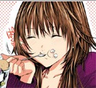
While here, I've noticed that some people would use some art tips, and I happen to experiment and play around with pics a lot, so I decided to make a thread on my own to share some of my experiments/knowledge that could be useful to you =3
Related posts:
Picture decomposed in layers
http://lemmasoft.renai.us/forums/viewto ... 176#p38176
Simple sprite making
http://lemmasoft.renai.us/forums/viewto ... 078#p38078
Drawing groups in perspective (no foreshortening)
http://lemmasoft.renai.us/forums/viewto ... 420#p45420
Shortcuts:
Morning-Sunset-Night Palettes
http://lemmasoft.renai.us/forums/viewto ... 280#p39280
More Tutorials
http://lemmasoft.renai.us/forums/viewto ... 231#p41231
Background variations and light 1 & 2
http://lemmasoft.renai.us/forums/viewto ... 163#p43163
http://lemmasoft.renai.us/forums/viewto ... 218#p43218
Drawing Human Figure: Basic & Fixing a drawing: structure-wise
http://lemmasoft.renai.us/forums/viewto ... 656#p45656
Overlay Coloring
http://lemmasoft.renai.us/forums/viewto ... 664#p45664
My tutorials on deviantART:
http://dejichan.deviantart.com/gallery/#Tutorials
Now, here it is a little experiment on shading I did, that I thought I'd share =3
Shading colors - making palletes
(image heavy!)
Unless I'm working with a multiply layer to do the shading, I always pick the shadow color by instinct... you know, with the color picker, I move a bit to te desaturated and darker area and then move to the blue in the spectrum.
But with my latter work, I've realizd that there should be a more quick and efficient way of picking the shadow colors and mantain a certain "uniformity" between all the colors used in the character design, and that could be used in several characters/pictures and keep this same "feeling"...
So, playing around, I found a fun way that actually works!
I made a random pic to test my coloring and used some pretty bright colors. I made a new layer called "pallette" and painted some dots representing the colors I used in the composition, and duplicated them some pixels away.
- base coloring and pallette
Then I selected the duplicated spots and opened my Levels window. I pretty much played around here, desaturating, making darker at the RGB chanel, and then went on the separate channels and played moving things around until I got something nice. This stage is pretty much experimenting and having fun.
- darkened pallette colors after playing with levels
I used my new pallette to color the whole pic!
- colored pic and pallete
- this one is darker and more blue
- Green!
- more pallettes!
- 11.jpg (75.68 KiB) Viewed 8872 times
- another coloring with another pallette
If you want to keep all your characters or a series of pictures with the same kind of shading, you could do the base coloring of everything first and then make a base pallette with all of them and apply this method.
Hope it helps!
Please feel free to post more step-by-step things or tips that could hep people improve their art skills, and also feel free to ask/comment/whatever =3
I'll try to keep everything linked and organized in the first post.