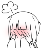
This is my art dump page, critiques welcome
I've also previously posted :
- Little Mauve Riding Hood cartoon backgrounds
- This moderate gore piece
- 14-Day Challenge

Yep! Poses are probably just as important (if not more important than) the way the character is styled. (Clothes, hair, ect.)bosinpai wrote:I dig the "pose conveys character" concept, much potential for creativity.
Oh! I forgot all about that, somehow. I pictured him in his 40's or 50's lolol. Sorry about that!! Definitely don't push the age if it doesn't match the historical period!People are quite young at that historical period, including the main noble characters, hence I didn't push the age; this breaks the modern reader's expectations though, so I'll keep that in mind.
You're welcome! ^^ This was something I recently learned, too; it's amazing how much more interesting it makes the coloring!Thanks for the shadow&hue pointer, I recently varied saturation in addition to value, and now I see we can vary hue as well, shadows are definitely richer than they seem
(and yes, my shadows were VERY light, I chickened!)
Users browsing this forum: No registered users