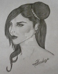
I used FireAlpaca to create this. I call her Elena and she will be the PC of the otome I am currently working on. She will not have a sprite in-game as everything will be from the player's perspective but I needed a character design for CGs. I have never drawn or painted anything digitally before but I have 22 years of experience using physical art mediums. I am a self-taught artist and greatly appreciate any tips and advice I receive!
I will be designing the romance options during the week so if there is anything I could improve upon, I'd love to hear it!
Thanks!
First ever digital creation. Constructive Criticism please!
-
Ethereal Grace
- Newbie
- Posts: 22
- Joined: Sun Mar 15, 2015 5:59 pm
- Contact:
-
robovelociraptor

- Regular
- Posts: 91
- Joined: Sat Jul 09, 2016 8:59 am
- Deviantart: robovelociraptor
- Location: USA
- Contact:
Re: First ever digital creation. Constructive Criticism plea
Hello again! ^^
As a critique, I think it looks/would look better with a more blended sort of coloring, which I did below, for reference (you can probably tell, but my coloring's not perfect):
I also lowered the saturation on her clothes, which may just be a preference on my part, but I think it's a bit easier on the eyes and puts more focus on her face and hair.
This is a side note, but I really like this pose.
Now, I'll go into detail about how to color this way: just a warning, this is going to be kinda long.
BLENDING & OPACITY
I've said this before, but I know next to nothing about FireAlpaca. However, I would assume there's some sort of blending/blurring tool, which is, while not the only, the more efficient way of getting results like this.
When you blend you have to be VERY careful about the opacity of your coloring, which is something that's especially important for sprites, since they'll be on top of several different backgrounds.
Here's an example of what I mean:
Here the subject is on a white background, the coloring is far from perfect, but it doesn't look that bad. Now, let's make the background a dark grey.
As you can see, the skin below the neck and the pink ribbons in her hair noticeably darker than they were before, which looks even worse on a black background. This effect is particularly worse when dealing with lighter colors. (And this also works the other way around (dark on white layer) as you can tell by the top image.) This may not be the best example, but I hope you get the gist of what I'm saying. Basically, check the image by changing the background to at least 2 different colors before setting it back to transparent.
You can fix this by simply making a layer under the original colored one and coloring in all the places where the opacity is low. Then, you want to merge the original colors layer down with the one you just made, this way, you can blend color on the layers. I recommend enabling the "Protect Alpha" setting on all of your color layers, which will prevent this from happening. (Just uncheck it if you want to erase something.)
SHADING & HIGHLIGHTS
When you're shading (realistically or "normally") you want to keep all shades relatively close together, but, especially with skin, not necessarily within the same hue. For example, I shaded the skin with a "redder" tint than the base color. Generally speaking, you should avoid shading non-monochromatic things with grey/black.
One problem I think you had with coloring is that the shading (for the clothes) was too dark, as well as the shading on the tunic( ? idk what it's called) being too saturated. The only time it should be that dark is it there's a very "dramatic" light source.
I also think some of your highlights were a bit faulty. For example, on the skin there were parts that were too yellow, and on the tunic the purple-ish highlights were unnecessary and maybe both too unsaturated and dark.
CONCLUSION
I hope this wasn't too confusing, since I'm pretty bad at explaining things, but hopefully it could help you. If you were confused about something, please tell me! I can probably elaborate. One thing I'd like to say is that you make sure lineart for your sprites is clean. (I know that this one is just a rough draft, but just for future reference.)
Oh and were you working on just one layer? If so, I would highly recommend not doing that, since it's a total pain when you start the coloring process.
That's all! Don't feel too down on yourself about this, you're doing a lot better than I did when I first started! Good luck!
As a critique, I think it looks/would look better with a more blended sort of coloring, which I did below, for reference (you can probably tell, but my coloring's not perfect):
This is a side note, but I really like this pose.
Now, I'll go into detail about how to color this way: just a warning, this is going to be kinda long.
BLENDING & OPACITY
I've said this before, but I know next to nothing about FireAlpaca. However, I would assume there's some sort of blending/blurring tool, which is, while not the only, the more efficient way of getting results like this.
When you blend you have to be VERY careful about the opacity of your coloring, which is something that's especially important for sprites, since they'll be on top of several different backgrounds.
Here's an example of what I mean:
- ksa;'das.png (30.25 KiB) Viewed 1462 times
- ipksd'ald.png (28.53 KiB) Viewed 1462 times
You can fix this by simply making a layer under the original colored one and coloring in all the places where the opacity is low. Then, you want to merge the original colors layer down with the one you just made, this way, you can blend color on the layers. I recommend enabling the "Protect Alpha" setting on all of your color layers, which will prevent this from happening. (Just uncheck it if you want to erase something.)
SHADING & HIGHLIGHTS
When you're shading (realistically or "normally") you want to keep all shades relatively close together, but, especially with skin, not necessarily within the same hue. For example, I shaded the skin with a "redder" tint than the base color. Generally speaking, you should avoid shading non-monochromatic things with grey/black.
One problem I think you had with coloring is that the shading (for the clothes) was too dark, as well as the shading on the tunic( ? idk what it's called) being too saturated. The only time it should be that dark is it there's a very "dramatic" light source.
I also think some of your highlights were a bit faulty. For example, on the skin there were parts that were too yellow, and on the tunic the purple-ish highlights were unnecessary and maybe both too unsaturated and dark.
CONCLUSION
I hope this wasn't too confusing, since I'm pretty bad at explaining things, but hopefully it could help you. If you were confused about something, please tell me! I can probably elaborate. One thing I'd like to say is that you make sure lineart for your sprites is clean. (I know that this one is just a rough draft, but just for future reference.)
Oh and were you working on just one layer? If so, I would highly recommend not doing that, since it's a total pain when you start the coloring process.
That's all! Don't feel too down on yourself about this, you're doing a lot better than I did when I first started!
-
Ethereal Grace
- Newbie
- Posts: 22
- Joined: Sun Mar 15, 2015 5:59 pm
- Contact:
Re: First ever digital creation. Constructive Criticism plea
Thank you so much! The skin was the hardest part for me was the skin. It's easier with real paint to just mix up the color you need but I had trouble getting good shading colors with the sliders. It seemed like the peachy tones for the skin were all mostly too yellow looking.
How exactly did you lower the saturation?
That may be a dumb question but I am a complete noob! This drawing was my practice round so I can improve for the actual sprites! The blender didn't work great for me so I'm not sure what I was doing wrong. Digital drawing is so different! I appreciate you taking the time to help me!
I tend to always be too hard myself. I'm a bit of a perfectionist.
Thank you for the tip about changing the background color! I would not have thought of that. That makes a lot of sense seeing as the sprites will be on all sorts of backgrounds. How do you get a good skin color that doesn't let background peek through? Is there a better way to implement layers? That's a whole new ballgame for me! I did most of my work with pencils and a single piece of paper.
And what's the most efficient way to get clean lines when doing the lineart? It seemed like the edges always looked a bit pixelated and I had a lot of issues with that on GIMP.
Thanks again for all your help! I'm sorry for all the questions!
-
Ethereal Grace
- Newbie
- Posts: 22
- Joined: Sun Mar 15, 2015 5:59 pm
- Contact:
Re: First ever digital creation. Constructive Criticism plea
Oh, and this was using 4 layers, by the way!
-
robovelociraptor
- Regular
- Posts: 91
- Joined: Sat Jul 09, 2016 8:59 am
- Deviantart: robovelociraptor
- Location: USA
- Contact:
Re: First ever digital creation. Constructive Criticism plea
I downloaded FireAlpaca so I could try and help you better. I included a lot of pictures in this one!
You can try using the color wheel instead, it may be easier to find shades. Just go to the "Color" tab and then click "Color wheel."
I made some color samples for skin tones, along with what color to shade them with, to help you out a bit:
These aren't perfect, it's just a baseline to experiment with. You can use use these by saving + opening this picture and then using eyedropper tool (just click the icon and then click the color you want.):
 Go to Filter > and then click Hue. There, you can change the hue, saturation, and brightness.
You can even do this for a single selection instead of for the entire layer:
Make a selection (pictured above) and then just do the above step.
First and foremost, lay down the base with the pen tool and make sure this is checked. "Protect Alpha" will prevent the background from peeking through when you blend colors.
Next, you want to lay down your shading (not blended yet):
After doing that, select the watercolor tool and blend it:
These both look much better than anything the smudge/blur tool could do, in my opinion. It is also much easier to do. 
You don't have to shade this way, this is just a suggestion. You should play around with the different brush settings and see what you can come up with!
You can also do what I do, which is make a layer above it for shading:
I circled the "Clipping" box because this will make it easier for you to shade. When you have it checked no matter how messily you color, it will never move out of the base color and you can change the saturation or hue whenever you like without messing up the base color.
One thing to note is that (for me at least) when I changed the background color it looked like this:
BUT, if you you look at the layer from the sidebar it looks like this:
Just paint the background color over the white parts and it will look like normal.
Use either the Pen tool or the Pen (Fade In/Out) tool.
"Anti-Aliasing" with keep the lines smooth looking and "Correction" makes your lines less shaky when you draw them.
Also, for your eraser, make sure this is checked:
My advice for lineart is to use a thin brush and work on a large canvas (around 5000 x 2500 or 2500 x 1250) with 300 dpi (Don't do this if you have an old computer), this way, when you resize the sprite, the mistakes won't be as noticeable and it doesn't have to be perfect.
In addition to this, you can also try coloring the lines, which you can do by checking "Protect Alpha" on the lineart layer and then coloring the lines with the pen tool. That's just a stylistic choice, though.
 And questions are good! How can you learn without asking them?
Haha, it's okay, I can't mix paint to save my life, so we're even.The skin was the hardest part for me was the skin. It's easier with real paint to just mix up the color you need but I had trouble getting good shading colors with the sliders. It seemed like the peachy tones for the skin were all mostly too yellow looking.
I made some color samples for skin tones, along with what color to shade them with, to help you out a bit:
- akin.PNG (18.74 KiB) Viewed 1442 times
- jaslkas.PNG (832 Bytes) Viewed 1442 times
It's not a dumb question!How exactly did you lower the saturation? That may be a dumb question but I am a complete noob!
- kasdaskd.PNG (3.43 KiB) Viewed 1442 times
You can even do this for a single selection instead of for the entire layer:
The blender didn't work great for me so I'm not sure what I was doing wrong.
How do you get a good skin color that doesn't let background peek through?
Is there a better way to implement layers?
Next, you want to lay down your shading (not blended yet):
- jasdlksad.PNG (11.11 KiB) Viewed 1442 times
- askd;laskd.PNG (6.18 KiB) Viewed 1442 times
You don't have to shade this way, this is just a suggestion. You should play around with the different brush settings and see what you can come up with!
You can also do what I do, which is make a layer above it for shading:
One thing to note is that (for me at least) when I changed the background color it looked like this:
- jaksd;las.PNG (719 Bytes) Viewed 1442 times
It looks like for line art, you want to keep the settings like this (or close to this):And what's the most efficient way to get clean lines when doing the lineart? It seemed like the edges always looked a bit pixelated and I had a lot of issues with that on GIMP.
- settings.PNG (1.42 KiB) Viewed 1442 times
"Anti-Aliasing" with keep the lines smooth looking and "Correction" makes your lines less shaky when you draw them.
Also, for your eraser, make sure this is checked:
- kljs;dad.PNG (542 Bytes) Viewed 1442 times
In addition to this, you can also try coloring the lines, which you can do by checking "Protect Alpha" on the lineart layer and then coloring the lines with the pen tool. That's just a stylistic choice, though.
Oh, okay!Oh, and this was using 4 layers, by the way!
No problem!Thanks again for all your help! I'm sorry for all the questions!
-
Ethereal Grace
- Newbie
- Posts: 22
- Joined: Sun Mar 15, 2015 5:59 pm
- Contact:
Re: First ever digital creation. Constructive Criticism plea
You are awesome! That is very in-depth and helpful! I'm bookmarking this convo for easy access.
I did try to emulate what you did with my drawing earlier and while it looks better than it did, it doesn't look as great as what you did. These tips will certainly help and now I know quite a bit more than I did starting out!
And I always wondered what the heck "Protect Alpha" was for! Thanks for cluing me in! haha
Anyway, here is what I was able to do with the picture in the little bit of time my kid actually napped.
- Attachments
-
-
robovelociraptor
- Regular
- Posts: 91
- Joined: Sat Jul 09, 2016 8:59 am
- Deviantart: robovelociraptor
- Location: USA
- Contact:
Re: First ever digital creation. Constructive Criticism plea
I'm so glad I could help you! You did really good for being so new to digital art! I've been doing it for 4-5 years and my coloring only recently started to look good-ish. Just keep at it, and you'll get to the place you want to be eventually!
-
Ethereal Grace
- Newbie
- Posts: 22
- Joined: Sun Mar 15, 2015 5:59 pm
- Contact:
Re: First ever digital creation. Constructive Criticism plea
Thanks so much for your help. It is very much appreciated!
-
Ethereal Grace
- Newbie
- Posts: 22
- Joined: Sun Mar 15, 2015 5:59 pm
- Contact:
Re: First ever digital creation. Constructive Criticism plea
And I'm following you on Deviantart to see your work, if you don't mind.

Re: First ever digital creation. Constructive Criticism plea
You need to give the colors more contrast. And make the linearts layers separated from the colors layers (lineart layer above the colors layers)
It will probably be easier if you used Gimp or any other free drawing program that will let you change the layers order
It will probably be easier if you used Gimp or any other free drawing program that will let you change the layers order
-
Ethereal Grace
- Newbie
- Posts: 22
- Joined: Sun Mar 15, 2015 5:59 pm
- Contact:
Re: First ever digital creation. Constructive Criticism plea
Thank you! I'm starting my second drawing now and I'll see how it turns out using all I've learned.
-
Ethereal Grace
- Newbie
- Posts: 22
- Joined: Sun Mar 15, 2015 5:59 pm
- Contact:
Re: First ever digital creation. Constructive Criticism plea
I finished this character late last night. His name is Damen.
- Attachments
-
Who is online
Users browsing this forum: Bing [Bot]