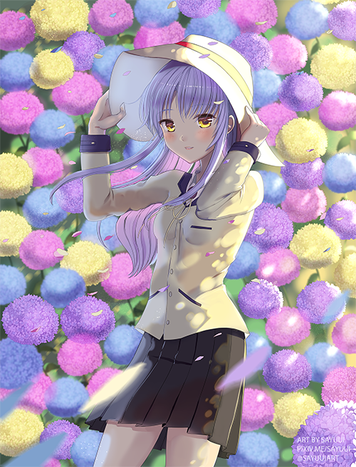
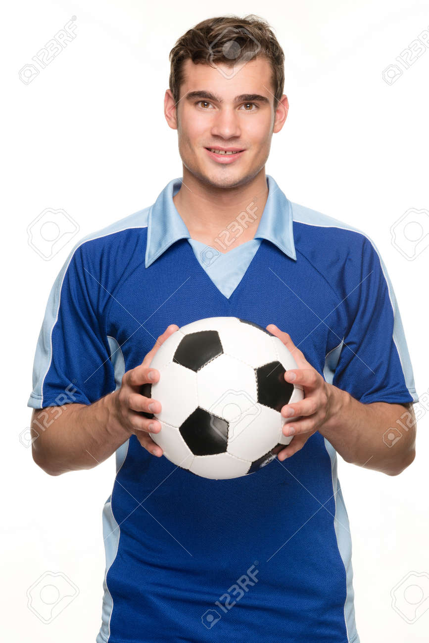
About the first picture, it seems that his arm is a bit taller than it should, but I am not sure whether you wanted it like this -->
http://previews.123rf.com/images/vadymv ... -Photo.jpg or like this -->
https://thumbs.dreamstime.com/z/footbal ... 691287.jpg .This one is more manlier way of holding a ball (if your character was a boy)-->
http://previews.123rf.com/images/lammey ... -Photo.jpg
Giving him shiny hair will be nice~
About the second one, here is my over coloring
-The focal point in this picture is the little kid, so to lead the eyes to it is to make it brighter than what it surround.
-I put away the tree coz it seemed like it made some unpleasant frame to the composition (in my opinion, tho lol)
-I made the little dragons brighter coz that what I thought you wanted it to look like lol same with the legs
-front trees to give it a frame and to make the place look crowded (since I thought this was a garden=lots of trees) and also to help the focal point be clearer
-Added some texture to the tree trunk and made more detailed grass (the grass is short coz...it's a garden that is well taken care of)
-The kid's neck was long a bit so I shorten it
To be honest it was really fun over coloring this XD
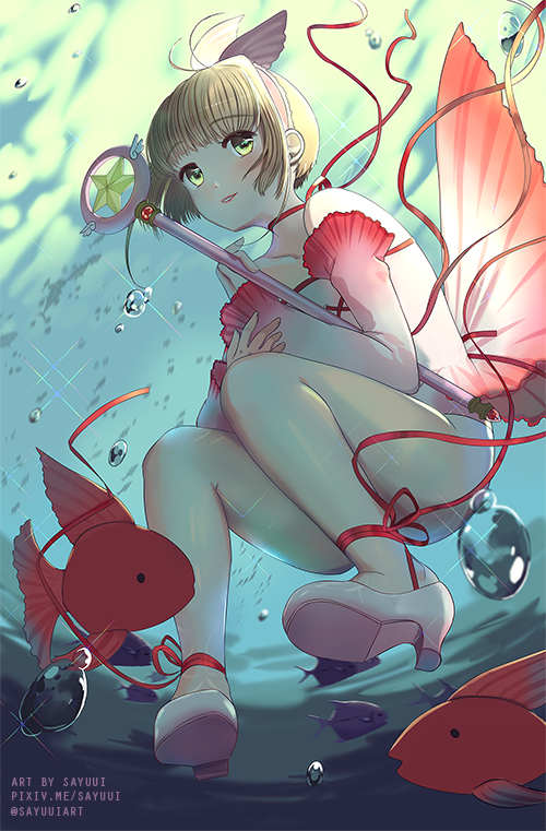
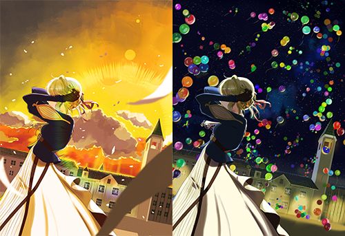
To the third one
Here is my edited ver
-Changed the overall colors so it all fits together
-Made the magic wand brighter to make it the focal point
-I dimmed the background and blurred it
-Added bright light to the top and darker shadows to bottom (you know why? to make the focal point clearer! lol)
-Blurred her outfits to give it dynamics
-And I thought you should add something in the big space in the top coz it really...makes the eyes lost instead of focused in the focal point, but dunno what to add (maybe birds...? or write something there...?)
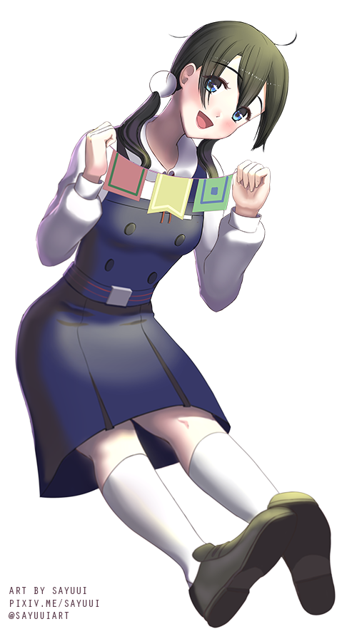
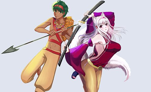
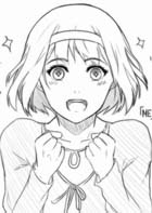
To the fourth picture: (lol I have overdone the critique today)
the only thing I can say about it is that I think that her butt is......too pointy lol
her hand is a bit small too
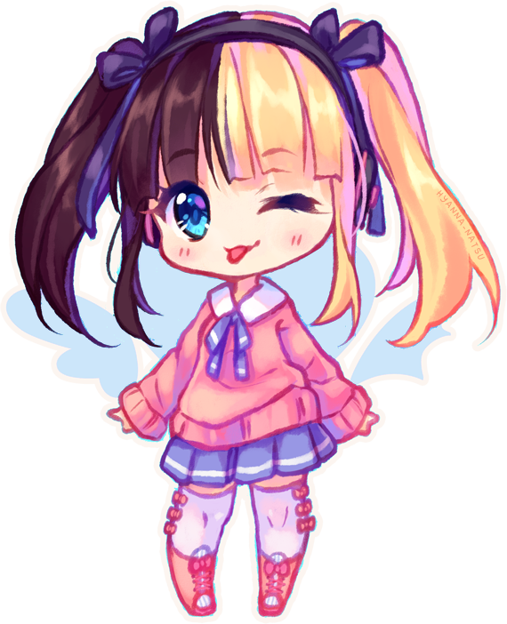
To the fifth drawing:
The chibi. There is nothing wrong about it, but one thing I would like to change is...the style of it. I just prefer the ones that have rounder faces and fatter bodies like this one -->
http://orig15.deviantart.net/10c0/f/201 ... ad4ayn.png
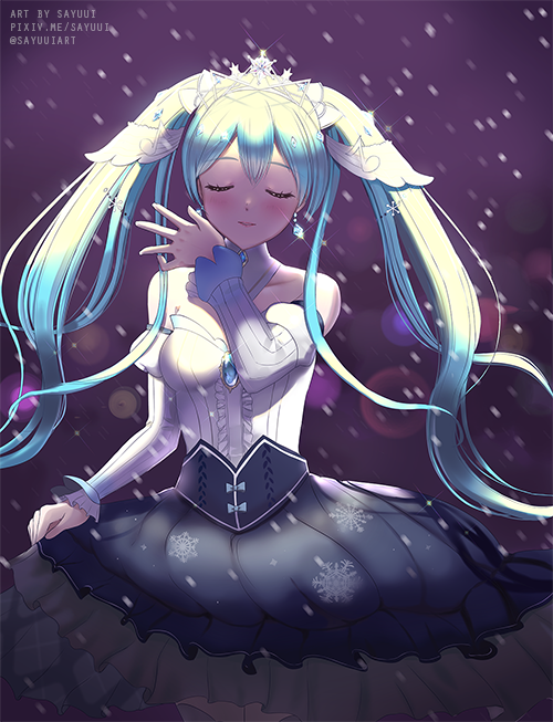
And that's all lol you are lucky I didn't critique the last one (I liked that one best X)
mainly for how you drew her chest jk~ it's nice overall~ her expression look alive and not like a doll)
Hope I helped!


