Page 2 of 2
Posted: Fri Dec 31, 2004 12:51 pm
by Guest
@PyTom: That picture looks very, very good!

It has a very nightly feel to it, yet everything is clearly visible.
Posted: Fri Dec 31, 2004 12:57 pm
by BlackSpider
PyTom:
The corrected background looks much better. I can clearly see all details and now I'am actually sure that it's a beach

.
Eclipse:
Your background looks ok too. But, IMO a few more colors would really help here (dark green shades for the grass).
Posted: Fri Dec 31, 2004 12:58 pm
by Yang Sei Fu
Like I said before, needs more texture and shades.
Water isn't calm in anything larger than a bathtub.

This should help.
Posted: Fri Dec 31, 2004 1:49 pm
by PyTom
Yang Sei Fu --- I think you're right, it does need more texture and shades. In my defense, those were my first and second digital paintings, and it's been over a decade since I took a formal art class, and those were high-school ones that weren't very good. I'm a programmer by training, not a creative type, so making a game is really pushing me out of my element. But it's a lot of fun, and it's always good to do things that you don't know how to do.
I'm considering repainting those backgrounds, but I'll need to be sure I can do a competent job before I try. And I still want to release the game fairly soon.
Do you know where I can get the picture from AIR that you mentioned?
Update: Right above. Thanks!
Eclipse --- I have no problem seeing your background, since white and black are almost certainly very different on people's monitors. (To the reader: If you cannot distinguish white and black on your monitor, please check the position of the "Power" button.
)
The flatness and black and white may make it only suited for very flat, uncolored, characters. While I don't know this for sure, it may make sense to experiement with some solid filled areas to give it a little depth, like screentone is used for in Manga. But I'm just a programmer out of his depth, so take what I say with a grain of salt.
Posted: Fri Dec 31, 2004 2:53 pm
by RedSlash
PyTom: Picture is now visible on my monitor. Other than that, I think you should make the moon shiny. Your moon looks gray and has no light emitting from it. Pict above is a good example.
Eclipse: Your pict is B & W? If so, then it showed up perfectly.
Posted: Fri Dec 31, 2004 2:55 pm
by Yang Sei Fu
I've done a night CG before. Technically, it's a failed piece. But here it is:
ClearWind Design Studios (Yang Sei Fu) - Uta no Umi (Sea of songs)

Posted: Fri Dec 31, 2004 3:07 pm
by rioka
Thanks for your suggestions you guys. I'll try them out and see what works best.
Posted: Fri Dec 31, 2004 5:29 pm
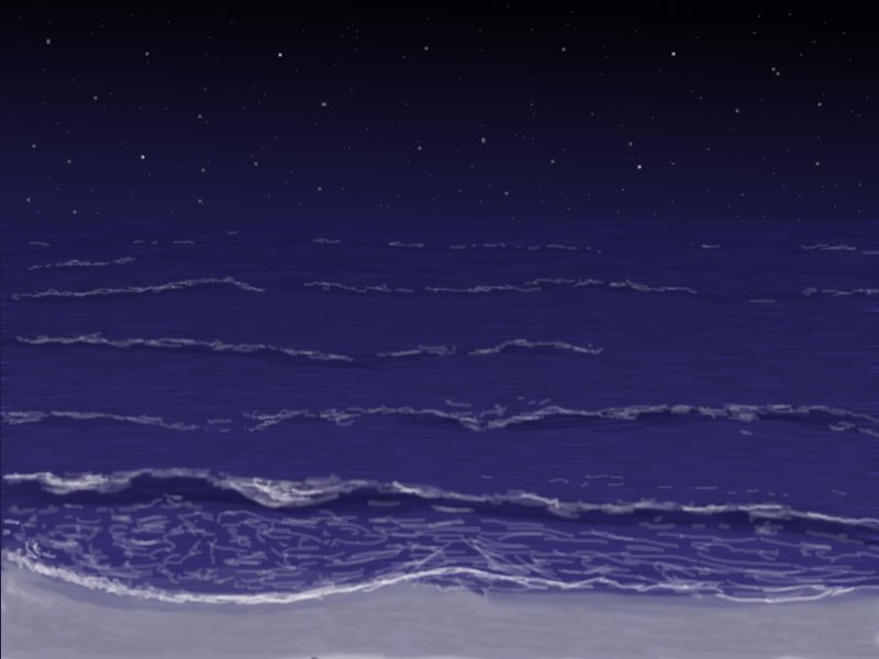
by PyTom
http://www.bishoujo.us/moonlight/pics/newbeach.jpg
Is a newly drawn picture that includes waves and water texture, which I agree makes the picture look a bit more realistic. It also has larger, hand-drawn stars, which show up much better on the darket monitors, IMO.
What do people think of this one.
Oh, and happy new year.
Posted: Fri Dec 31, 2004 5:34 pm
by Yang Sei Fu
Closest level (the beach level water) - blur the waves more. The lines are noticedably artificial.
Posted: Fri Dec 31, 2004 5:55 pm
by Tage
PyTom: That last one looks a LOT better; however, it's difficult to notice where the sky ends and the ocean begins...but you may want it that way n.n
Eclipse: I can see it quite well

Nice drawing!
Posted: Sat Jan 01, 2005 9:42 am
by mikey
The last picture with the hand-drawn stars is excellent.
ALTHOUGH: Personally, I have absolutely no problems with dark BGs or games. I am used to corecting my gamma settings for many games, so I wouldn't worry too much. Even plain black/white is fine (eclipse's picture), because although this can really sting your eyes, there's still the contrast adjustment button.

Posted: Sat Jan 01, 2005 3:53 pm
by RedSlash
That last pict looks good! No probs with my mon on this one.
Posted: Sun Jan 02, 2005 7:10 am
by BlackSpider
Indeed no problems with the last pic on my monitor too. However as Tage already said, it's difficult to notice where the sky ends and the ocean begins. I need to adjust brightness to really see the difference.
Posted: Sun Jan 02, 2005 11:45 am
by Yang Sei Fu
I actually liked the idea of the sea mixing into the sky. That is good when no light sources are available.