KomiTsuku wrote:Good night for you, good morning for me.

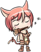
I like it. The coloring job is good and the pose is rather unique. The only thing that strikes me as off is the skirt seems to be blowing back with no indication that the character is moving or presence of wind. Then again, I have no talent at art and I just woke up, so I may be completely out of my mind about the skirt. Overall, solid job.
Ah yes. >< This is my very bad habit. I always make long skirts flow in one direction (usually away from the direction the character is facing) or another whether there is wind or not. It's more dramatic?

Anyway, you're right, it doesn't make much sense so I'll change it.
stellacisem wrote:well, firstly good job! The shadowing, coloring, drawing, everything looks perfect. Bravoo!

*cheers*
secondly, are you going to use this for any game?
and lastly, have a good rest XD
*facepalm* I forgot to mention that this is for HigurashiKira's game, Mini-Death Rule:
http://lemmasoft.renai.us/forums/viewtopic.php?t=10256
Please play the demo and give him some feedback. :3
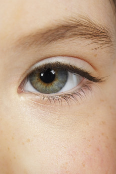
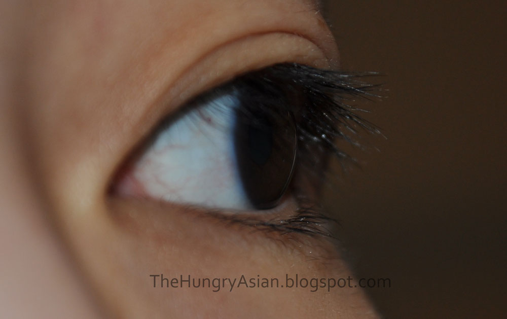
Fawn wrote:A lot of things are going well in this picture, but some aren't. Crit time!
The shading is a bit sloppy, specially on the skirt and the hair. Instead of using smaller, soft brushes with high pen-pressure settings, (I'm assuming you use Sai), use a larger harder brush with less pressure settings to block out the colors on clothes and skin.
Hair shading is a bit different, you need to think about the strands of hair that are hit by the lightsource. Also, remember where the part of the hair is, since that's where a lot of your shading lines may originate from.
Also your eyelashes seem clumped, this is easily fixed. Think of them in perspective from which way you'd be looking at her, how her eyelashes would look.
Here's some (super sloppy, sorry ^__^;) examples of what I mean:
datcritique.png
I'm still a learning artist myself, so I most likely did a few things wrong. But, what I do know is that blocking out your colors saves a lot of time and looks smoother.
Wow! Great crit, I love you already.
Actually, I use Photoshop. I have no idea how to set pen pressure settings. ^_^; But I guess now I know that they are "too high"? I'll google how to lower them.
Ah, thank you for pointing out where her part is. I never even thought about it. xD I admit I got lazy there.
Okay, I'll fix the lashes. This is good advice! I don't really know much about girl's make up or eyelashes. With males I don't draw them, haha.
Usually I'm too lazy in general to color anything; I have a million linearts. xP So I appreciate any crits on my coloring as I know I don't have much experience with it.
HigurashiKira wrote:Excellent, I like! The knife was a nice touch.
(Also, I'm getting a "Hunger Games" vibe from this, I don't know why...)
Thanks! I'm glad you like! If you want me to make changes, tell me soon before I slip into my mental La-Z-boy.

I must google Hunger Games and find out.

I'll take all of your advice into consideration and post a fixed pic as soon as I get it done.


