Okay, so I'm not the best at drawing backgrounds. I'm just about better than the worst. But I decided, you know, practice makes perfect, so I decided to draw some I might use for a future VN I might make.
TakeOverWorld's Art thingy (uh, critique please?)
-
TakeOverWorld
- Regular
- Posts: 112
- Joined: Fri May 27, 2011 11:00 am
- Location: London, UK
- Contact:
TakeOverWorld's Art thingy (uh, critique please?)
Hello 
Okay, so I'm not the best at drawing backgrounds. I'm just about better than the worst. But I decided, you know, practice makes perfect, so I decided to draw some I might use for a future VN I might make. That's the (very rough) sketch I'm using to colour in the background... It's meant to be a giant statue of a (very stylized) bunny, viewed from below, then I thought it might look bare, so I added trees. .... And that's how far I've gotten at the moment, doing that tree. I've been using tutorials found on DeviantArt to do the tree... But, ah, it looks a bit weird.
Okay, so I'm not the best at drawing backgrounds. I'm just about better than the worst. But I decided, you know, practice makes perfect, so I decided to draw some I might use for a future VN I might make. That's the (very rough) sketch I'm using to colour in the background... It's meant to be a giant statue of a (very stylized) bunny, viewed from below, then I thought it might look bare, so I added trees. .... And that's how far I've gotten at the moment, doing that tree. I've been using tutorials found on DeviantArt to do the tree... But, ah, it looks a bit weird.
-
Hayzel
- Veteran
- Posts: 417
- Joined: Sat Jun 25, 2011 7:08 pm
- Projects: Echo: Legend of the Centennial Bells, The Making of a Visual Novel, MLPFIM: The Flower Blooming Festival
- Location: MI, USA
- Contact:
Re: TakeOverWorld's Art thingy (uh, critique please?)
the sky looks real O.O When I first looked at it I thought it was a picture !!! That's pretty amazing 
-
MaiMai

- Yandere
- Posts: 1757
- Joined: Sat Mar 21, 2009 6:04 pm
- Completed: [Phase Shift]
- Projects: [ None ]
- Organization: Paper Stars
- Tumblr: maiscribbles
- Deviantart: maiscribble
- Location: USA, Southern California
- Contact:
Re: TakeOverWorld's Art thingy (uh, critique please?)
Are you using Photoshop clouds? Because I honestly don't recommend that if you're going to CG everything else. Still I do like the blue/blue gray gradient you've got going there, it's pretty atmospheric.
 COMMISSIONS AVAILABLE (check Tumblr sidebar)
-
TakeOverWorld
- Regular
- Posts: 112
- Joined: Fri May 27, 2011 11:00 am
- Location: London, UK
- Contact:
Re: TakeOverWorld's Art thingy (uh, critique please?)
Yeah, I am using photoshop clouds. Thanks for the advice, I'll find another way to do the clouds
-
TakeOverWorld
- Regular
- Posts: 112
- Joined: Fri May 27, 2011 11:00 am
- Location: London, UK
- Contact:
Re: TakeOverWorld's Art thingy (uh, critique please?)
So I tried another way of doing the clouds..... I think it came out alright, bearing in mind theres going to be a statue thingy in the middle of the picture anyways.
These are also some character sketches I drew yesterday. The woman on the left is meant to be slightly muscular... or stocky, or something.
-
TakeOverWorld
- Regular
- Posts: 112
- Joined: Fri May 27, 2011 11:00 am
- Location: London, UK
- Contact:
Re: TakeOverWorld's Art thingy (uh, critique please?)
Sorta triple post now :/
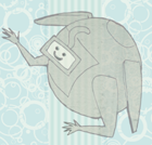
Eitherways, her's a pic. It's the MC of a VN I'm working on. It'd be the side image when I make it smaller. I think the head's a tad too big, though.
Eitherways, her's a pic. It's the MC of a VN I'm working on. It'd be the side image when I make it smaller. I think the head's a tad too big, though.
Re: TakeOverWorld's Art thingy (uh, critique please?)
The sky looks much better, however the tree looks very strange. Tree branches are more like this:TakeOverWorld wrote:So I tried another way of doing the clouds..... I think it came out alright, bearing in mind theres going to be a statue thingy in the middle of the picture anyways.
These are also some character sketches I drew yesterday. The woman on the left is meant to be slightly muscular... or stocky, or something.

--------------
Your characters are looking very thin here
.TakeOverWorld wrote:Sorta triple post now :/
Eitherways, her's a pic. It's the MC of a VN I'm working on. It'd be the side image when I make it smaller. I think the head's a tad too big, though.
Good work! The shading of her hair is excellent
My advice is to add a stronger shading to the eyes and white dots to make them shine! (Eyes are shiny~)
Triple post? Well, this forum is getting kinda dead, maybe because it's summer...
Re: TakeOverWorld's Art thingy (uh, critique please?)
I really like how the clouds turned out in the second picture.
It seems to go along with the feel of your characters and the sketches better then the first, and gives a gentler feel to the picture.
Plus, the coloring of your character is good.
It seems to go along with the feel of your characters and the sketches better then the first, and gives a gentler feel to the picture.
Plus, the coloring of your character is good.
-
TakeOverWorld
- Regular
- Posts: 112
- Joined: Fri May 27, 2011 11:00 am
- Location: London, UK
- Contact:
Re: TakeOverWorld's Art thingy (uh, critique please?)
Thanks for the responses
 .
I'll do that next time - I find it hard to shade eyes, because I don't really have my own way to do it at the moment.
.
I'll do that next time - I find it hard to shade eyes, because I don't really have my own way to do it at the moment.
Yeah, I thought the tree looked strange but I've decided to re plan the background anyways, as it doesn't look good with a sprite in front of it.The sky looks much better, however the tree looks very strange. Tree branches are more like this:
Ah, whenever I draw people, they always end up on the skinny side, even when I attempt to draw people slightly more stockyYour characters are looking very thin here .
Thank youGood work! The shading of her hair is excellent !! I think your color choice is great.
My advice is to add a stronger shading to the eyes and white dots to make them shine! (Eyes are shiny~)
Thank youI really like how the clouds turned out in the second picture.
It seems to go along with the feel of your characters and the sketches better then the first, and gives a gentler feel to the picture.
Plus, the coloring of your character is good.
Who is online
Users browsing this forum: No registered users