Page 5 of 8
Re: Witch Apprentice (Oct 31st update: Demo up on page 3)
Posted: Thu Nov 01, 2012 11:17 am
by Anna
Cadenza wrote:
I don't think there's a problem with Cassandra being.. well, Cassandra, and her character seems very fun! But, I think you could pull off the "this is the Pervert Witch" idea much better if you progressively revealed her perverted ways.
Now that Cadenza mentioned it, I have to agree. Most of her personality is told, not shown; it's much more interesting to see what she is like by how she acts instead of her telling us what she did/that she's perverted.
Re: Witch Apprentice (Oct 31st update: Demo up on page 3)
Posted: Thu Nov 01, 2012 1:18 pm
by Razz
I actually like the cassandra part since it's supposed to be revealed very quickly how weird everyone is, to give you a fish out of water feel or 'oh god what did she get into', but maybe the main character we could put more emphasis on expectations in the beginning? Like how they'll be noble or serious practitioners of magic seeing as they're the most powerful of all time. But yeah the char introductions are supposed to be extreme and weird and then you learn other sides to their personality.
As for the sprites...darn i'm not really sure how to fix that one. >w>
No you aren't rude!

Thank you for sharing your thoughts with us!
Re: Witch Apprentice (Oct 31st update: Demo up on page 3)
Posted: Thu Nov 01, 2012 2:18 pm
by Rem-chan
Ahh this game looks promising

<3
Re: Witch Apprentice (Oct 31st update: Demo up on page 3)
Posted: Fri Nov 02, 2012 2:25 pm
by Razz
I'm working on the GUI. I'm hesitant to use black since I think it's overused but at the same time I thought it looked nice in the demo, but I included a tan sort of textbox as well. Looking for thoughts and suggestions.
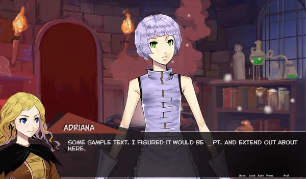
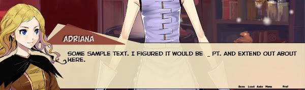
The demo title screen was one of my throwaways and i think i'm going to go for a sleeker look.
Re: Witch Apprentice (Oct 31st update: Demo up on page 3)
Posted: Fri Nov 02, 2012 2:36 pm
by Anna
I find the black one easier on the eyes, but maybe that's just me. Also, I think it would help readability if you added some drop-shadow for the text.
Re: Witch Apprentice (Oct 31st update: Demo up on page 3)
Posted: Fri Nov 02, 2012 2:45 pm
by Cadenza
Razz wrote: Looking for thoughts and suggestions.
I find that when working on a GUI, it's helpful to have a set aesthetic in mind for it. Colours, vibes, inspirations - basically, what kind of mood you want the design to evoke in people. The GUI design should match the VN design.
I prefer the black. I think you can't go wrong with a black textbox at >75% opacity + white text. The shape of the textbox and how the quick menu is incorporated can be a way to add a more individual look to it. Also, I agree with Anna, a slight drop shadow with very little distance would help readability and look less "flat".
Are you going to be using those fonts in the final, do you think? The text font looks a bit too "comic book" to me at the moment.
Re: Witch Apprentice (Oct 31st update: Demo up on page 3)
Posted: Fri Nov 02, 2012 3:07 pm
by Razz
Thanks, i'll ask if it's possible to code in a drop shadow function. It does look better.
It is a comic book font hehe, it's my favorite one so i'm a little biased towards it. I might use calibri, which i think is the game default.
Cadenza wrote:
I find that when working on a GUI, it's helpful to have a set aesthetic in mind for it. Colours, vibes, inspirations - basically, what kind of mood you want the design to evoke in people. The GUI design should match the VN design.
Very good advice...hmmm. Gonna go back to tinkering with it. Thanks!
Re: Witch Apprentice (Oct 31st update: Demo up on page 3)
Posted: Fri Nov 02, 2012 3:13 pm
by Cadenza
I think Calibri would be good! I love Calibri. And you should be able to code in a drop shadow, I'm sure it's somewhere on the Ren'Py site. Happy tinkering! ♥
Re: Witch Apprentice (Oct 31st update: Demo up on page 3)
Posted: Fri Nov 02, 2012 5:25 pm
by Reikun
Razz wrote:I'm working on the GUI. I'm hesitant to use black since I think it's overused but at the same time I thought it looked nice in the demo, but I included a tan sort of textbox as well. Looking for thoughts and suggestions.
How can black be overused?

/halfjoking
I like the black one since it provides better contrast with Adriana's color scheme while the Tan one kinda blends with her hair :S Also black will undoubtedly match with all the sprites/bgs/colors you could ever put in the game while tan may not be appropriate for all scenes?
But uh. Take whatever I say with a grain of salt in terms of GUI. Since I, y'know,
made a tan-ish textbox. /brick'd
Re: Witch Apprentice (Oct 31st update: Demo up on page 3)
Posted: Fri Nov 02, 2012 11:51 pm
by izukwon
I like the tan better than the black. I think when you use transparent black for the textbox it kinda gives you the "this is what I thought" feel. You know, in comic books/manga black frames mean either a flashback or a thought.
While it's true the tan blends too well with Adriana's sprite, I don't think that's a bad Idea. Also with what the game is about, the color fits that "leather scroll" feeling perfectly too. And I don't see why tan would not match with certain color, I have a khaki jeans that fits perfectly with any colorful and mute shirts I own

Though I am biased to brown and its family colors :p
Re: Witch Apprentice (Oct 31st update: Demo up on page 3)
Posted: Sat Nov 03, 2012 11:29 am
by Blane Doyle
Hmn... I am... a bit down the middle, actually. I like both and both have their downsides, agh... Hmn...
The black is traditional (in a loose sense) and naturally looks nice and fits a story for witches. But a lighter text box fits the goofy tone. The black one blends in Adri's cape too much to me, while the light one blends her in general but not overwhelmingly so. Both are easy to read, but I find the tan one easier on my (weak) eyes.
Hmn... I think I would vote for the tan one, but I think it could use a little work color tone wise.
Re: Witch Apprentice (Oct 31st update: Demo up on page 3)
Posted: Sat Nov 03, 2012 4:07 pm
by WickedRaccoon
even though they both look fine to me,i think i'm going to vote tan,cause it makes adriana's sprite look better.black makes her loose her cape and black hair streaks in the backround,and the tan brings them out (hope i'm making sense) ^^
Re: Witch Apprentice (Oct 31st update: Demo up on page 3)
Posted: Sat Nov 03, 2012 4:16 pm
by Cadenza
I think it's important to remember that while the tan one may look better with Adriana's sprite, all characters + narration will also be occupying the textbox. Just a note c:
Re: Witch Apprentice (Oct 31st update: Demo up on page 3)
Posted: Sat Nov 03, 2012 4:35 pm
by Razz
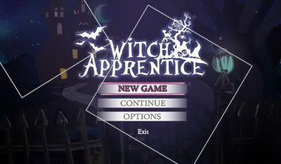
Thanks for the feedback everyone! ;w; You guys are awesome. I'm still tinkering with it, I couldn't get any non-nuetral colors to look good so i'm gonna see if a nice texture or backdrop behind her will help.
Incidentally here is the new title screen!
Re: Witch Apprentice (Oct 31st update: Demo up on page 3)
Posted: Sat Nov 03, 2012 5:29 pm
by wakagana
That looks quite fancy. -adjusts monocle- I approve~
Only odd thing for me is the change of text/size with Exit.
Almost makes me feel like you should feel guilty for clicking on it D;