I Need Your Critiques (Update: I'm Using Your Critiques)

Art threads specific to a single artist.
Post Reply
Message
Author
User avatar
Obscura
Eileen-Class Veteran
Posts: 1431
Joined: Fri Mar 09, 2012 6:58 pm
Projects: Coming Out On Top
Location: United States
Contact:

I Need Your Critiques (Update: I'm Using Your Critiques)

#1 Post by Obscura »

So, here begins my story. I tried putting up my unfinished game on Steam today just to see what kind of feedback I would get. I was prepared for haterade. I was prepared for "THIS IS GAY"and "YOU SUCK AT EVERYTHING AND DIE" (I'm not easily upset by criticism, if you haven't noticed already.) What I wasn't prepared for was:

- I thought I was going to have to go through at least one admin/bureaucratic hurdle before my hastily-thrown together presentation was up on Steam. (Nope. As soon as I hit submit, there was all my crap up on Steam. Yeah. I guess that's the point of this Greenlight thing, I know I know. But it was really startling and I was unprepared.)
- One of our forum members included my game in the list of veteran vn developers on Steam. It was nice of this person :wink: ...but OMG :shock: I'm a freaking amateur. -_- I was trying to sneak my game on there for feedback, not be included as a "serious VN maker."

Anyways, the feedback on Steam is obnoxious, but still helpful. Basically, a lot of people hate the artwork. I need your help, guys. The art needs to be revamped for the longer game anyways, so I might as well start now.

So, you probably have seen my characters by now. But here they are again. Let me know if you want me to post the individual sprites.
SCALED_ks_coot_image_2.png
Please tell me what is and isn't working for you. Be harsh (put please be specific too.) There's not much I can do about the backgrounds (which I hope to buy for the full game), but the character art? What is bothering you about the line work/shading/coloring/proportions of these characters.

I guess I assumed the art was passable (if flawed) because I haven't heard much with regards to my art at all. After staring at it for so long, it's hard to tell what needs to be changed.

Any feedback you have is appreciated. I'll probably leave up the game for a while longer on Steam Greenlight before I cut the cord.
Last edited by Obscura on Sun Sep 09, 2012 1:30 am, edited 4 times in total.
Coming Out On Top - An Adult Gay Dating Sim
website

User avatar
wakagana
Veteran
Posts: 374
Joined: Mon May 14, 2012 1:27 am
Projects: Flash Q
Organization: Team Bread
Contact:

Re: I Need Your Art Critique

#2 Post by wakagana »

Your shading could be a bit better. All you can really notice from afar is that the colors don't blend into one another so it looks sort've blotched where some area's are a lot more darkend then others when it should be a gradual change. I might be crazy though. -shrug-

The art in your game is decent. Just continue to practice and you'll get better and better.

User avatar
Awedacious
Regular
Posts: 61
Joined: Sun Aug 26, 2012 9:45 pm
Location: Brisbane, Australia
Contact:

Re: I Need Your Art Critique

#3 Post by Awedacious »

The most obvious deficit I can see is the shading. It looks like the shadows are simply the base colour with black added. This gives the sprites a dull, lifeless look.

This is not a hard rule, but using the complementary colour to your lighting works well. i.e. If you have a warm highlight, use a cool shadow.

Also, there don't seem to be any highlights--just the base colour and shadow. Highlights bring out the entire picture as well.

If I was really nitpicky, I would also comment on the level of detail in the clothing. Simple stuff, like how the jacket's hood on the purple haired girl seems glued to the jacket on her left shoulder, or the unrealistically crisp collar on the blonde haired man's shirt, or the infinitesimally thin turtleneck collar the balding man is wearing.

There's a few other things, but in general, the art just seems a little rushed, is all. A lot of shortcuts have been taken that detract from the overall picture.

I hope I wasn't too hard on you they're perfectly fine for a simple game and I hope your project goes well!

User avatar
FatUnicornGames
Miko-Class Veteran
Posts: 576
Joined: Sun Mar 25, 2012 7:54 pm
Projects: Club Shuffle
Contact:

Re: I Need Your Art Critique

#4 Post by FatUnicornGames »

I like your art, I wouldn't mess with the style.

I think your shading could use more contrast. A darker shadow a lighter highlight. Variation on the line work would be good too. Dynamic line work has thicker and thinner points.

As an aside I showed Les your work and he says it is really good but that he agrees with the points I am making.

Good luck hun!

Edit: Also as has been said, just because it is a shadow doesn't mean it is the base color plus black. A darker version of the color could have a more saturated AND darker version.
Last edited by FatUnicornGames on Sat Sep 01, 2012 12:28 am, edited 1 time in total.
Image
Developer Blog for Club Shuffle - Follow and Share?
-Also! You can call me Crystal if you want.-

User avatar
Auro-Cyanide
ssǝʇunoƆ ʇɹ∀
Posts: 3059
Joined: Sun Jul 25, 2010 9:02 am
Completed: http://auro-cyanide.tumblr.com/visualnovels
Projects: Athena
Organization: Cyanide Tea
Tumblr: auro-cyanide
Deviantart: Auro-Cyanide
Location: Melbourne, Australia
Contact:

Re: I Need Your Art Critique

#5 Post by Auro-Cyanide »

There are probably 3 main areas that need work:

Lineart:
-The lineart has no thickness variation and doesn't taper. In work like this it can make the lineart look clunky.
-The lineart is black. While this can work with a stylistic choice, your colours aren't really strong enough to pull it off.

Shading:
-The shading colours seem to just be a darker colour of the base. It's best to choose and add a bit more variation.
-The shading is too soft and lacks variation. Studying shadows and light might help to give you a better idea of how it should fall.

Colour choices:
-The colours are kind of... bright? Like they lack a certain harmony. Maybe you could try restricting your colour palette?

I think your anatomy is pretty good generally, maybe a bit more variation in facial expressions and maybe give the characters eyelids.

CheeryMoya
Miko-Class Veteran
Posts: 892
Joined: Sun Jan 01, 2012 4:09 am

Re: I Need Your Art Critique

#6 Post by CheeryMoya »

Hrn, I wouldn't take those Steam comments too personally, anything that requires lots of reading and remembering for the plot probably doesn't sit too well with that crowd.

Well, I already told you that I'm not fond of how glossy their hair is. Also was looking at Ian's shirt and
Image
Those wrinkles aren't doing anything??? Usually there would be some shadows under there but there aren't. Add some?

Also, try experimenting with line thickness. You've got a tablet, go beyond the same thin lines! You know what I've been into lately *coughTWEWYcough* and I really like the aesthetic of the outlines they have. Not to say that you should make your style like this, but you get the idea? Varying line thickness.

P.S. I'M SORRY I HAVEN'T COMPLETED THE LP I WAS DOING but I cannot stop the twewy party sob sob

User avatar
Sapphi
Eileen-Class Veteran
Posts: 1685
Joined: Fri Jun 05, 2009 3:31 am
Completed: Boku no Taisetsu na Yumeko
Projects: Twelve, PAW ★ PRINTS
Organization: Kitsch-soft
Location: Illinois, USA
Contact:

Re: I Need Your Art Critique

#7 Post by Sapphi »

Yikes, I was just reading the comments on Steam for this.

Um, if you want my honest, honest opinion (as both a perfectionist artist and animation enthusiast):
Any time I see those blunt, vector-trace lines, I think "cheap". Compounding the problem is the spotty detail work. The shading is very inconsistent between the sprites. They seem to have it all according to the same light source, but the technique used seems to vary between images. This makes it feel very rough and rushed, which also screams "cheap".

It seems to me that these are traced from photos (is that correct?). While I think it's an interesting technique, as a consumer I'm not sure if I would spring for it. When drawing a character from the ground up, one is able to put a lot more feeling and exaggeration into the pose than if the pose is traced. Right now, I get a feeling of "vagueness" from your sprites - especially because the lineart for their eyes seems sloppy in some places (red hair girl). Eyes are very important, so I hate to see them drawn like they were an afterthought. Believe it or not, it actually makes me feel less of a connection to the character. It reminds me that they are a drawing.

Also, something needs to be done about the colors. You have very saturated colors (I'm looking at the girl in purple in particular) with very low contrast in the shading. This, combined with the vector-trace outlines, makes the art look very flat.

So, in summary... blunt "traced" lines + inconsistent detailing + garish colors + lackluster contrast = blah. "Blah" is how I feel, because "blah" is what the images are conveying to me - a massive lack of attention to detail.

Of all these things, it's the blunt, same-weight lines that really irk me.
"It is [the writer's] privilege to help man endure by lifting his heart,
by reminding him of the courage and honor and hope and pride
and compassion and pity and sacrifice which have been the glory of his past."
— William Faulkner
▬▬▬▬▬▬▬▬▬▬..+X+..▬▬▬▬▬▬▬▬▬▬
Image

User avatar
FatUnicornGames
Miko-Class Veteran
Posts: 576
Joined: Sun Mar 25, 2012 7:54 pm
Projects: Club Shuffle
Contact:

Re: I Need Your Art Critique

#8 Post by FatUnicornGames »

By the by, I am glad you are trying to improve (we all should try to improve), but don't let the haters on Steam (I read the comments) get you too down. They were really overly harsh and pretty dickish.
Image
Developer Blog for Club Shuffle - Follow and Share?
-Also! You can call me Crystal if you want.-

User avatar
MysteriousArtistX
Regular
Posts: 42
Joined: Tue Aug 14, 2012 2:54 pm
Projects: A Lifelong Work I'll Eventually Share
Organization: Because Arrrt?
Location: The Americas
Contact:

Re: I Need Your Art Critique

#9 Post by MysteriousArtistX »

I love your style, and I think it's absolutely great and that you should only grow upon it.

I think it's mostly a matter of coloring and lines. Line variation helps in defining features, as do using the proper colors to accentuate lights and shadows and give a little more liveliness to a character.

Besides that I really think your style is great 8)
"I Believe Everyone Should Have A Game They Can Relate To: That games are an art and no one should be excluded. My games will do this."

User avatar
FatUnicornGames
Miko-Class Veteran
Posts: 576
Joined: Sun Mar 25, 2012 7:54 pm
Projects: Club Shuffle
Contact:

Re: I Need Your Art Critique

#10 Post by FatUnicornGames »

Do some research on cel shading. Here are a couple tutorials I dug up.

http://myapple.deviantart.com/art/Cel-S ... -270935090
http://kaze-hime.deviantart.com/art/Con ... -283161859
Image
Developer Blog for Club Shuffle - Follow and Share?
-Also! You can call me Crystal if you want.-

User avatar
clua
Miko-Class Veteran
Posts: 537
Joined: Sat Dec 12, 2009 1:38 pm
Completed: Stormy Night /The Knife of the Traitor/Charlatans
Projects: The Hurtful Wall /_Salomon/Infurubia
Tumblr: notttt-che
itch: chegovia
Location: In a jar with pirañas
Contact:

Re: I Need Your Art Critique

#11 Post by clua »

uhhh I was lurking but I wanted to give a little critic since you want to improve, which is very admirable, after reading all the coments.Instead of getting angry, you want to do better.

I think the problem lies more on the lineart than the coloring.In the end think of coloring as a makeup. It will make your lineart pretty! But your lineart will be the same. If it's bad. well...
Also everyone pointed what I wanted to say. I just want to add that the expressions of your characters are hmmm like I can't fully understand them? Like this one for example, the blonde guy has a flirty expresion, but what about the other one? Is he ashamed? Confused?

Maybe you can draw directly on paper and have fun drawing expressions too, looking to photos or people that surrounds you, whatever you like most. Make studies!

I hope this is helpfull :D
♦WIP♦
Infurubia
The hurtful wall
_Salomon

♦COMPLETE♦
+The Knife of the Traitor(Nanoreno 2012)
+Charlatans(Nanoreno 2015)

Dev tumblr
EVN Store

User avatar
myapple
Regular
Posts: 151
Joined: Sat Jun 30, 2012 12:34 pm
Projects: RoG2.0, Stirling
Organization: red inc.
Location: Tokyo
Contact:

Re: I Need Your Art Critique

#12 Post by myapple »

^Totally recommend those tutorials X'D

I think you have a nice style! It's interesting and clean~

Other than colouring, some really easy quick fixes for lineart (if you want to work with what you already have done, though this also applies if you redraw anything) is to colour your lines, and to go in and manually taper them if you don't have working pen pressure or draw with a mouse.

Rather than using black, which is a very harsh colour, especially against bright colouring, try changing your lineart to brown, or maybe a dark blue or purple. It will take the edge off a bit. If you want to go the extra step, you can even change individual parts of the lines to reflect what they surround (ie for the girl in the middle, make the lines of her hair purple, for the blonde boy, a mid-brown, etc).

As for tapering, I read that you have a tablet, and as far as I can tell you seem to be drawing using SAI? Pen pressure should be something that you have turned on all the time. BUT you can go in with a small eraser, and make the lines pointy at the ends. It should only take a few minutes, but it makes a world of difference. Also, take a super small brush, and go over your lines again in any places that should be shadowed, making them thicker. (eg under the chin, under the arms, on the opposite side of the sprite from the light source, etc) This will enhance the tapering, and give your lineart more depth.

ALSO, if you ever happen to redraw anything, or for any future projects, try to draw in a higher resolution. When you sketch out what you want, increase the size (I usually go for 400%, and make sure you're on 300DPI) before doing lineart or colouring. It makes a huge difference in quality of line and colour when you resize back to original dimensions for the sprite art.

User avatar
LateWhiteRabbit
Eileen-Class Veteran
Posts: 1867
Joined: Sat Jan 19, 2008 2:47 pm
Projects: The Space Between
Contact:

Re: I Need Your Art Critique

#13 Post by LateWhiteRabbit »

Awedacious wrote:The most obvious deficit I can see is the shading. It looks like the shadows are simply the base colour with black added. This gives the sprites a dull, lifeless look.
I'll add that your highlights suffer from the same problem, but in reverse - you just added white to the base color - or in some cases like the faces actually USED white. Complimentary colors and just COLOR in general should be used for highlights and shadows.

For instance - take a white shirt. It shouldn't be white. (I know - crazy right?!) It should be a light shade of blue, or a pale pink, with deep blue shadows or purple shadows. If you are going for a more muted palette you might use yellows and browns for a white shirt. It will still READ as white to a viewer, but it will have rich, three dimensional color and life. Look at this image by Jo Chen:

Image
The Punisher is wearing a black coat and shirt, isn't he? But Chen didn't paint it using black, because black is a dead, lifeless color. She painted it using browns, reds, and greens. It reads as black though - you wouldn't mistake it as anything other than a black leather outfit.

This brings up another issue, which makes a huge difference. Shadow edges. The edges of your shadows have a lot to say about material definition and the three dimensional quality of your characters. Some shadow edges are hard, sharp, and defined, others are soft and diffused. This tells the viewer about the surface of the material and the distance it is from the light. In the image above, the jacket reads as leather and the girl's hoodie reads as cotton because of the way lights and shadows are handled on the surfaces.

Your shadows are too blobby and undefined. Which is symptomatic of your line and detail work in general - they are very inconsistent. You have sharp squiggles for hair highlights on one character, soft air brushed highlights on another character's hair, bands of highlights for another character, and then NO highlights for other character's hair. Your characters need to look like they belong in the same stylistic universe together.

Use a unified palette for all your game's art. Don't just start each sprite with all 16 million colors available to you. Create a custom palette and stick with it. It will help unify the design and keep the character's grounded with each other.

As others have said, you need to move away from the one weight linework. Your lines in your drawings should not have a uniform weight (i.e. width) across the entire drawing. It makes the figures look flat.

Image

You don't have to go this extreme, but it shows what I'm talking about. The general rule is that lines in areas of shadow are thicker, and lines in areas of light are thinner, and lines thin where they meet or terminate. Good line weights can add dimension and life to your drawings before color even enters the picture.
Obscura wrote:I'm a freaking amateur. -_- I was trying to sneak my game on there for feedback, not be included as a "serious VN maker."
You've got a good head on your shoulders. Your art has problems, but it isn't anything a little more attention to detail won't solve. I'd classify you a serious VN maker. Keep your chin up! You've got some good advice to go on in this thread.

User avatar
Obscura
Eileen-Class Veteran
Posts: 1431
Joined: Fri Mar 09, 2012 6:58 pm
Projects: Coming Out On Top
Location: United States
Contact:

Re: I Need Your Art Critique

#14 Post by Obscura »

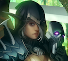
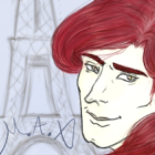
Hey thanks guys. First of all, yeah, there are a bunch of dickweed comments on Steam but I'm okay with that, especially when it comes to my art because I know it needs work. If somebody tells me my art is awful and that's why they won't touch the game, it's still feedback and ultimately helpful to me.

Anyways, I deleted the game off of steam as I mentioned in the other thread because the art criticisms (harsh but helpful) were turning into visual-novels-are-awful criticisms (totally unhelpful.)

So...about the art. Re:the comments about vector/uniform line weight = bad. I don't think that ever occurred to me. Thanks so much for the feedback on that. Right now I'm using a vector program to clean up my line work, so I'm either going to have to learn how to change the weight of the vectors or just use a drawing program instead, it seems. I guess my paranoia is that I'll one day need to scale up the line work and the quality will degrade in the process.

If anyone's curious as to why I use a vector program, it's because the easiest way for me to draw is to use my ipad, since I'm so shaky with my Wacom Graphire tablet. I take the drawing from ipad (which I have to draw in low res because of memory issues), then trace it over with a vector program. Then the vector gets blown up and goes into GIMP, where I start coloring and shading.

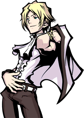
I did trace the arms and chest for one character, and for all the others I just drew looking at photos off the net.

Specific stuff:

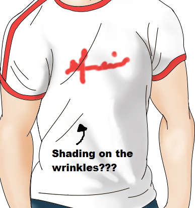
@Wakagana: Thanks, yeah, the shading is a problem right now. This is due to me using one technique and then changing it mid way and then not...settling for any technique in particular and just "winging" it.

@Awedacious: Thank you for the assessment. Nuxill alerted this to me in the beginning but I was having a hard time with trying to achieve the look I wanted. At some point I just gave up and I think went back to almost-black shadows. So shadows is on my list of things I need to fix. And I have highlights but they are teeny tiny. Also the comments about the clothing will do a lot to help me with the final game.

@FatUnicornGames: Thanks. You brought up the major points I need to work on and wow, thanks for asking Les. Of course now I'm flipping off all the haters in my head, thinking, "a comic book artist says it's fine, eff you, so there." :lol:

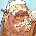
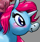
@Auro: Those are really helpful and specific comments, thank you. Black lineart is black, eh? I haven't attempted to experiment with that, so I'm going to give that a shot. It's good to know what I need specifically to do with the shading and colors, so thank you. I love the colors you use...color harmony is really difficult for me. Eyelids!!! What are those? No, thanks...I never even thought of that.

@Cheerymoya: Thanks...yeah. The hair thing. All of their hair is a mess right now...I don't know why but I can't seem to select the right brush to use for the darker and lighter hair strands. It always looks wrong so they're all wearing Lego helmets at the moment. And thanks for the clothing feedback. Ahaha, my entire Tumblr is filled up with this TWEWY thing BECAUSE OF YOU (and I don't know anything about it). I dunno, do I retaliate with the gay porn? Kidding. But I'll check out the artwork.

@Sapphi: Another vote against my one-dimensional lines, haha. Thanks for the comments, and yeah, I didn't realize how weird the eyes looked until I flipped the photos. Again, pointing out the problems with colors and lack of contrast is helpful. And yeah, you realized that I kind of "winged" it on the shading because midway through I didn't realize what the hell I was doing anymore with the shading.

Thanks everybody so far for your IMMENSE assistance. I don't know how much I can change before the my project goes live next week, but it'll help me for the longer game (if it gets funded) and/or future projects. And I'll be able to hire somebody to help me, hopefully.
Coming Out On Top - An Adult Gay Dating Sim
website

CheeryMoya
Miko-Class Veteran
Posts: 892
Joined: Sun Jan 01, 2012 4:09 am

Re: I Need Your Art Critique

#15 Post by CheeryMoya »

Ahaha, my entire Tumblr is filled up with this TWEWY thing BECAUSE OF YOU (and I don't know anything about it). I dunno, do I retaliate with the gay porn? Kidding. But I'll check out the artwork.
I have found my happy place, and that is with the Slamigos... But the artstyle for TWEWY is very bold and edgy. It's certainly different and it uses obvious black outlines and shading. If you want to rely less on black though, you should put less of that for detail and use more color? Like Edwina's hair, there's random black squiggles for her hair. Get what I'm saying???
/ollies out of thread to let actual artists talk

Post Reply

Who is online

Users browsing this forum: No registered users