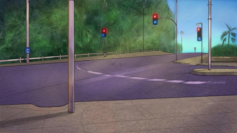
Lesleigh63 wrote:Background for my visual novel. 90% of my backgrounds are nighttime scenes and I can't figure out if you're supposed to show atmospheric fade if it's a night-time scene. Anyone know?
[You posted this a while ago so it's probably not that helpful anymore but...] I don't whether you're supposed to but I would. I'd probably make the buildings just recede all the way to the horizon and heavily fade them out, otherwise it looks like you're at the edge of town. You can also side-step the decision by making the road we're looking down intersect with another road so that there's buildings blocking the horizon.
---
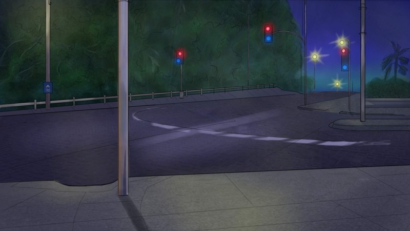
Howdy Tempus. I added atmospheric fade to my park background and decided it looked better; so I went back and added it to the street scene (makes it look less flat).
Like your colours on your background, but I don't like the moon (the shape doesn't feel right to me but I could be wrong). I'd probably go for a less defined edge on the mountain range behind the trees and even more less defined on the one behind that - but it really depends on what 'feel' you want to this piece.
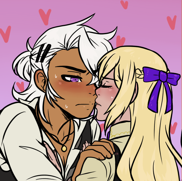
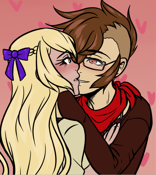
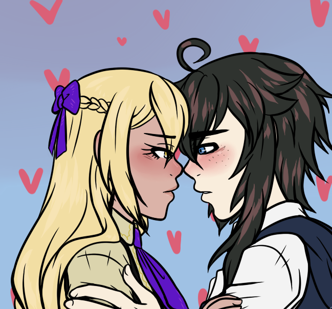
May 23rd was Kiss Day in Japan, so I drew a thing in response to it (although it was no longer the 23rd in Japan's timezone by then hahhh). I had to crop it into three parts because it was too wide for the forum's limits :')
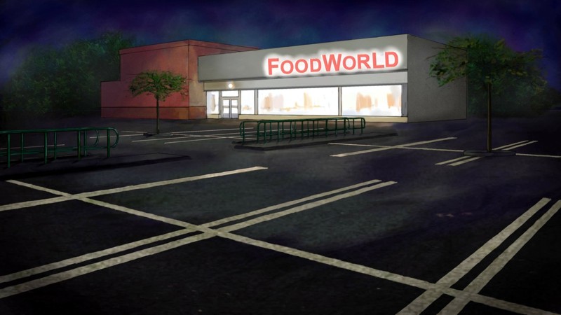
Still working on backgrounds. This one a supermarket at night.
I returned to working on my project after doing bgs for a group project for a year and a bit; and my style has changed now - and these latest bgs aren't consistent with the four I did for my project over a year ago. I'll probably need to retouch the earlier ones.
Woo, something I'm almost happy with! I'm not quite sure what I did but I messed up the layers and I couldn't be bothered to fix it and just now I remembered something I was supposed to add. Well whatever. I wanted the legs to be long but I think I overdid it. Anyway, any pointers would be appreciated.
Also, just flipped it and it looks better? Not sure how that happened...
Harick wrote:Woo, something I'm almost happy with! I'm not quite sure what I did but I messed up the layers and I couldn't be bothered to fix it and just now I remembered something I was supposed to add. Well whatever. I wanted the legs to be long but I think I overdid it. Anyway, any pointers would be appreciated.
Also, just flipped it and it looks better? Not sure how that happened...
Looking good! The monster is maybe a bit back-heavy, like the back legs should maybe be in a slightly different angle to support the weight better? I don't draw a lot of animals, so I could be totally off.
However, I do have one tip that could help you! The monster is such a big element of the piece but it seems a bit "empty" in a way. I think the piece would really benefit from adding some sort of a texture to the monster. Maybe scales, or if it's supposed to be smooth, some kind of patterns or highlights could work.
The legs of the human character are definitely a bit long. Legs are usually half the length of the full body (though depending on the style, this "rule" can be broken).
Thanks for the tip Aviala! I'm not really used to color my stuff but I have wanted to learn how to do textures for a while now, so this can be a nice learning experience.
I triend going back and changing the parts I didn't do all that good but at this point I should redo the coloring and some of the line art like the legs, so hopefully it'll look better then.
Edit!
Ended up redoing it and I think it's better now? I was originally going to add fire to the monster so hopefully that'll make it look less empty. Don't know how to do textures, but I did try something, but I don't think it shows.
Aaand I just noticed that I accidentally made the legs EVEN LONGER. I really need to get a better eye for spotting mistakes.
Harick wrote:Thanks for the tip Aviala! I'm not really used to color my stuff but I have wanted to learn how to do textures for a while now, so this can be a nice learning experience.
I triend going back and changing the parts I didn't do all that good but at this point I should redo the coloring and some of the line art like the legs, so hopefully it'll look better then.
Edit!
Ended up redoing it and I think it's better now? I was originally going to add fire to the monster so hopefully that'll make it look less empty. Don't know how to do textures, but I did try something, but I don't think it shows.
Aaand I just noticed that I accidentally made the legs EVEN LONGER. I really need to get a better eye for spotting mistakes.
The fire looks good! :D For human anatomy, it really helps to memorize a few basic rules, like that the legs are half of the whole body, the hands are on the mid-thigh level when the arm is straight (fingertips can almost be at the knee level sometimes), and the human body is usually 7-8 heads tall (head included in the lenght). Then, when sketching a person, check if all these "rules" apply. Do this until you develop an eye for what looks right :) It's usually good to learn realistic anatomy first and then start stylizing after, because it's easier to stylize when you understand how the human body works.
....Not that I'm a expert, I just own a couple of anatomy books for artists :'D
................. In which instead of finishing writing the VN I'm working on right now, I make a GUI for the sequel because I had an idea that wouldn't leave my head :'D
Basically I tried to emulate a music player.......... Or something :' D
The parts that actually have color change colors, and the little ball thing moves according to the Main Menu music
Almost forgot to put how the menu looks when you pass the mouse over it :' D.... Probably gonna add a gallery/extra button later.
Kinda proud that I actually managed to code the GUI the way I wanted since my knowledge of code is kind of fail :' D
(First, I warn you, Im french with poor skill in english, so if you see mistakes in my post, please, tell me !)
Hi
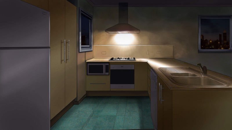
lesleight63 >> I love your backgrounds ! But I think blur and details makes your drawing more lively and interesting. Infact, if you add for exemple random object in the kitchen and perfects vegetation, your art will be more convincing.
Hoyuu >> The effect with the umbrella are really beautiful ! The design is pure and simple but works well. Im impatiente to discover your final game
Well, it's my turn now !
This is some illustrations from my project. Please can I have honest opinion ? I need to know if my art makes people want to play.
Have a nice day~
Attachments
A random background. Im not used to draw background but I try to do my best.
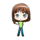
Aeron, provisional sprite. I think I will change his eye, Im not satisfied.
If you haven't done backgrounds for a visual novel before, remember that the sprite needs to sit on top of it and you may need to change the perspective to accommodate that (I always have a sprite on a layer so I can check).