Art Dumpage! Show your art ^^

Questions, skill improvement, and respectful critique involving art assets.
Message
Author
Otaku Dash
Veteran
Posts: 405
Joined: Fri Jun 25, 2004 10:46 am
Location: In a thing called "hope"....
Contact:

Art Dumpage! Show your art ^^

#1 Post by Otaku Dash »

Hey...i thought that since there are lots of good artists around here, that a thread related to showing art was created. I didn't know where to put this so i decided to put in he General part of the forum...if the Mods think that this thread is useless and/or becoming a "Spam" nest i ask for the shut down of this thread and the presentation of my apologies.......

Ok enough with the serious talk... i'm not a great artist and my drawing skillz are not that much....

Image

This is my latest work...it was made for the Final Fantasy 11 adventure thread in MT. Its not shaded since i was thinking of clor it... but since my Photoshop decided to give wierd bug (following a coloring toturial) that nomatter the color i choose to paint it always comes out red......ARGGHHH!!! :evil:

Show your art and give your opinions! :D
"Life is like a flower....take care of it and watch it bloom......only there will you see its true beauty" - Myself

"Emptiness....that is...true fear...."

-FEAR THE NARU PUNCH!!- :)

Sai
Winged Hybrid
Posts: 367
Joined: Tue Feb 03, 2004 5:35 pm
Location: England
Contact:

#2 Post by Sai »

Good idea for a thread... I was kind of wondering if something like this would eventually appear.

Nice artwork. Good dynamic pose, I always find poses difficult. I guess I would say to just look into clothing folds more right now. The idea and design for the clothes is great though. And that sword is *really* cool.
Might want to clean up the grey-ish colouring of the scan though. You can do that in Photoshop by going to Image >Adjust > Levels and tweaking the little arrows. I think there might be an Auto option around soemwhere though...
The red colouring problem sounds like you went into the Channels window and either have the Red channel selected or deleted all but the Red channel. Try checking your Channels window (should be able to bring it up under the Windows option in Photoshop somewhere) and make sure RGB channel is selected I think.
Hope that helps and keep up the great work! ^^

I still haven't got around to reviving my art website, because I wanted to use a image gallery script for me to easily add to the gallery and allow people to comment. But those I've found aren'y easy to customise into a layout of my own so I need to write my own or see if a friend can @_@

So instead I have some of my art just in a folder on my domain here for the time-being:
http://www.geocities.com/leonheart40/art/
(The Shining Lore image is a colour-work... that's rare for me heh. I find colouring a bit of a pain -.- Even though it makes a drawing really come to life -_- )

But anyway I'll post about a couple that originally wasn't in that folder but I just added for the purpose of this thread....:

B_W13
I did this for an art contest but they never did announce any winners or anything it just kinda died -_- The contest asked you to draw someone with wings that were diagonally coloured black and white (if you know what I mean...)

B_W14
Done on a whim after reading a lot of manga I think and feeling a little inspired.... Surprised myself because I'm usually hopeless with any kind of pose (as always anatomy anatomy anatomy -_-;;; )

[edit] C&C (comments and cristicm) is welcome if you like [/edit]
Last edited by Sai on Wed Aug 25, 2004 7:45 am, edited 2 times in total.

User avatar
rioka
Royal Manga Tutor
Posts: 1255
Joined: Fri Jul 16, 2004 12:21 pm
Completed: Amgine Park, Garden Society: Kykuit, Metropolitan Blues (art)
Location: somewhere in NY
Contact:

#3 Post by rioka »

You shouldn't put yourself down, Dash. You may not be a great artist now but you've got potential. You just need to keep working at it. C&C on your artwork:

1) Background is good but you should define it better. It'll probably be clearer when you color it but right now it's a bit sketchy - is he underground, in a cave?
One thing about backgrounds is you have to let your viewer's automatically know where your character is - kind of like setting the stage in images rather than words in less than a second. Instant recognition.

2) Sai is correct - you have to touch up on you clothing folds even if there's only a few lines. He looks flat otherwise.

3) Anatomy - you probably know it but I'll say it anyways. You've got to work on it a bit more. The hand holding the sword looks good but the other one looks stiff. Try splaying out the fingers next time or bend the fingers at least instead of having them all together like that - it looks unnatural.
His upper torso looks odd. His armpit starts too low. Raise it up a bit.
On the arm holding the sword, you should define where the elbow is. It looks like a wooden arm as it's so stiff looking.
It may be a personal preference but anyways: his neck looks weak because you have the lines move inwards. Straighten it out and he'll look much stronger.

4) Last but not least, cool sword - next time, make sure it's straight from the pommel to the blade. It's a common mistake but it's just one detail that seperates good from better. =)

And another thing, his eye-piece - isn't it supposed to wrap around his head out in the open? I'm looking at it and it wraps over his cheek and goes up but stops at his bangs. ??

Overall, nicely done drawing from character design to background. Good job!

And you've got nice artwork too Sai! I'll leave out c&c as you didn't ask for it and this post is too long as it is. Umm, I guess I should put something up as well... This is the most recent image I can show. She's a test character - a filler until the actual character is done.

Image

Sai
Winged Hybrid
Posts: 367
Joined: Tue Feb 03, 2004 5:35 pm
Location: England
Contact:

#4 Post by Sai »

Well C&C is welcome if anyone can be bothered heh ^^ I should note that in my post.

Wow nice artwork Eclipse. Good grasp on anatomy and detailing on clothes and hair. Neat little pose too.
I'm always messing up on skirts, so nice work on that aspect.

Otaku Dash
Veteran
Posts: 405
Joined: Fri Jun 25, 2004 10:46 am
Location: In a thing called "hope"....
Contact:

#5 Post by Otaku Dash »

Sai & Eclipse -> Heh thx for replying! I'm glad you liked the creation of this thread. :D

I'm still praticing everyday so that i iron out some of my anatomy problems....

Most of my problems is doing the hands..they always come out....wierd..non human like (maybe is because i fare a bit better at the creation of Monsters :P)

The clothes are a bit wierd because i wanted to color them since this is just a sketch for practice.....by the way thx for the advice Sai! I'll try doing that in my next pic :wink: (BTW i can't see your folders Sai...it says that the account is suspended... :( )

Glad you both liked the sword... i usualy spend my time drawing weapons so its what i fare best at the time...

Eclipse:I...got potencial..? :oops: Thank you for your support...i always try to improve and do my best! :D

Really nice pic...good anatomy. I really like the clothes expecially the skirt...(i really have to know how o do that... :) ) It really is very good. Keep them coming!
"Life is like a flower....take care of it and watch it bloom......only there will you see its true beauty" - Myself

"Emptiness....that is...true fear...."

-FEAR THE NARU PUNCH!!- :)

Sai
Winged Hybrid
Posts: 367
Joined: Tue Feb 03, 2004 5:35 pm
Location: England
Contact:

#6 Post by Sai »

Otaku Dash wrote:(BTW i can't see your folders Sai...it says that the account is suspended... :( )
Yeah, sorry about that. I think I went over my allowed bandiwdth on my domain @_@ Hosted too much this month. Need my bandiwdth to reset or buy more.

I uploaded them to my old Geocities account:
http://www.geocities.com/leonheart40/art/

Grey
Veteran
Posts: 320
Joined: Thu Jan 01, 2004 8:08 am
Contact:

#7 Post by Grey »

Dash:

it's not too bad. I like the sword as well :)

The bits I find odd are the location of his eyeball (which is rich coming from me :roll: )

Also where his trousers/shorts are folded up on the leg nearest the sword hilt looks more like his knee than the little bulge where you evidently intended it to be. I think its to do with how the leg thins after the turn up...also the belt could do with being a bit less straight, make it curve to add a bit more depth to his torso.

Sai:

Your stuff looks better than mine :roll: The style of it is very nice as well, in a way I can't really describe.

A couple of hiccups though

However on B_W13 look at the hand. If you make the palm down pose with your right hand you see that the thumb is actually on the other side. Ooops! >_<

Also it could be a stylistic thing but I think the lower leg might be a bit small as well compared to her torso.


ON B_W14 I like the pose. The gloved hand is very good.

In terms of right meaning her right, left her left

What's the lump on the left hand side of her jacket?
It's far to high up (in comparison) to be her left breast, but it doesn't look much like a fold in the jacket either. The way its shaded makes it look like a definite lump :?

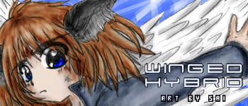
I've havn't looked everything in the directory, but 9 is really cool!


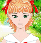
Eclipse, thats a very nice clean picture. Heh, detailed and undetailed. You didn't ask for C&C though, and I can't really see anything wrong with it, so I won't type any more.


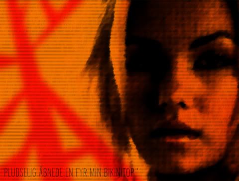
Hmm, my stuff now I guess. See what you think of this one.

Image

And the scan I did it from is here

C&C welcome. I did it as a sort of test for a game idea.

She's meant to be a Final Fantasy style thief. Does she look like it?

When I was CGing it though I thought she looked a bit plain...

User avatar
rioka
Royal Manga Tutor
Posts: 1255
Joined: Fri Jul 16, 2004 12:21 pm
Completed: Amgine Park, Garden Society: Kykuit, Metropolitan Blues (art)
Location: somewhere in NY
Contact:

#8 Post by rioka »

^_^ Thanks for your comments everyone!

Dash>> Good to hear you're practicing - keep it up! How's the coloring going?

Sai>> So that's where your sig banner came from... =) Looking over your drawings, there were some anatomical issues such has short shoulders, hands needing a bit of tweaking, and a few clothes that need a few touch ups. Also, the throne is off a bit perspective-wise. The farthest hand-rest is higher than the one closer to the viewer.

At first glance, I thought #9 was your best pic but after looking at it awhile... her butt is up in the air behind her, right? Where is the rest of her back? I can imagine the shirt going down as it's not tucked in but her back is practically non-existant. If you meant to curve her back down with shoulder and butt up, then her chest should be out more... There's just a problem of me seeing her upper connecting to her posterior correctly. ^^'
So your best pic would be #12, imo, but #9 comes in a close second.

As for skirts, all you really need to draw is columns for pleated ones and just follow the body's shape. And in the case of movement, you just draw the skirt in the direction you want but to be aware of things in the way like a hand holding the skirt down or how stiff the skirt is...
Image
Image

Grey>> You've definitely got a unique style, Grey. C&C:
1. Why is one eye larger than the other? It would make more sense if her whole head was turned to 3/4 view but it looks like it's still face-on.
2. Her ear is a bit too high, imo - try bringing it down a little.
3. Her armpit on the right side is too high compared to her other side. Bring that down a bit too.
4. Some of the bandages needs to curve around her arm and not go straight.

The first impression about her is her coloring is much like Locke in FFIII (with Terra, Gau, etc). As for being too simple: Why not try giving her a bandana, earings, maybe a choker, a belt or sash, some design on her tank-top, give her a tattoo, or scar(s)? How about a jacket?

Sai
Winged Hybrid
Posts: 367
Joined: Tue Feb 03, 2004 5:35 pm
Location: England
Contact:

#9 Post by Sai »

Grey: Thank you for the compliments I really appreciate it ^^
Oh, you're right about number 13 on both accounts.
14 - yeah, it's supposed to be her left breast, you're right actually I guess it is a little too high x_x;;;
Thanks for spotting those.
Glad you like them

Your artwork has a definite style to it and that's always a good thing. I hope you will be able to build on it in future.
Haven't played FF Tactics in a long time so can't really say for sure about the Thief thing.
She looks very nice.
"Flat" - Well I would suggest looking into different tones, light and dark, and making more of a contrast between the two perhaps. If you wish to make things seem more "off the page", that might be the best way perhaps.

eclipse:
Yeah that's where the sig came from hehe
Thanks for the tips.
Anatomy of the body is my main weakness >_< Practised heads for too long @_@
I agree about 9... I couldn't quite get the perspective on that right -_-;;
I appreciate your comments, thank you =)

Realistic
Newbie
Posts: 21
Joined: Fri Aug 27, 2004 2:22 am
Contact:

#10 Post by Realistic »

i located my devart password so i can post my scanned image. it was my first one i deemed worthy for upload, and its not good. i got better, then a lot worse. it happens when you dont pick up a pencil for 3 months :oops:

anyhoo, without further ado
http://www.deviantart.com/deviation/6429964/
im aware the arms are far too slender, and the left shoe needs a little touch up, but here it is. i feel the scan did the shading i did no justice.

-Realistic

optimus160
Ultimate Lemma One
Posts: 77
Joined: Mon Mar 17, 2003 10:54 pm
Location: With You
Contact:

#11 Post by optimus160 »

this may seem a bit unorthodox of a dump... but i am going to dump anyways
Image
THis is my current wallpaper for my computer... I really like how it came out, I made it last night took about an hour or so... If you dont recognize the girl its Elisha Cuthbert, from such notable things as the tv show '24' and 'The Girl Next Door'. anyways hope you like
Image
PHEAR THE POWER OF THE ULTIMATE LEMMA ONE

Visit my DeviantArt page for stuff!

Lillico
Otaku Manga Maiden
Posts: 95
Joined: Wed Jul 21, 2004 3:28 am
Contact:

#12 Post by Lillico »

I thought it was gackt @ first ^^;;
he's purdy! :oops:
Image

Lillico
Otaku Manga Maiden
Posts: 95
Joined: Wed Jul 21, 2004 3:28 am
Contact:

#13 Post by Lillico »

well.. I guess I should post something here..
I'm not good @ critzing other peoples works..
everything is beautiful <3.. I especially like Sai's Eyes.. :lol:

these are some commisions I did on Gaia- practicing with my new tablet..

ImageImage
Image
Image

Sai
Winged Hybrid
Posts: 367
Joined: Tue Feb 03, 2004 5:35 pm
Location: England
Contact:

#14 Post by Sai »

Thanks for the compliment Lillico ^^
Your artwork is really nice! I especially love the catgirl on the top left image, her pose is really well defined and she's so cute ^^

Grey
Veteran
Posts: 320
Joined: Thu Jan 01, 2004 8:08 am
Contact:

#15 Post by Grey »

Thanks for the comments on my art people :)

Lillico, the first ones my favourite, but the second is quite cute as well.
Realistic wrote:i located my devart password so i can post my scanned image. it was my first one i deemed worthy for upload, and its not good. i got better, then a lot worse. it happens when you dont pick up a pencil for 3 months :oops:

anyhoo, without further ado
http://www.deviantart.com/deviation/6429964/
im aware the arms are far too slender, and the left shoe needs a little touch up, but here it is. i feel the scan did the shading i did no justice.

-Realistic
Its' not bad. What I notice first about this picture is that her body seems to have an extra...segment if you will. Consider your own body. The curve of your waist is just above the hip-bones, so you've started where the shorts are drawn too low. With a baggy T-Shirt like that on I doubt you'd see much of the the crotch area. Moving the shorts up, or making the T-Shirt smaller, and keeping the feet where they are to make the legs longer would make it look a lot better. Also maybe try moving her eyes and nose down a little, which would give her more of a forehead.

The rule of thumb I generally stick to (not necessarily correct, but it works for me at the moment) is that the body is a about head and a half, and the legs are about two of the body.

Also try playing around with your scanner settings, making it keep the natural settings, rather than trying to enhance the lines.

Keep practising :)

Post Reply

Who is online

Users browsing this forum: No registered users