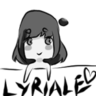
Here you go SilverxBlue. BTW, it's quite big (1200x1600), so if you open it, you can see all the tiny details
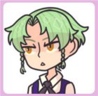
I chose Greg as you can see (white hair, glasses, ties, oh gawd, I'm in love). I hope you like it!
Lyriale wrote:Here you go SilverxBlue. BTW, it's quite big (1200x1600), so if you open it, you can see all the tiny details
I chose Greg as you can see (white hair, glasses, ties, oh gawd, I'm in love). I hope you like it!
Ohhh... Yay for Greg~! He's actually my favourite together with one other character, so I'm really glad. ouo //shot
Anyway, he looks awesome here... Dat smirk Thank you~
"A fool who doesn't think is more foolish than a fool who foolishly thinks." - Franziska Von Karma Weeeeeee~ 不愉快です !!!
Could I get either the Man of Child from my WIP, All the Pretty Flowers? Link is in my sig
Black bookstore owner. Diverse fiction reviewer. Bestselling romance author. Award-winning fiction editor. Quite possibly a werewolf, ask me during the next full moon.
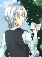
I like the cover design. I like the way it's composed and the way the black/white/grayscale are used. Elements contrast with each other in a pleasing way. Overall, I'd say it's pretty cool looking.
I do have some comments, though. One is that I can't tell what's going on with the guy's head. I'm not sure what position it's in; the body, face, ear position, and even forehead conflict with each other. I recommend making sure you have a clear idea in your head of what it's supposed to be, and then find references for that position. Make sure the placement of all of the elements fit together.
The girl's head is in a much simpler position and works fine, although I think the eye and ear could be just a smidge lower -- they're placed properly around the halfway point between the top of her head and her chin, but not accounting for the volume of her hair.
Another thing to think about is the cohesiveness of the textures. I'm specifically thinking of three things: the clouds, the horizontal striped shading on the guy's shirt, and the camo pattern on the girl's pants. Individually I think they all work, but together they clash a bit in style. I'm not convinced they completely jive with the style of the rest of the cover, either. The clouds are soft and misty, the stripes plain and harsh, and the camo is detailed but solid. I do really like the gradient of the sky and how it contributes to the overall composition. The clouds could work if that wispy style were echoed elsewhere on this cover, otherwise, try some different styles. The stripe-shading would probably work better if you drew those lines in so there was a little bit of variation in thickness... or if they echoed some other element. The camo... I dunno, maybe some outlines and striped-shading if you do it on the shirt, or whatever. Experiment. There are a lot of different ways you can do it, as long as they all feel like they're part of the bigger picture.
The white outlines around the characters are cool, but currently messy. You'll want to polish those up. The girl's lower arm feels a awkward in some way. If you didn't draw it first without the fence in the way, then I'd recommend doing that. If you did, then go back to the drawing without the fence in the way to make sure its position seems natural. (Also, the black of her arm needs a little cleaning up, too.)
Finally, the title seems a little busy the way its sized and placed with the leaves/clouds. It makes it hard to read. I love the leaves, so I'd recommend adjusting the title. (It could be a little smaller, or the words on different lines, or positioned a little different, etc.) It might work out as it is if there is more white behind it, less gray. It would also be helpful if the "written and illustrated" part were bold.
Anyway, I really like this cover, so I hope my feedback helps you polish it up!
I, Miku (NaNoRenO 2014) Vignettes (NaNoRenO 2013)
_________________