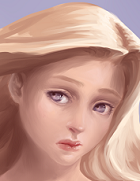
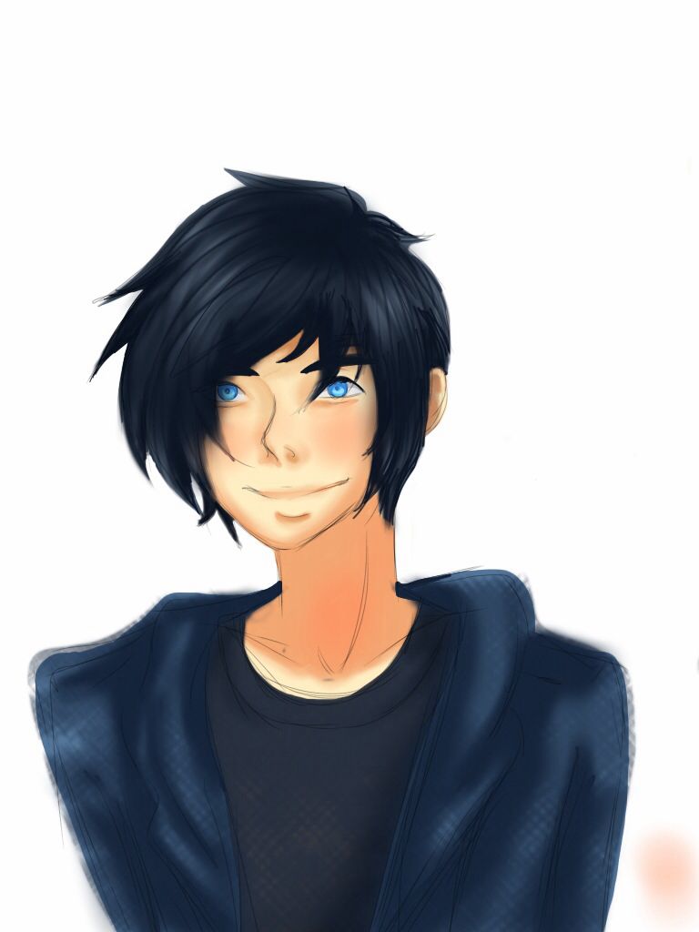
I'll just start out by attaching some past works I've done.
Critique is very welcome, I feel like I need it atm


 COMMISSIONS AVAILABLE (check Tumblr sidebar)
 Well, most people would just draw an eye as a symbolized eye, like <o> right? (On my laptop, so I can't exactly draw at the moment, hah.)If possible, please do elaborate!
No problem!Thank you very much for taking the time to write this reply!

Uhhh, I mean when you look at "gaia.png", you drew in her bottom-eyelid with a distinct black. Might've been better to leave it as the same color as the skin-line, with less eyelashes? For example, when you look at either one of their faces in "ib.png", you painted their bottom eyelashes in with a not-entirely-skin-color but not-entirely-upper-eyelid-color either.I think I know what you mean, you mean that my top lashes don't really match properly to the bottom ones? (meaning either they have too few eyelashed, or only the top has eyelashes?) Or do you mean that I need to put an equal amount of volume to the bottom and top lashes XD
 COMMISSIONS AVAILABLE (check Tumblr sidebar)
Users browsing this forum: No registered users


