SundownKid wrote:
I think people would probably pay more for your art if the shading was improved in detail. The soft shading just looks like slightly blurred cell shading, instead of having actual volume to it. It looks very matte and simplistic with little depth.
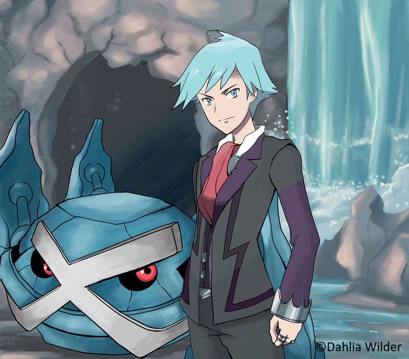
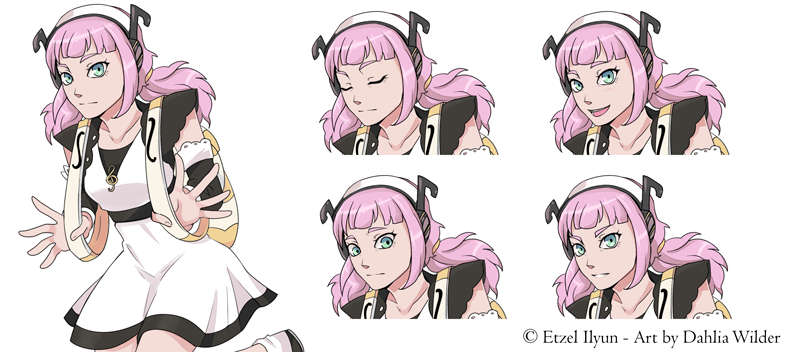
Her facial proportions also seem a tad strange. Her mouth is a bit large. It could just be an individual character trait, but it makes the drawing seem very "Amerime" and if you are aiming for an audience who wants Japanese style art it could be a negative in someone deciding to hire you.
Thanks a lot for the critique!
About the shading: I see what you mean with the soft shading comment, you're totally right, I'll work on it

What do you think of the hard cell shading version, though?
Regarding her facial features: Yeah, I'm not much of a fan of "pure" anime style (especially for girls), I find it a little bit repetitive and too cute-sy, but I always state in my threads that I can accomodate to different styles if asked
, although now that you're mentioning this (and you do have a point, especially because that style seems to be the most popupar for VNs), I might make a more anime-esque version of this one in the future to add to my samples.
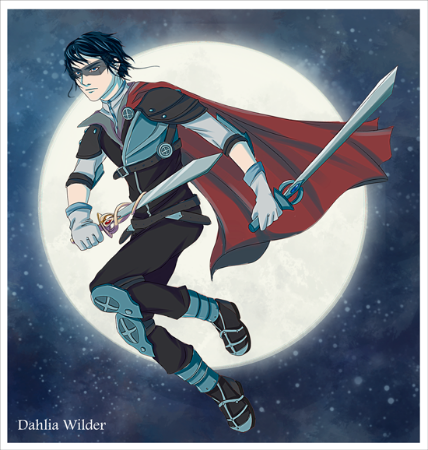
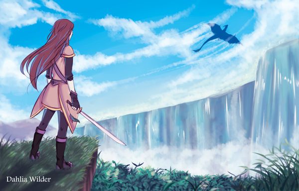
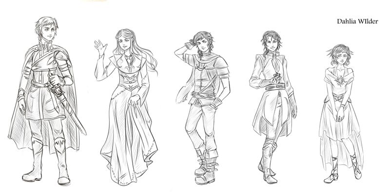
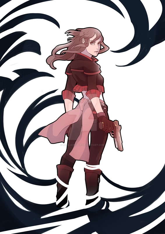
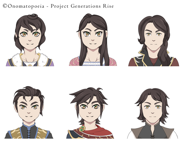
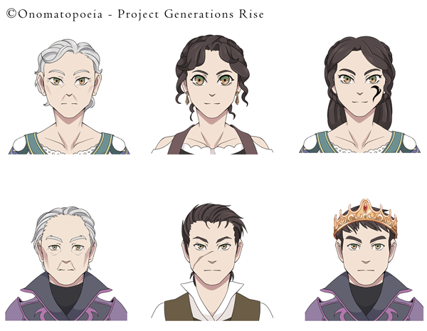
namastaii wrote:I think the cover art looks great. I didn't assume anything about the first character shown because it could be a character trait that they are more broad-shouldered and have a more masculine (but yet feminine) physique. Because the females you drew on the pictures below, are more feminine-like proportioned.
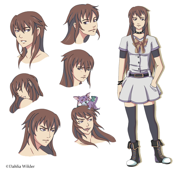
Thank you! I hadn't noticed the broad shoulders before, maybe it's also a by product of my aversion to make my girls too feminine (if at all!). I'll work on it. Actually, this is an OC of mine, and the sprite character is the same as the one at the lower bottom (just with a diferent outfit, she's some magical girl of sorts haha)
Thank you both

!
Feel free to point out anything else you find could be improved
I'll be updating the thread with new stuff sometime.