New VN dev looking for character design feedback

Art threads specific to a single artist.
Post Reply
Message
Author
zurvon
Newbie
Posts: 6
Joined: Sat Aug 13, 2016 2:00 pm
Contact:

New VN dev looking for character design feedback

#1 Post by zurvon »

Hey guys, new to this forum, I kind of already posted the same in Show your Art thread, but I think I screwed the formatting of the images, so this is try 2, hope I'm not violating any rules here (promise this is going to be my last post regarding this subject). The images can be found below.


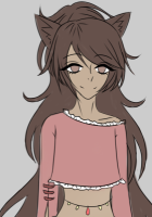
Basically, for the past several month I have been working in a team of three people working on a VN. There is only one artist as part of the team tho, who does everything art related basically. She has been awesome so far, especially when it comes to background (at least the quality satisfies me), but now that we moved on to the characters, something feels off about them, and I'm not even sure how to express this. So I'm looking for feedback.


The quality of her art is good, so not complaining about that, but I'm looking for a feedback style-wise. This is the first sketch of hers and of our first character (neither protagonist nor antagonist).


To me it just feels like the characters lack 'volume', 'liveliness' and look 'too 2d'. Please let me know what you think of art, and also if you agree with my comments, let me know how can I express more specifically which parts she should fix for the style to suit the VN more.


Disclosure: The artist isn't very familiar with anime/manga/visual novels, so this might be part of the issue. Also, in case this matters, the VN is going be in genres of fantasy, action, detective, mystery, city fantasy, supernatural, and a small touch of religion/philosophy.

Black&White version
Image

Coloured version
Image

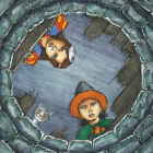
Background to check the style
Image

Nekonomicon
Newbie
Posts: 7
Joined: Sun Jul 24, 2016 12:54 am
Deviantart: Nek0n0mic0n
Contact:

Re: New VN dev looking for character design feedback

#2 Post by Nekonomicon »

Hi :D
I think her style works well, the designs are cool! It might not be the typical anime-like style that lots of VNs use, but that makes it unique and that's good :D
The buildings and trees are really well done too ^.^

As for the characters lacking liveliness, I think lots of that is because she's not used to the style and is taking her time to get things right. The long term solution to a lack of movement and life is lots of gesture drawing, but sketching the character faster and multiple times also has worked for me - you don't have to worry about getting it right when it's just quick guides :D
I agree that the characters do look a little 2D, but if all the art is done in the same style it shouldn't look too out of place :3 However, there are a couple things she could try:
Less blending - instead of blending the colours, she could try a cel-shaded style, which would (maybe) make it look more anime-like and then nobody will notice it looking 2D >:3

More shadow colours - at the moment, it seems she's using a base colour and 1 darker colour for each part of the picture. For me, at least 2 shadow colours and normally a highlight colour as well is enough to make it work :D

I hope that made some sense and was helpful O.o Good luck with your project!

User avatar
gamerbum
Regular
Posts: 128
Joined: Fri Sep 18, 2015 4:40 pm
Projects: Our Lovely Escape, Mizari Loves Company
Organization: Reine Works
Tumblr: reineworks
Location: Canada
Contact:

Re: New VN dev looking for character design feedback

#3 Post by gamerbum »

You're right, it is very nice.

I think what you're seeing but unable to describe is how flat the character looks. The emotions on her face in the samples are very flat and inexpressive; they're more like a real person's than a cartoon's. As a consequence of that, her face "rests" a lot, which also makes her expressions look very similar to one another rather than easily distinguishable. I think if you had your artist study the exaggerated facial expressions of anime, it'd help a lot.

If you're talking in terms of clothing design and such, I don't see anything wrong with it at all. It's a different style from anime and manga, but it's quite nice, although I'm not a big fan of the bright yellow boots. That being said, the shading doesn't match the art style. The face is very cartoony, so I'm expecting cartoony and unrealistic shading. It looks sort of boring, which is jarring with a Disney face.

gekiganwing
Lemma-Class Veteran
Posts: 2473
Joined: Wed Sep 29, 2004 1:38 pm
Contact:

Re: New VN dev looking for character design feedback

#4 Post by gekiganwing »

zurvon wrote: The artist isn't very familiar with anime/manga/visual novels, so this might be part of the issue.
You can find a rather wide spectrum of art within those three categories. For instance, Jojo's Bizarre Adventure has evolved considerably over the years, but has its own offbeat style. So do the TV series Kaiba and the movie Redline, Samurai Pizza Cats features anthropomorphic robot characters. Madoka Magica shows a seemingly normal world as well as surreal landscapes.

I believe that your project can benefit if it has a distinct aesthetic. For example, Cinders has relatively realistic looking characters along with detailed backgrounds.

If your artist has a favorite specific style or artist, that's fine. Consider letting the person draw how they want to. I think this is better than asking them something such as "Make this look just like Marmalade Boy" (to use a random example).

I like the character and environment drawings which you provided. Right now, I'm not exactly sure how to describe the art. I can't categorize them as photorealistic, abstract, or exaggerated.
zurvon wrote: ...the VN is going be in genres of fantasy, action, detective, mystery, city fantasy, supernatural, and a small touch of religion/philosophy.
If you sell the final product as an indie game / VN, that could be a challenge. Think about whether it easily fits into one or two genres.

zurvon
Newbie
Posts: 6
Joined: Sat Aug 13, 2016 2:00 pm
Contact:

Re: New VN dev looking for character design feedback

#5 Post by zurvon »

gekiganwing wrote:
Consider letting the person draw how they want to. I think this is better than asking them something such as "Make this look just like Marmalade Boy" (to use a random example).
Oh, I am not asking for the style to be more like what I'm used to from playing VNs (reading manga/watching anime). I want the art for background and characters to remain consistent, and the characters to pop/stand out more relative to the background. I don't want to force the artist to any style, but I think her work can be improved, which is why I was asking for the opinion of the community to see what she can improve and how can I express it to her in terms she is used to, rather than saying "the face looks bland"
gekiganwing wrote: If you sell the final product as an indie game / VN, that could be a challenge. Think about whether it easily fits into one or two genres.
Well kind of, it would be mostly city fantasy with elements of action and detective. All other genres that I added essentially describe the same thing. But to be more specific, I am planning to post soon in Work In Progress sub, so if premise got you interested you will be able to follow the updates and learn more about the game.

gamerbum wrote: I think if you had your artist study the exaggerated facial expressions of anime, it'd help a lot.

The face is very cartoony, so I'm expecting cartoony and unrealistic shading. It looks sort of boring, which is jarring with a Disney face.
Nekonomicon wrote: Less blending - instead of blending the colours, she could try a cel-shaded style, which would (maybe) make it look more anime-like and then nobody will notice it looking 2D >:3

More shadow colours - at the moment, it seems she's using a base colour and 1 darker colour for each part of the picture. For me, at least 2 shadow colours and normally a highlight colour as well is enough to make it work :D

I hope that made some sense and was helpful O.o Good luck with your project!
Thanks a lot, this was very helpful! A lot of people have been mentioning shading, so I think that might be the actual problem, and yes also the facial expression too. Also thanks for your wishes, hopefully one day I will post an announcement regarding release of the VN :wink:

zurvon
Newbie
Posts: 6
Joined: Sat Aug 13, 2016 2:00 pm
Contact:

Re: New VN dev looking for character design feedback

#6 Post by zurvon »

Also an update.

This is what the artist send me after my comments, but before receiving feedback from you guys. It is incomplete, but it was her attempt to make the character look less 2d. The top left image is the reference she used, the top right is coloured sketch of the character, and the bottom image is another attempt to make it look more 'lively'

Image

While this is the original version vs a quick mock up using varied line weight from another reviewer on reddit with the background. The image on the left is the original version. The image on the right is the quick mock up version.

In case the image above is hard to see, here is the link with original resolution: Image link

Image

Which one out of all images do you think looks better and suits the background style the best? I'd love if you could help me to choose.

I am also planning to post an update after the 'final' (hopefully) version is done with consideration of all the feedback we received.

User avatar
Fuseblower
Regular
Posts: 189
Joined: Sat Jan 16, 2016 6:01 pm
Projects: Mall Macabre, Slushball Slasher, Doomed Diner, Tenkeiteki Tokyo
itch: fuseblower
Location: Netherlands
Contact:

Re: New VN dev looking for character design feedback

#7 Post by Fuseblower »

Hi Zurvon. It seems to me that your artist lines her angles up too much and everything is too symmetrical. Symmetry indicates flatness.

Take a look at the shoulder line vs the hip line in the drawing of the woman walking towards the viewer. These two lines are never the same unless someone stands exactly straight up (and symmetrical) with equal weight on both feet. They're also hardly ever horizontal. It's unnatural. The shoulder line typically counteracts the hip line. The head is often moved towards the foot that carries the most weight (curving the spine ofc), etc. The character walks the way models walk but even models have to tilt their hips when walking. Also : the rotation of the hip (one foot forward, the other backward) is not indicated. The hip that moves towards the viewer should have a greater area than the one that moves away from the viewer (too much symmetry), much like a face in a 3/4 view that has a greater area for the part that faces the viewer and a smaller area for the part that is turned away from the viewer.

That's what you have to look for when working from a reference :
- Where is the base of the skull in respect to the feet? (typically not right inbetween them)
- What are the angles of the shoulder en hip lines? (typically not the same, typically opposite of each other)
- What are the angles between the belly and the chest and the head? How do they line up?
- What are the areas on either side of the central axis? Your artist does it right in the 3/4 view of the face but not in the body.
etc.

Often the angles form a kind of "zig zag pattern", they're all countering each other, they're not lining up at all. It's very important to look at good reference photos and see how the angles work in a posture. This is what makes a drawing dynamic.

Take a look at the reference you posted.

The reference has the chest pushed out in an expression of brawn. Compare the angle of the chest with that of the head : they're countering each other. It makes sense because if you push out your chest and you don't tilt your head forwards then your head will hang backwards (try it for yourself).

Now, take a look at the drawing your artist made from that reference. She mimicks the angle of the head of the reference.

But now look at the neck. Drop a plumb line from it. In the reference the neck is far too the right of the belly section. In the drawing it falls exactly in the middle (you can draw a vertical straight from the navel to the center of the neck). Also the angles in the reference are different from that of the drawing.

It seems to me your artist lines up everything along a straight line and puts equal weight/area on either side. This is "drawing what you know" vs "drawing what you see". We know that humans are symmetrical when viewed from the front but that's not how we look in real life because we strike all kinds of postures.

Things like shading and line weight will not magically add volume when there is none in the sketch so your artist should focus on getting the angles and areas right.

zurvon
Newbie
Posts: 6
Joined: Sat Aug 13, 2016 2:00 pm
Contact:

Re: New VN dev looking for character design feedback

#8 Post by zurvon »

Fuseblower wrote:Hi Zurvon. It seems to me that your artist lines her angles up too much and everything is too symmetrical. Symmetry indicates flatness.

Things like shading and line weight will not magically add volume when there is none in the sketch so your artist should focus on getting the angles and areas right.
Hey there, sorry for the late reply and thanks a lot for the feedback. I wonder if you could also let me know about this update as your input was very valuable, and I think the artist fixed some of the issues you were talking about.

Everyone else is also very welcome to criticize and add more feedback about the new updated version.

Update

Without BG
Image


On top of BG
Image

Post Reply

Who is online

Users browsing this forum: No registered users