The first image looks better, even though you can push it even further, but you're going in the right direction nonetheless! The second image honestly feels overdone with all those unnecessary texture, so definitely go with the first image.
Although, as I said, you can push it further to better show the mood. I tried to digitally enhanced the first image using photoshop's adjustment layers and some airbrush (I can share you the psd if you want, while I keep it) and here's the result :
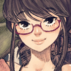
I still felt that something is off when it finally hits me that other than the girl and the wall of photos behind her, everything else is not important, so I cropped the image and here's the result :
Before, there are 2 strong light sources in the image, one from the window and one from the fairy lights, and both are in entirely different direction which results in divided attention to the main focus. Eliminate one, in this case the window, and the whole picture will come together. Just by cleverly cropping the image, you can see that the wall of photos behind the girl is some kind of precious memories and it brings nostalgia and warm feelings to her.
There's something called 'the rule of third' that can help you create a good composition. In photoshop, by using 'crop tool', you can see some kind of ruler that divide the screen into 3x3 parts and you just have to drag the screen to find out the best composition you can get from your image. Not sure if gimp has similar tool, but try googling the rule of third to learn more about composition.
Also, I'm not sure how old the girl is, but I feel that her room is very empty for a girl on her age. The head of her bed can be filled with plushies, or alarm clock, or framed picture, and you can definitely choose a more suitable poster for her age =D. Remember to take a look at a lot of reference. Hope that helps!