Wow, lots of feedback there. Thank you for playing, everyone. I really appreciate your comments and support.
Arowana wrote:When the three portraits appear, maybe space them more evenly across the screen? Actually, is there a reason that portraits are used in the hospital at all, given that full silhouettes are used for everything else?
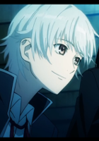
The hospital scenes are all in Jacqueline's imagination, since she can't see, so she's imaging portraits of people when she recognizes their voices.
And I just realized, this means my use of a full silhouette of Jacqueline in the flashback sequences... makes no sense. Because why would she "see" herself in her own memories?? UHGGGH gasdll. WAIT I can fix this with a side image! I might do that. When I did those scenes I was looking at it from a more cinematic perspective rather than the narrator's perspective.
I am going to adjust the text outline and some of the spacing issues you mentioned, but I didn't catch the stretching of the definitions so I will review that too. It's parametrized text, and I think may need to look at the positioning.
Reikun wrote:I'm glad to hear you're going to allow skipping the 1st two acts in the final version. I'm usually patient with cut scenes, but I felt like the car crash in the beginning was a little too slow (this impatience may have just been me playing the game late at night though).
Yeah, I know it is a little indulgent, but after I finished the animation I decided I would make everyone sit through it at least once. Oh, vanity.
- I'm not sure what the point of bobbing the portraits is. If it's supposed to seem like the person is coming into focus, try a blurry portrait that becomes more crisp over time?
I'm going to scrap the portrait bounce. People don't like it and I agree that it doesn't have an obvious context.
- I love your clock/gears transition, but gears do not work like that! No matter how small the gear is, the teeth need to be the same size as the other gears for them to click together and turn like that, like this. Not sure if you're willing to re-do the gears, but they are quite off...
You're right. Realistically, I probably won't invest the time in this particular change because it would mean having to redo the assets. It works as a visual, even though from a real-world perspective it's wrong.
cuttlefish wrote:Is the hour hand supposed to disappear before the rest of the clock disappears when time is going forward? It seems like it'd be better if everything faded away together. Also, this detail probably doesn't matter, but the clock roman numeral for 8 is 7. Does VIII become illegible?
Someone else mentioned the delayed clock fade and I've fixed that, and I agree that it looks much better when it all fades together.
As for the VIII... GOOD EYE! Ha! The clock was a free asset. I spent a TON of time working on the clock hands to get them to animate right and I never even noticed the numerals were off.


