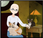
Here is a preview of the background I've done. With a pretty neutral colour palette.
Critique Request?
Critique Request?
Hey there everyone, so I'm curious to know if the background style I've done here would suit a visual novel.
Here is a preview of the background I've done. With a pretty neutral colour palette. And here's a mock up of what it could look like in a game with my own art. Any advice, comments & critique are much appreciated.
Here is a preview of the background I've done. With a pretty neutral colour palette. And here's a mock up of what it could look like in a game with my own art. Any advice, comments & critique are much appreciated.
-
SusanTheCat
- Miko-Class Veteran
- Posts: 952
- Joined: Mon Dec 13, 2010 9:30 am
- Location: New Brunswick, Canada
- Contact:
Re: Critique Request?
I like the style.
Is the picture on the left supposed to pop out? The colours aren't as neutral as the rest of the background.
Susan
Is the picture on the left supposed to pop out? The colours aren't as neutral as the rest of the background.
Susan
" It's not at all important to get it right the first time. It's vitally important to get it right the last time. "
— Andrew Hunt and David Thomas
— Andrew Hunt and David Thomas

Re: Critique Request?
I think it looks good and suits the style of your sprites. The danger of using such a neutral color palette though, is that it's hard to tell the time from it. I'm assuming here the second BG is supposed to be night/evening, and that the lamp is turned on. I can tell it now because both BGs are right next to each other, but in the game, I wouldn't be able to tell that difference.
You can try fiddling with the palette a little bit more. Perhaps some traditional dark blue/purple at the window, a darker interior or a stronger contrast between the room and the lamp's glow might help C:
You can try fiddling with the palette a little bit more. Perhaps some traditional dark blue/purple at the window, a darker interior or a stronger contrast between the room and the lamp's glow might help C:

Re: Critique Request?
Thanks for the tip, since it's sort of vector which generally means flat colours I was having difficulty with the lighting in it.Zylinder wrote:I think it looks good and suits the style of your sprites. The danger of using such a neutral color palette though, is that it's hard to tell the time from it. I'm assuming here the second BG is supposed to be night/evening, and that the lamp is turned on. I can tell it now because both BGs are right next to each other, but in the game, I wouldn't be able to tell that difference.
You can try fiddling with the palette a little bit more. Perhaps some traditional dark blue/purple at the window, a darker interior or a stronger contrast between the room and the lamp's glow might help C:
I will try tweaking the palette in different variations rather than just overlaying a gradient XD
Ah yeah, I was attempting one of those sorta art deco geometric wall canvases heheSusanTheCat wrote:I like the style.
Is the picture on the left supposed to pop out? The colours aren't as neutral as the rest of the background.
Susan
Who is online
Users browsing this forum: No registered users