If I may make one critique, regarding the writing. The opening scene before the captain appears seems to have excessive info dumping. Honestly, too many organizations, groups, names, and political details where being discussed for me to get a grasp on, with the major problem being I don't have a reason to care enough to grasp them yet. All that stuff can be introduced naturally in dialogue as it comes up, just as the term for mechs, i.e. Ryders, was introduced without beating us over the head with details.
Take a look at the original Star Wars opening scrawl for giving just enough info to set the stage. After your line about humans spreading across the galaxy, you could have something like, "It is a time of uncertainty amongst the galactic powers. PACT, an alliance of many worlds, has begun annexing neutral planets by military force. Cera, a neutral planet in the path of expansion, is today launching a new flagship to defend itself from this growing threat ...."
but I just have to note the excessive amount of terms that the players need to absorb at the beginning.
Maybe displaying the flags of each faction and their respective color would help?
So I guess this means I have to redo the intro huh... (Will be changed)
I thought the overlay that was used in the battle backgrounds was pretty distracting though. It looks really pixelated or artifacted compared to everything else. It's seen in screenshots 27 and 29 of this topic, for example. Did you have to use a small image for it due to performance issues?
This will be more difficult to fix. That is a high quality .jpg, but computers just aren't capable of displaying enough colors to create a smooth gradient for the background. The only way to fix it would be to up the contract and redraw, but I don't know how that'll look yet.
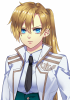
I also wonder if it would help to turn up the contrast on character sprites, since the backgrounds have very full shading and it often felt to me like Ava didn't have much presence in comparison. It might be partly because of her more subdued color palette compared to the others.
The contrast on the characters has been a problem. What you see in the demo is what we have after the artist re-shaded all the art in the game because the sprites before it had even less contrast. (Compare Ava in the screenshot in the first page of this topic to Ava in the demo to see the difference.) I don't think I can commit more hours to fixing the contrast, since we've already committed so much work to that. (aka, I think the artist has better things to be doing and will have my head if I make her fix these more)
But it's kind of interesting since this is one of the few VNs I've seen that puts so much effort into setting the scene, that it almost feels like a waste because the story is being 'sold' as something very character-driven, with the morality system and all. Maybe it really will have everything when it's completed though. I'd love to see how it turns out!
The morality system is not in the demo, and only one of the seven girls has been introduced, so there's quite a lot of story content which is missing - which should now be in production!
As for technical issues, I think the characters have this really crisp pixelated edges, I'm not sure if I'm the only one encountering it, because they look smooth in your screenshots. I tried switching to full screen/windowed /restarting the game and still has it.
That is a technical problem with renpy. All the character sprites are very large and have been scaled down in game by renpy in the demo. The over sized character sprites are necessary to seamlessly zoom into the character sprites. The edges seem to occur whenever renpy scales down a large transparent png though, so there's not much I can do about that.
I tried to download, but was told that my Safari browser is "too old" and not able to download a file this large. Rubbish! I then tried Firefox and was told that I had to first download a Mega extension. I am not about to download an unknown extension to my computer just to be able to view your beta. Sorry, but I guess I will not be able to view your story - you should investigate a download host that is friendly to Mac users.
Mega does not support Safari. A better host will come when I can afford one. ._.
Just long enough to get me really excited. Battle system worked well, but I really think clicking on the icon for the ship would be a much more enjoyable experience in my opinion. (If you need help coding it, let me know)
Ah, yeah. I forgot to mention this too. On the battle screen, when Ava told me to "Select the Sunrider", I kept clicking on the icon of the ship, and thought it wasn't working. It took me a few moments to see the commands at the bottom against the dark background. If you have the time and knowledge, it would be more preferable to click on icons to select things in battle.
A more graphical and informative battle UI will probably be the next thing I work on...
Any chance we can donate to the project?
Not yet.

Do we happen to have random rich people on Lemmasoft seeking to save some money by entering a lower tax bracket?