First off:
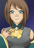
-Beautiful graphics, I really like the design of the cursor and the Cyanide Tea logo! It was a really nice touch to fade it in with blood splatters, it was really classy! I liked the title screen too, and the cursor was just gorgeous. I really liked the two bodies of Adrian and Luca standing by the side, and the return to menu was really classy! I didn't quite like the textbox, maybe because it didn't look as regal with just two lines around it? The side image place for Miranda was really nice and pretty to look at to! I like the theme of red and gold in this game, blood and royalty. The choice menu was also really nice to look at.
-Really like the art! There were a few anatomical errors, but the backgrounds and CGs and sprites were really nice to look at. It was really pleasant on the eye, and I liked the character designs for all the characters! I just thought that in the bite scenes, the blood after wards was a nice touch, and so was the plaster. I do have a bunch of nitpicks which I'll list later, but that's pretty much personal opinions. The colours were really nice, and I liked how you flipped the
Red/Hot-headed and Blue/Calm with Luca and Adrian's hair colours.
-Nice choice of music! For this I'm not sure if it's a personal opinion, but I enjoyed the fast tracks and the slow tracks were quite nice to listen in the background too. I'm biased towards Music Box of Time, Danger Approaches, Wandering Child and Impending Doom. I have to say my favourite BGM was Stand at Attention.-Loved the plot and writing! I really liked all the events with the characters, they were likable and quite funny. Miranda being scared of Egbert is adorable, and
how Luca puts it on her is amusing~ I quite enjoyed the card game
and all their interactions with all three of them more than the romantic moments. I found them quite realistic, and liked how the vampires really did act like asshole vampires hahaha!
The writing was a joy to read, it was really engaging, and I was rarely bored. Their reactions to each other were lovely. I quite liked Miranda despite some of her weirder actions, and it was nice to see her optimistic about her death. You could really see their personalities through their talking with one another. Miranda was really realistic, and to me she came off like trying to convince herself she would be okay through her happiness.
-Multiple resolutions! -Nice extras! Music box, CG gallery, ending list! But where's the author's comments? ;-;
Okay now the bad stuff "orz Some are minor nitpicks or personal opinions.
-I felt like the bad endings were... just bad ends. I'm not referring to what happens if you
bluff or interrupt, I'm talking about the Feast, Pet and Escape endings. They didn't really feel like a realistic depiction of what would happen, and weren't a satisfying end to the story. It felt like just filler to end the story if you didn't romance Adrian or Luca, and was just there to scare you. As a result I wasn't scared at all, just surprised that it was such a weird end. It just felt like a Game Over screen and not a proper ending to the story.
-The side image of Miranda sometimes blocked out Adrian's body when they were all in the same room
. It was a bit weird to have to look at Adrian to see his expression but get distracted by Miranda's.-When
Miranda ran into Adrian, he was drinking from a woman. Said woman never appears again. Which forms... um... a gigantic plothole. They don't need to suck her blood, they have that woman. That kind of rendered every scene with blood-sucking a bit weird. I suppose perhaps the woman may have died from Adrian sucking her, but even then Miranda herself never brings it up again, despite it surely being a first impression.
-Somewhat romanticizing? I'm not sure if that's the correct word, but Miranda says it's okay that the vampires suck her blood. It sounds a lot like excusing them, and that didn't really sit well with me. D: It might be her deluding herself that everything is okay,
but it still left a nasty taste in my mouth. -In the
ends where you don't romance either Adrian or Luca, it jumps suddenly to the scene where you have to make a choice. I didn't even know what was going on since there was no context or anything, and when the option to live or die came up
, I was really surprised at what was going on.-The mood was a bit weird sometimes due to the music. When
Adrian pushed her down and tried to suck her blood
, I didn't really think it was scary or threatening, instead I kind of thought it was a happy scene due to the upbeat and jolly music. ._. Which clashed horribly. The music also transitioned suddenly, and it was really abrupt and jarring to the ears.I'm not really sure if I can properly answer the questions about CGs, but since I've seen Auro-Cyanide's art in a few games, I've noticed a few things about it. (I'm not sure if this is too personal >_<, if it is then I'll edit it out.)
The first is that the CGs have a lot of background space in them. It's not necessarily a bad thing, but rarely does a character in a CG fill up the entire space. It feels really distanced and like there's lots of wasted space.
Another thing is that the CGs tend to feel a bit repetitive. There's an abuse of light to make it look vibrant/dynamic/action-packed, it's at a distance, there's a lot of background, it's always in third-person, you can see almost their whole body. It does help with showing exactly what is going on, but it does get a bit repetitive. The large background also annoys me because I know exactly where they are, I've been staring at it for the last few minutes, I don't need to see it in another view again.
I'm not sure if this is a minor nitpick, I might just be used to some other styles of CGs.
The sprites also tend to be quite stiff, they tend to be all 3/4 position, and have barely any movements. While they do have arm movements, it's not very dynamic. They rarely move their torsos or their heads, so it feels really stiff after a while.
Again, also might be just me being used to other styles. For example, all the sprites in Diabolik Lovers are in idek poses, some even turn away from the viewer sometimes.
"orz That was a really long post, and I hope I wasn't too negative. Still, I really enjoyed the game of Nachtigal, it was a really fun read!
<3