Hello!
I'm making characters for my first project. I don't normally make cartoon style art, so I would like some honest opinions on what I have done so far- before I create more or add more detail to what I already have.
Not all of these images are sized properly, sorry.
I have three character drawings- and one background.
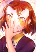
I am most concerned about their hair and faces... The woman is a newswoman...she looks... off. I don't think I'm going to use her.
I'm not finished with the blue haired guy- I was worried about his pose. I don't know if it is okay to have his front turned away.
Also- I am worried about proportions. What looks odd? and how I could go about improving or fixing any of the images.
Thank you for all your help!!!
Requesting art critique
Requesting art critique
- Attachments
-
-
-
-
-
ChiaAkiyama

- Newbie
- Posts: 4
- Joined: Tue Oct 18, 2016 8:18 am
- Deviantart: Chia-P
- Soundcloud: Chia_P
- itch: Chia-P
- Location: Mushroom Kingdom
- Contact:
Re: Requesting art critique
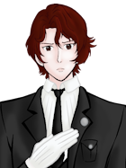
Billy's arms look a tad short compared to his torso. Your arm and fingertips should extend to the mid-thighs, but here it seems his arms would only reach his hips. The coloring looks alright and the rest of the torso / legs look fine as well.
Just be careful with the arms!
Just be careful with the arms!
Re: Requesting art critique

I had time so I redlined the red haired boy.
Now, I'm not too good with backgrounds but I think you've decreased the size of the doors too rapidly, because I don't think any corridor would be long enough to warrant the end being so close to the vanishing point.
Observe:

I think this corridor is about the length of the one you've drawn (minus the extra bit beyond the door). Notice how the door at the end is a lot larger. You might also want to widen the angle of the ceiling (does that make sense?) to make it look less like a worm's eye view.
Hope this helps.
Re: Requesting art critique
I will give you some advice on your newswoman character but I hope you don't mind me scribbling on your drawing ^^;
I think the proportion is quite good although some improvement won't hurt. First thing I realize is the size of the head compared to her body. If you use photoshop, the easy and fast way to correct this kind of mistake is by using "Edit -> Transform" or simply press Ctrl+T and then just drag the pointers.
If you traced her head shape, you'll find that part of the hair line is too close to her head and the other is too far. It can be good if you use it right, but I think balance and more realistic approach are more important for this art style. Remember that connector of neck and shoulder has smooth curve. Longer torso will make her look tall and stand straight and confidence. You put the elbow parallel with her waist and that's correct (yaay!). Her face proportion is already good imo, but since you draw her lips quite small, her smirk is not very visible.
The folds on her suit is not correct either especially the part on her stomach and under her breast. Don't be afraid to use lots of reference =) Also to define shape, using darker line art is better. The suit is purple, so rather than bright red, try using dark purple instead.
I hope that helps you somehow!
- Attachments
-
-
Mammon
- Miko-Class Veteran
- Posts: 712
- Joined: Sat Nov 07, 2015 3:09 pm
- Completed: Pervert&Yandere, Stalker&Yandere
- Projects: Roses Of The Thorn Prince
- Contact:
Re: Requesting art critique
I'm not exactly a great artist myself, but I can always give you my two cents. The blue-headed guy actually looks pretty great, if his character tends to distance himself from the protagonist or is a tsundere, the looking away thing can work. You still see enough of his face to add the expressions. Comparing Billy to him actually makes Billy come a bit short; Billy's abs lack curves, his skin isn't colored as smooth and his torso seems detached from his pants.
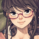
For Joan, she looks good but may I advice making the lines underneath her eyes a bit softer? Right now they make her look like 30+ (unless that was your goal, and a game about an older woman pursuing younger boys... Unique to say the least.) And her eyebrows, they're a bit too close together and too thick. You might want to thin them a bit and make their ends vanish under the hairline. I'm liking her lips though, rare to see those in a sprite rather than just a line.
For Joan, she looks good but may I advice making the lines underneath her eyes a bit softer? Right now they make her look like 30+ (unless that was your goal, and a game about an older woman pursuing younger boys... Unique to say the least.) And her eyebrows, they're a bit too close together and too thick. You might want to thin them a bit and make their ends vanish under the hairline. I'm liking her lips though, rare to see those in a sprite rather than just a line.

Re: Requesting art critique
Thank you all SO MUCH for taking time to help me!!! I am so grateful for your advice and will put it all to good use!!! XD
-
Taleweaver
- Writing Maniac
- Posts: 3428
- Joined: Tue Nov 11, 2003 8:51 am
- Completed: Metropolitan Blues, The Loyal Kinsman, Daemonophilia, The Dreaming, The Thirteenth Year, Adrift, Bionic Heart 2, Secrets of the Wolf, The Photographer
- Projects: The Pilgrim's Path, Elspeth's Garden, Secret Adventure Game!
- Organization: Tall Tales Productions
- Location: Germany
- Contact:
Re: Requesting art critique
Personal art belongs into the Personal Art forum.
Moved.
Moved.
Scriptwriter and producer of Metropolitan Blues
Creator of The Loyal Kinsman
Scriptwriter and director of DaemonophiliaScriptwriter and director of The Dreaming
Scriptwriter of Zenith ChroniclesScriptwriter and director of The Thirteenth Year
Scriptwriter and director of Romance is DeadScriptwriter and producer of Adrift
More about me in my blog"Adrift - Like Ever17, but without the Deus Ex Machina" - HigurashiKira
Who is online
Users browsing this forum: No registered users