Game Sprite Critique

Art threads specific to a single artist.
Message
Author
User avatar
noeinan
Eileen-Class Veteran
Posts: 1153
Joined: Sun Apr 04, 2010 10:10 pm
Projects: Ren'Py QuickStart, Crimson Rue
Organization: Statistically Unlikely Games
Deviantart: noeinan
Github: noeinan
Location: Washington State, USA
Contact:

Game Sprite Critique

#1 Post by noeinan »

Hello!

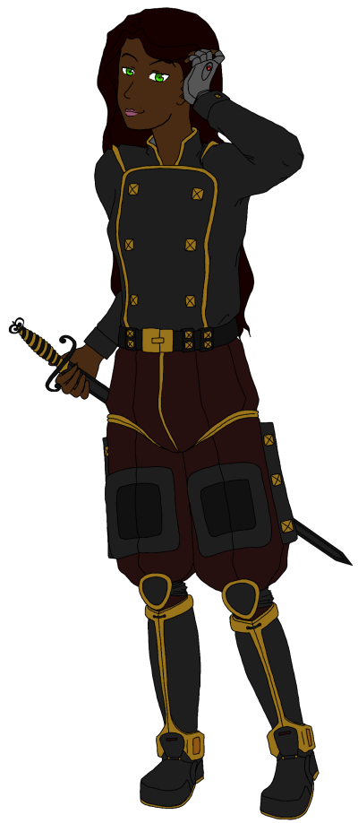
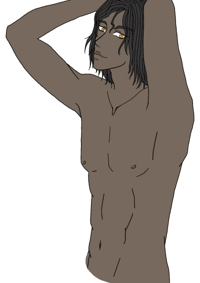
I am making a visual novel with my husband and I will be the coder/artist! I've been working on drawing the game sprites for a while and looking at the time in between pictures I realized that I haven't improved much over the last few years. In particular, I have been trying to work on shading and coloring since I have been pretty minimalist on that so far.

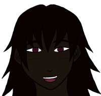
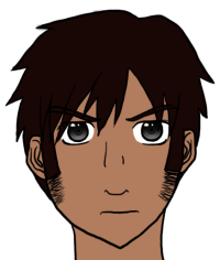
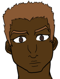
I also try to keep my characters fairly anatomically correct, although I use an anime/manga style so some elements do stylistically diverge from realism. One thing I have always had a problem with in anime/manga style, though, is the Only Six Faces, Only One Female Mold and Mukokuseki. Thus, I try really hard to make faces individual, have various body types, and not have everyone look Caucasian. It's super difficult to do all that while staying true to the anime/manga style by not adding a bunch of extra lines. In any case, if anyone has advice on how to do this elegantly, especially quirky facial features that would be greatly appreciated! Also examples, if you can post them. :)

Here's the lineup of my sketched characters so far. I draw them in several layers, first the base and then the clothes, because I am going to have different outfits on them at different points in the game. Here they are not clothed because I didn't want to take up space, and it's less distracting for me when I'm resizing them to fit their respective heights.

[Edit: Put my slightly updated version here. I made the legs longer and also straightened out some characters that were tilting to the left.]
Image

Here are a couple of the characters with clothes, though they are still sketched and not inked/colored.
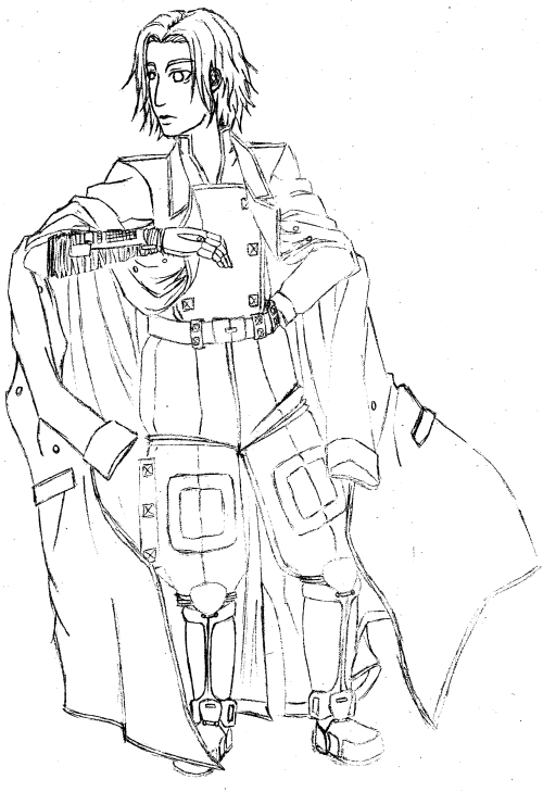
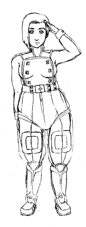
Image Image

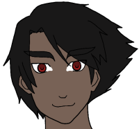
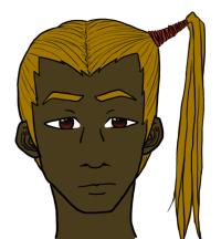
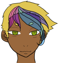
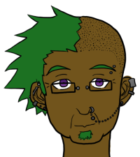
Colored character faces (Not all of them are finished, though, so there might be a few uncolored pieces or coloring outside the lines):
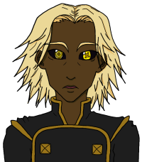
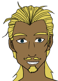
Image Image Image Image

Image Image Image Image

Image

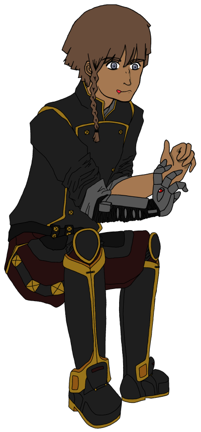
More of the bodies colored:
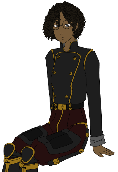
Image Image

Image Image

And this is just my color planning for various characters:
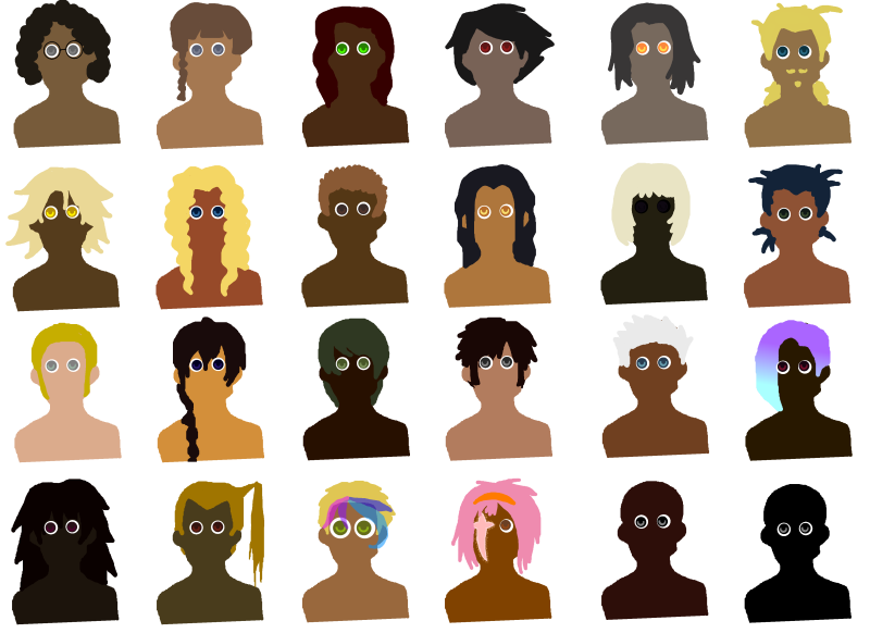
Image

Thank you in advanced for your comments and critique!

(If you want to look at anything in more detail, I have larger versions on my deviantart: daikiraikimi.deviantart.com I just had to make everything fit the 800 pixel wide limit.)
Last edited by noeinan on Tue May 28, 2013 3:57 pm, edited 1 time in total.
Image

Image
Image

User avatar
Kiki
Regular
Posts: 27
Joined: Tue Feb 07, 2012 5:43 pm
Contact:

Re: Game Sprite Critique

#2 Post by Kiki »

I'd suggest working more on your anatomy. The upper halves of most of the sprites look fine (though a few look like the arms are a little short) but the bottom halves are way too short in comparison. Overall it makes the bodies look unbalanced.

For your question about the lack of distinct faces in anime/manga style, I really have to ask what style you are talking about? There are many, many 'styles' that exist in various anime and manga titles, so for someone to help you figure out how to adapt a style in more facial diversity we'd need to know what style in particular you are working with. For example in Monster, a popular anime, there is a lot of variation in character's faces (compare this character to this one and this one) but in Madako the characters are only set apart by their hair and outfits (such as her and her). Variation is going to depend on what sort of look you're going for.

For what you have shown us, I think the direction you're going with the features (noses, eyes, chins) is working but if you're really wanting to make character distinct I think you could exaggerate the features further without hurting your style. Particularly exaggerating the chin/jawline and the noses a little more could help make the characters more distinct.

User avatar
noeinan
Eileen-Class Veteran
Posts: 1153
Joined: Sun Apr 04, 2010 10:10 pm
Projects: Ren'Py QuickStart, Crimson Rue
Organization: Statistically Unlikely Games
Deviantart: noeinan
Github: noeinan
Location: Washington State, USA
Contact:

Re: Game Sprite Critique

#3 Post by noeinan »

Kiki wrote:I'd suggest working more on your anatomy. The upper halves of most of the sprites look fine (though a few look like the arms are a little short) but the bottom halves are way too short in comparison. Overall it makes the bodies look unbalanced.

For your question about the lack of distinct faces in anime/manga style, I really have to ask what style you are talking about? There are many, many 'styles' that exist in various anime and manga titles, so for someone to help you figure out how to adapt a style in more facial diversity we'd need to know what style in particular you are working with. For example in Monster, a popular anime, there is a lot of variation in character's faces (compare this character to this one and this one) but in Madako the characters are only set apart by their hair and outfits (such as her and her). Variation is going to depend on what sort of look you're going for.

For what you have shown us, I think the direction you're going with the features (noses, eyes, chins) is working but if you're really wanting to make character distinct I think you could exaggerate the features further without hurting your style. Particularly exaggerating the chin/jawline and the noses a little more could help make the characters more distinct.
Hm, I've shied away from long legs in general because anime/manga styles often have exaggerated legs but perhaps I've gone too far. I will lengthen them and see how they turn out. :)

As far as detail goes, the characters linked for Monster kind of show a trend that I am not terribly fond of. Older or unattractive characters often have a lot of facial detail, but if an artist wants someone to be young and attractive that detail goes away. I don't have an example to show you because I haven't seen much that I'm satisfied with as far as facial distinction goes. My style is definitely less realistic than Monster, but not as deformed as Madoka. Sorry if that's not very helpful!

Personally, I've found that I can put some detail into the nose and face shape (jaw, chin, etc.) as well as the shape of the eyes and lips without disastrous effects. But I feel that the empty space between those features is best left just that-- empty-- unless the character is much older. Adding lines there really quickly changes their face and it's hard to keep an attractive design, in my opinion, while messing around with it. I guess what I really want to do is to add distinguishing facial features while keeping the character attractive so that there are lots of different kinds of attractive rather than only one. (I don't try to make all my characters attractive, but characters can be unattractive in different ways so I think they should be attractive in different ways, too.)

Thanks for responding, by the way!
Image

Image
Image

User avatar
noeinan
Eileen-Class Veteran
Posts: 1153
Joined: Sun Apr 04, 2010 10:10 pm
Projects: Ren'Py QuickStart, Crimson Rue
Organization: Statistically Unlikely Games
Deviantart: noeinan
Github: noeinan
Location: Washington State, USA
Contact:

Re: Game Sprite Critique

#4 Post by noeinan »

More specific to the nose, I find that I can draw the bottom of the nose and some lines at the bridge to add distinction, but I haven't found any way of drawing the nose wings that still looks good to me. If anyone knows of any examples on how to add nose wings that doesn't look too realistic I would love to see them. I've looked around a lot of Western cartoons and comics, but haven't found anything that translates well into my drawings.
Image

Image
Image

LVUER
King of Lolies
Posts: 4538
Joined: Mon Nov 26, 2007 9:57 pm
Completed: R.S.P
Location: Bandung, West Java, Indonesia
Contact:

Re: Game Sprite Critique

#5 Post by LVUER »

Even if you're claiming you're using a more realistic proportion, they're all still wrong. Even looking at real human proportion, the lower portion of the body are all too short. If it's only the head, I don't see any problem. I can't say much about the coloring since you haven't shading them. But for now, they're all good (except for the proportion I wrote above).

And all of the drawing are tilted a little bit to the left. Some can be corrected by rotating the sprite a little bit to the right, but some of them are tilted starting from the upper torso. You definitely want want to fix this.
"Double the princesses, quadruple the fun!" - Haken Browning (SRW-OG Endless Frontier)

DeviantArt Account
MoeToMecha Blog (under construction)
Lolicondria Blog (under construction) <- NSFW

User avatar
Nuxill
Veteran
Posts: 464
Joined: Sat Sep 25, 2010 4:50 pm
Projects: No Friend
Tumblr: nuxill
itch: nuxill
Contact:

Re: Game Sprite Critique

#6 Post by Nuxill »

I love the amount of diversity in the character's bodies! Kiki and LUVER have good points and I'd like to echo the fact that the characters are leaning a bit to the left. That's something you have to watch out for especially when you're drawing on paper because you don't have the ability to flip the image back and forth as easily (especially if you've got it in a sketchbook)

I went into photoshop and used the 'skew' transform tool to move them a bit to the right, lengthened the legs and moved the crotches up a teeny bit. Obviously fixing the anatomy will take a little more effort than this but it's more of an example than anything.
Attachments
Screen shot 2013-05-27 at 8.29.01 PM.png

User avatar
noeinan
Eileen-Class Veteran
Posts: 1153
Joined: Sun Apr 04, 2010 10:10 pm
Projects: Ren'Py QuickStart, Crimson Rue
Organization: Statistically Unlikely Games
Deviantart: noeinan
Github: noeinan
Location: Washington State, USA
Contact:

Re: Game Sprite Critique

#7 Post by noeinan »

They are all tilted-- some of them I wanted to be leaning on one foot but I hadn't realized that all of them were. Must be I'm getting used to my own mistakes so I don't notice them anymore. >< Thank you all for pointing that out, I'll go ahead and fix them and post again. I don't want all crooked and stubby sprites in my game!
Image

Image
Image

User avatar
noeinan
Eileen-Class Veteran
Posts: 1153
Joined: Sun Apr 04, 2010 10:10 pm
Projects: Ren'Py QuickStart, Crimson Rue
Organization: Statistically Unlikely Games
Deviantart: noeinan
Github: noeinan
Location: Washington State, USA
Contact:

Re: Game Sprite Critique

#8 Post by noeinan »

Okay, I straightened several of them out and made the legs more proportional. Does this look better?

Image
Image

Image
Image

LVUER
King of Lolies
Posts: 4538
Joined: Mon Nov 26, 2007 9:57 pm
Completed: R.S.P
Location: Bandung, West Java, Indonesia
Contact:

Re: Game Sprite Critique

#9 Post by LVUER »

The proportion is still wrong. Try this -> http://www.realcolorwheel.com/human.htm

And they're all still tilted to the left. Try draw a line perfectly straight from the ground (90 degree angle). Since you're drawing them all from the front, that line should slice them in perfect half.

PS: I don't have access to any drawing software in this PC so I can't do any red line.
"Double the princesses, quadruple the fun!" - Haken Browning (SRW-OG Endless Frontier)

DeviantArt Account
MoeToMecha Blog (under construction)
Lolicondria Blog (under construction) <- NSFW

User avatar
noeinan
Eileen-Class Veteran
Posts: 1153
Joined: Sun Apr 04, 2010 10:10 pm
Projects: Ren'Py QuickStart, Crimson Rue
Organization: Statistically Unlikely Games
Deviantart: noeinan
Github: noeinan
Location: Washington State, USA
Contact:

Re: Game Sprite Critique

#10 Post by noeinan »

LVUER wrote:The proportion is still wrong. Try this -> http://www.realcolorwheel.com/human.htm

And they're all still tilted to the left. Try draw a line perfectly straight from the ground (90 degree angle). Since you're drawing them all from the front, that line should slice them in perfect half.

PS: I don't have access to any drawing software in this PC so I can't do any red line.
The characters that are still tilted are leaning on one foot. That's how I intended it in any case. Also, the proportions are not 1:8 head to body ratio so I don't think they are going to match those on the page you mentioned. Is there something specific that looks off about the proportions?

Here's how I see their weight:

Image
Image

Image
Image

LVUER
King of Lolies
Posts: 4538
Joined: Mon Nov 26, 2007 9:57 pm
Completed: R.S.P
Location: Bandung, West Java, Indonesia
Contact:

Re: Game Sprite Critique

#11 Post by LVUER »

Just like I said. Draw a line 90 degree from the ground. Will you stand tilted like that? Can you stand like that in the first place? Will you be comfortable doing what that character does? If the answers are all yes, then you don't need to change anything.

And about the proportion, in the end, you decide. To tell you the truth, I don't draw using real human proportion. I kinda make my own proportion. May be even different than most anime proportion out there (FYI, but I know all kind of proportion before hand including the real one so my character won't look strange at the least). The link I gave you is the proportion of normal 28 years old male (of real human).
"Double the princesses, quadruple the fun!" - Haken Browning (SRW-OG Endless Frontier)

DeviantArt Account
MoeToMecha Blog (under construction)
Lolicondria Blog (under construction) <- NSFW

User avatar
noeinan
Eileen-Class Veteran
Posts: 1153
Joined: Sun Apr 04, 2010 10:10 pm
Projects: Ren'Py QuickStart, Crimson Rue
Organization: Statistically Unlikely Games
Deviantart: noeinan
Github: noeinan
Location: Washington State, USA
Contact:

Re: Game Sprite Critique

#12 Post by noeinan »

Hm, I would say I don't always stand at a 90 degree angle from the ground. If I put my weight on one leg, resting on it, I do tilt a bit. I'm definitely open to suggestion if somethings up with my proportions, I just might not be seeing the problem (especially if I've gone over the picture a few times and my brain has edited out any issues I would see in someone elses work.)
Image

Image
Image

Endorphin
Veteran
Posts: 366
Joined: Mon Nov 22, 2010 10:52 am
Location: Germany
Contact:

Re: Game Sprite Critique

#13 Post by Endorphin »

While you are right that this creates a rested, natural pose (which is something one should want to archive and it's great that your concious about it!) your people would simply fall down, as some are tilted in a way which seems highly unbalanced.
One tip is to try to have the head in the gap between the legs. Wow, this came out wrong. /shot
Since language fails me due to my lack of sleep I included a sketch.
example_balance.png
Keeping the head in line with this is good for standing poses, but should be broken when drawing dynamic images, of course. (Like running etc.)
Also, there are other ways to balance your characters which are a bit more complicated.
You see a simplified version in the right image. Basically, if one thing tilts a lot on one side, you want another to balance it out by being equally tilted.
(If the comparison helps you, try to think about in numbers. One body part tilts to 20, so you need another to tilt to -20 so that it's 0 again and thus balanced.)

Rules can be broken, of course, so just try to study from life.

Which leads me to your comment from above:
Hm, I've shied away from long legs in general because anime/manga styles often have exaggerated legs but perhaps I've gone too far.
You've got a lovely style and a lot of potential, so try not to limit yourself out of fear to make the generic mistakes.
The legs are too short even if we look at them from a realistic viewport, yes. However, you can still leave them this way if you prefer shorter legs--just make this an
Also, you can also learn from manga. I'm not drawing in this style any more, but >these books< still helped me a lot. Manga is just a very simplified, very stylised portrayal of the human body, and this can be wonderful to learn, as it's the shapes that matter. Muscles, fat etc. can be build upon it once the base is drawn--how much you pull the individual feature is your choice alone.

To the drawing itself--they are adorable, can't wait to see how you'll develop.
I especially like "CeltyDressUnifrom".

Gosh, I already apologise if you don't understand parts of it. I need to sleep.

User avatar
100puro
Regular
Posts: 88
Joined: Sun Feb 12, 2012 11:43 am
Projects: Driftwood, FatexHeart
Contact:

Re: Game Sprite Critique

#14 Post by 100puro »

I understand your need to stray away from any anime tropes so I won't say anything is wrong just because its not something I usually see. However, if you would like to stay realistic and not stylistic, the legs on the characters are short and the heads are a bit large but of course like other people have mentioned its up to you how you want to draw them. Regarding proportions, I will note that the waists on some of the characters are a bit on the small side, (old man sprite and slightly on the young boy sprite) making the shoulders seem disproportionately large in comparison.

Also though you've drawn the line of balance on the characters, the straight lines you've drawn through the characters is tilted. So the old man and young boy, though they're supposed to be standing straight, are actually slanted. This is shown in my attached picture where I have drawn straight, perfectly perpendicular lines through everyone. You can see then that there is uneven weight distribution across the line making them likely to topple over if they were standing that way in real life.

I'm not good at explaining this balancing thing myself but I'll try my best. First you should try to find where the weight is positioned between the feet. It could be all on one foot, equal on both, or mostly on one foot. That's where the center of balance is and you should draw a straight line from there. On both sides of the line there should be equal weight on both sides including the torso, limbs, and such. When drawing a plain standing figure you could also use a simple trick using the nose and drawing a straight line down from there to find the balance, but this won't work if you bend your hips like in one of the example pics I drew.
I probably didn't make much sense so you might want to look this stuff up >>;

In the design department I think you did a great job in making the characters varied and easily distinguishable from one another. I wish you luck with your VN! :DD
Attachments
Balancing
Balancing
straight lines through everyone!

TrishaYuu
Regular
Posts: 44
Joined: Fri Jun 29, 2012 11:12 am
Organization: Winter Wolves
Contact:

Re: Game Sprite Critique

#15 Post by TrishaYuu »

I totally agree with everything that Endorphin said (especially the balancing part) though I think I'd like to put more emphasis on the "study from life" part. It's important to understand human anatomy first. Seriously. I've been drawing anime for years before finally realizing (or more like admitting to myself) that the best way to draw people (realistically or in anime/manga style), is to learn basic human anatomy and proportion - in other words, draw real people first, then stylize. This is probably the best tip I can give you.

I do realize that you're looking for quick tips/fixes though, so here are some from me (though I am no expert, I hope these still help :D ):
  • As Endorphin mentioned, when posing characters in a standing position, keep the head over the space between the legs as shown on her illustration. Also, take note of how the hips tilt over the supporting leg. You're drawing it the other way around.
  • The 20, -20 tip by Endorphin! I think this was what LVUER may have meant by symmetrical.
  • As for proportion, a more realistic head to body ratio is 1:7 like what you did with the characters on one of your replies to LVUER.
    I tried to use it on myself (I'm 5'5") and my brother (6'5") and it's quite accurate! :D Also, the length of the forearm (from that line on the inner side of your elbow to that line on your wrist) is actually the same as the height? of your head! :D Cool huh? I just discovered that last bit of info just now while measuring my brother's height actually. So knowing the correct body proportions can help you know whether an arm or leg is too long or too short! :D
  • The shoulders are too stiff. Try to tilt the shoulders down a bit to make it look more natural/relaxed.
  • For a quick reference on anime feet, take a look at the characters from
    Naruto. Fun fact: Masashi Kishimoto LOVES to draw toes so she designed the character' shoes with openings at the tip just so she could draw them. :D
  • For quirky facial features, try Avatar the Last Airbender. It's technically not anime, but it's close enough.
[edit]
I when I started typing this reply, 100puro hadn't posted her reply yet. I totally agree with what she said as well.

Post Reply

Who is online

Users browsing this forum: No registered users