Game Sprite Critique

Art threads specific to a single artist.
Message
Author
User avatar
noeinan
Eileen-Class Veteran
Posts: 1153
Joined: Sun Apr 04, 2010 10:10 pm
Projects: Ren'Py QuickStart, Crimson Rue
Organization: Statistically Unlikely Games
Deviantart: noeinan
Github: noeinan
Location: Washington State, USA
Contact:

Re: Game Sprite Critique

#16 Post by noeinan »

Endorphin wrote:While you are right that this creates a rested, natural pose (which is something one should want to archive and it's great that your concious about it!) your people would simply fall down, as some are tilted in a way which seems highly unbalanced.
One tip is to try to have the head in the gap between the legs. Wow, this came out wrong. /shot

Also, there are other ways to balance your characters which are a bit more complicated.
You see a simplified version in the right image. Basically, if one thing tilts a lot on one side, you want another to balance it out by being equally tilted.
100puro wrote: I'm not good at explaining this balancing thing myself but I'll try my best. First you should try to find where the weight is positioned between the feet. It could be all on one foot, equal on both, or mostly on one foot. That's where the center of balance is and you should draw a straight line from there. On both sides of the line there should be equal weight on both sides including the torso, limbs, and such. When drawing a plain standing figure you could also use a simple trick using the nose and drawing a straight line down from there to find the balance, but this won't work if you bend your hips like in one of the example pics I drew.
These two bits definitely helped me understand the balance a bit better. I can see now how Melissa is off balance still in my new version. It's a bit harder to do the balancing and matching up with Emile, though, since his hips are angled away from the viewer a bit.
Endorphin wrote:
You've got a lovely style and a lot of potential, so try not to limit yourself out of fear to make the generic mistakes.
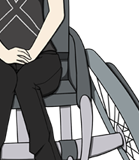
The legs are too short even if we look at them from a realistic viewport, yes. However, you can still leave them this way if you prefer shorter legs--just make this an
Also, you can also learn from manga. I'm not drawing in this style any more, but >these books< still helped me a lot. Manga is just a very simplified, very stylised portrayal of the human body, and this can be wonderful to learn, as it's the shapes that matter. Muscles, fat etc. can be build upon it once the base is drawn--how much you pull the individual feature is your choice alone.

To the drawing itself--they are adorable, can't wait to see how you'll develop.
I especially like "CeltyDressUnifrom".
Thank you! :3 I have also found the How to Draw Manga books very helpful, though I admit I haven't been looking at my reference books as much this past year. I'll get back on that now that I will be drawing a lot more! I'm glad that you like Celty-- she was my first attempt at drawing really curly hair and I was pretty happy with how she turned out even though her pose is pretty basic. :)
100puro wrote:I understand your need to stray away from any anime tropes so I won't say anything is wrong just because its not something I usually see. However, if you would like to stay realistic and not stylistic, the legs on the characters are short and the heads are a bit large but of course like other people have mentioned its up to you how you want to draw them. Regarding proportions, I will note that the waists on some of the characters are a bit on the small side, (old man sprite and slightly on the young boy sprite) making the shoulders seem disproportionately large in comparison.
The heads are definitely stylistically bigger, since I definitely still identify my style with anime/manga-- I will try to keep the legs a bit more under control, though. I hadn't really intended to make them a lot shorter, so I think I'll defer to realism on that one. About the small waists-- both of those characters are actually supposed to be uncharacteristically skinny, so I'm glad it stands out. :D The boy isn't supposed to have especially broad shoulders, though, so maybe I should look into slimming them down. It might be a little hard given that the position of his arms visually separates his shoulders from his waist, maybe making it stand out more...
100puro wrote: Also though you've drawn the line of balance on the characters, the straight lines you've drawn through the characters is tilted. So the old man and young boy, though they're supposed to be standing straight, are actually slanted. This is shown in my attached picture where I have drawn straight, perfectly perpendicular lines through everyone. You can see then that there is uneven weight distribution across the line making them likely to topple over if they were standing that way in real life.
I definitely see that in your picture, though I noticed that the picture you edited was the first version of my character lineup-- I posted an updated version a few posts down from that where I made the legs longer and made some of the character's stances straighter. (Yeah, the lines I drew were super sloppy-- getting to crunch time with my final term paper and so I was rushing a bit with my post. >< And yet, here I am... lol)

Image

If you don't mind, do you think that I have corrected some of the unbalance and proportions? Or does it still need some work? I didn't do much to correct Melissa's stance, and after reading your post I think I will need to do that, but I made some corrections across the board for the other characters.
100puro wrote: In the design department I think you did a great job in making the characters varied and easily distinguishable from one another. I wish you luck with your VN! :DD
Thanks! :D
Image

Image
Image

User avatar
Nuxill
Veteran
Posts: 464
Joined: Sat Sep 25, 2010 4:50 pm
Projects: No Friend
Tumblr: nuxill
itch: nuxill
Contact:

Re: Game Sprite Critique

#17 Post by Nuxill »

The legs are still a bit short. In realistic human proportions legs usually take up about half of the entire length of the body from head to toes, and all of the legs you've drawn are about a 'head' too short. I say usually because there are some exceptions where the legs might be shorter or longer, but when every character has legs that are too short it comes across less as diversity in body and more of an anatomy error. Shorter legs would probably look better on characters drawn in a more cartoonish style

Of course I don't know how you want to display the characters in your visual novel but If you have the characters shown from the thigh up it really won't matter if the legs are too short or not because we won't be able to see it and will have our minds automatically fill in the blanks anyway. :P

User avatar
arachni42
Veteran
Posts: 341
Joined: Mon Feb 25, 2013 6:33 pm
Organization: no, I'm pretty messy
Location: New York
Contact:

Re: Game Sprite Critique

#18 Post by arachni42 »

daikiraikimi wrote: If you don't mind, do you think that I have corrected some of the unbalance and proportions? Or does it still need some work? I didn't do much to correct Melissa's stance, and after reading your post I think I will need to do that, but I made some corrections across the board for the other characters.
I think it's definitely an improvement from before, but still a little off in some cases. I wish I had some good reference photos; I am eyeballing it and imagining where the weight is. The upper part of Emile's upper body looks too far to the left -- it creates a top-heavy situation on that leg... but, I actually think the upper body pose is good and it's the legs that should be corrected. He's leaning back and has his arm crossed, giving him a confident look... but the legs don't match with that look. I would expect for his feet to be planted a bit further apart defiantly at a little bit of an angle. We are looking at his upper body from an angle, but it seems like we are looking at the legs and feet relatively head-on.

Melissa looks a little odd, but it does not look like she would fall over. The legs are in good proportion to her body. In terms of strict balance, it works. But, the way her body is drawn suggests more of a peaking-around-a-corner pose, and less of a saluting pose (unless she is a bit drunk). I think her body type overall is uncommon, and that seems to be a strength of yours. The body shapes are different from each other and interesting. As you study the human figure more, keep that in mind -- notice the ways various bodies are similar and yet different. I like to point out people's strengths in art as well as weaknesses because I think it's important to know, but in your case I really want to emphasize it because I think it makes your figures particularly interesting.

Anyway... I think Alvere looks mostly balanced and Charles definitely looks balanced; as mentioned, they need work on the proportions of the legs. Saiph looks a bit off-balance but it looks like they are leaning on something, and their balance is just fine if they are. If they are not leaning, then I feel like the head and possibly torso is a little too far forward. It's hard for me to tell, because sometimes small shifts in weight in the upper body require foot, ankle and leg movements to balance, and they can be quite subtle. I think doing these poses in a mirror would be very helpful. (I mean, that is pretty much what I would need to do. I've got a good eye for things, but actually correcting them can take some investigation.) I have a feeling that some relatively small modifications to their right foot and ankle (their right, our left) would make a big difference.

Anastaszia overall looks balanced, although her head looks a little too far forward. Again, it's about capturing that feeling of "weight" being supported by the rest of the body. At this angle, her feet look too small, especially the one she is putting her weight on. There is a foot tutorial I found helpful, so maybe you will, too:
http://tyshea.deviantart.com/art/Tutori ... -252869062
I do like the way her left foot (our right) is positioned. Again, I think this pose is interesting. The foot should be a little bit lower (ie. "closer to us"); right now it looks like her left leg is shorter than her right leg.

As I said, I like your ambitions with the bodies and poses. I hope this helps!
I, Miku (NaNoRenO 2014)
Vignettes (NaNoRenO 2013)
_________________

LVUER
King of Lolies
Posts: 4538
Joined: Mon Nov 26, 2007 9:57 pm
Completed: R.S.P
Location: Bandung, West Java, Indonesia
Contact:

Re: Game Sprite Critique

#19 Post by LVUER »

Whew, it took longer than I thought. I was busier than I thought so the red lining is a bit late. I don't know if you still need this or not, but since I've made it, I don't see why I shouldn't upload it.
Red Line.png
First, take a look at this. I've draw a 90 degree line for each character. See how your characters are not balanced. If they don't fall, then they must be uncomfortable standing like that. You're making sprites right? That means player will be staring at them for a long time.

Since your pic is low-res, I can't read the names... but two of them (right most and the old man) are okay and one of them (third from left) is barely okay.

The mistakes is glaringly visible when the sprites is drawn from the front. Let's take a look at this.
Rotated RedLine-1.png
Rotated RedLine-1.png (47.21 KiB) Viewed 588 times
Even though you are claiming the guy is leaning on one foot, the guy will fall down like that unless he is leaning on a wall... which is a bad idea for a sprite.

If you still want the guy to lean on his right leg, then make sure the blue line is at least a straight line. Or you can rotate the sprite like this...
Rotated RedLine-2.png
Rotated RedLine-2.png (55.59 KiB) Viewed 588 times
But as you can see, some major re-draw need to be done on the legs.
Rotated RedLine-3.png
Rotated RedLine-3.png (59.77 KiB) Viewed 588 times
The same with her. We can rotate her but rotating too much means a major re-draw for the legs is a must.
Rotated RedLine-4.png
Rotated RedLine-4.png (70.59 KiB) Viewed 588 times
And here's a red line for the girl sprite. She is the hottest so I want to (completely) red line her. I use the proportion I told you. Not the long leg manga style.

FYI, this is not a correct pose for saluting. But I don't fix it since I'm only red lining your sprite.
"Double the princesses, quadruple the fun!" - Haken Browning (SRW-OG Endless Frontier)

DeviantArt Account
MoeToMecha Blog (under construction)
Lolicondria Blog (under construction) <- NSFW

Post Reply

Who is online

Users browsing this forum: No registered users